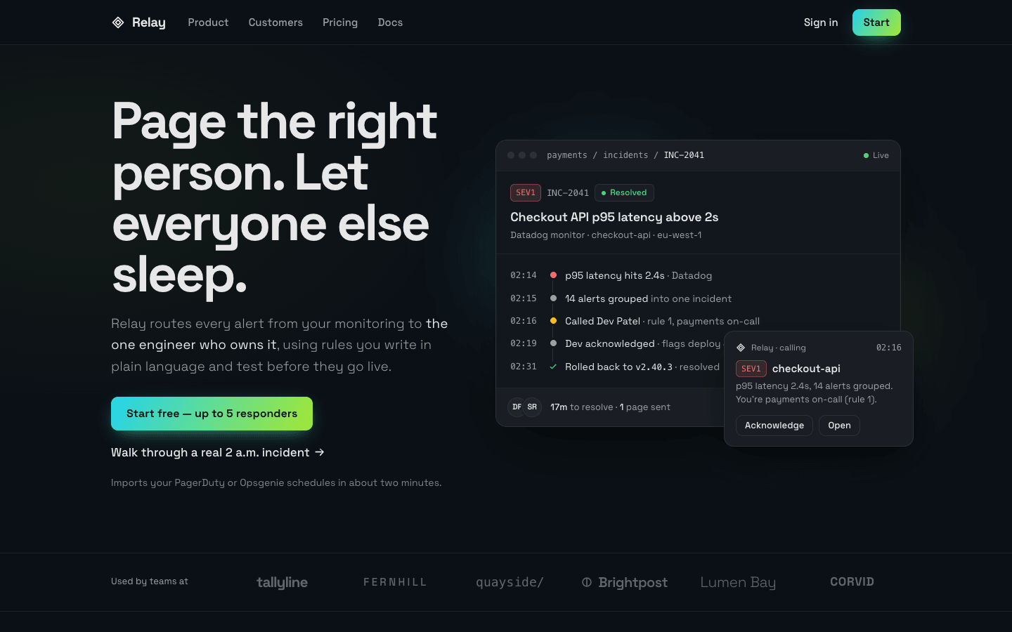
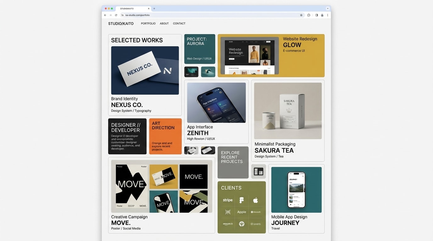
Create a gradient-led modern SaaS landing page: a dark canvas where one saturated gradient behaves like a light source and a signal, never like wallpaper.
Brief
Subject: Relay — on-call alert routing for small engineering teamsWrite real product copy: the name, what it does in one sentence, feature names, integrations, prices, customer quotes with roles. No "Supercharge your workflow" fillerOne concrete scenario runs through the page (one incident, one order, one deploy): the hero, the features and the product demo all show it with the same names, times and numbersDesign Tokens
Use these exact values. Where the spec is silent, stay consistent with them.
colors:
  accent: "linear-gradient(120deg, #22d3ee 0%, #a3e635 100%)"
  accentFallback: "color-mix(in srgb, #22d3ee 50%, #a3e635)"
  background: "#0b1016"
  border: "color-mix(in srgb, #ffffff 8%, #0b1016)"
  borderStrong: "color-mix(in srgb, #ffffff 14%, #0b1016)"
  danger: "#f87171"
  logo: "color-mix(in srgb, #ffffff 36%, #0b1016)"
  muted: "color-mix(in srgb, #ffffff 60%, #0b1016)"
  mutedDim: "color-mix(in srgb, #ffffff 48%, #0b1016)"
  ok: "#4ade80"
  onAccent: "color-mix(in srgb, #0b1016 70%, #000)"
  surface: "color-mix(in srgb, #ffffff 3%, #0b1016)"
  surface2: "color-mix(in srgb, #ffffff 6%, #0b1016)"
  surface3: "color-mix(in srgb, #ffffff 9%, #0b1016)"
  text: "color-mix(in srgb, #ffffff 90%, #0b1016)"
  warning: "#fbbf24"
effects:
  ctaSheen: "radial-gradient(60% 120% at 100% 0%, rgb(255 255 255 / 0.28), transparent 60%) over the band"
  gradientBorder: "border 1px solid transparent; background: linear-gradient(surface2, surface2) padding-box, the accent gradient border-box"
  gradientText: "the accent gradient with background-clip: text and transparent fill, on the whole demo headline"
  heroGlow: "behind the hero window, inset -6% -10% -4% -6%: radial-gradient(42% 48% at 30% 38%, start colour at 55%, transparent 70%), radial-gradient(40% 46% at 72% 64%, end colour at 45%, transparent 70%), radial-gradient(30% 34% at 55% 48%, a 50/50 mix of both at 35%, transparent 72%); blur 48px, opacity 0.85"
  pageLight: "on the body, above the background: radial-gradient(1100px 620px at 78% -8%, start colour at 9%, transparent 62%) and radial-gradient(900px 520px at 8% 4%, end colour at 5%, transparent 60%)"
  stripes: "repeating-linear-gradient(135deg, text 0 4px, muted 4px 8px) for schedule overrides"
fonts:
  body:
    fallback: "system-ui, -apple-system, 'Segoe UI', sans-serif"
    family: Space Grotesk
    weights: [300, 400, 500]
  display:
    fallback: "system-ui, -apple-system, 'Segoe UI', sans-serif"
    family: Space Grotesk
    weights: [600, 700]
  mono:
    fallback: "SFMono-Regular, Menlo, Consolas, monospace"
    family: ui-monospace
    weights: [400, 500]
layout:
  breakpoints:
    desktop: 980px
    mobile: 640px
    nav: 900px
    wide: 1080px
  container: 1180px including the gutters
  gutter: "28px, 16px under 640px"
motion:
  durations:
    button: 150ms
    colour: 200ms
    glowDrift: 18s
  easings:
    all: ease
    glowDrift: "ease-in-out, infinite, alternate"
radii:
  band: 22px
  control: 10px
  panel: 14px
  small: 6px
  window: 16px
shadows:
  notification: 0 20px 50px -18px rgb(0 0 0 / 0.85)
  primaryButton: "0 8px 28px -10px start colour at 55%, 0 6px 22px -12px end colour at 60%; on hover 0 12px 34px -10px at 70% and 0 10px 28px -12px at 70%"
  recommendedTier: "0 30px 70px -40px start colour at 45%"
  window: "0 30px 80px -30px rgb(0 0 0 / 0.8), inset 0 0 0 1px rgb(255 255 255 / 0.02)"
spacing:
  hero: "72px top, 88px bottom; 40px and 56px under 980px"
  panelPadding: "32px, 24px under 640px"
  section: "112px top and bottom, 80px under 900px"
type:
  body:
    font: body
    lineHeight: 1.6
    size: 17px; lead 18–19px in weight 300
    tracking: 0
    weight: 400
  caption:
    font: body
    lineHeight: 1.45
    size: 13px
    tracking: 0
    weight: 400
  display:
    font: display
    lineHeight: 0.98
    size: "clamp(40px, 8.4vw, 74px)"
    tracking: -0.045em
    weight: 700
  headline:
    font: display
    lineHeight: 1.05
    size: "clamp(32px, 5.4vw, 52px)"
    tracking: -0.035em
    weight: 700
  title:
    font: display
    lineHeight: 1.15
    size: "clamp(24px, 3vw, 30px)"
    tracking: -0.03em
    weight: 700
Style Rules
The gradient runs from the start to the end colour at 120° and lives in exactly five places: the hero glow, primary buttons, the recommended tier's hairline border, the product-demo headline and the CTA bandEverything else is calm: the background, three surface steps, two border steps and three greys, all mixed from the background colourHeadlines are bold and tight (700, -0.035 to -0.045em); body copy is 17px, with lead text in weight 300 and mutedProduct UI is the visual: real names, mono ids and timestamps, status colours only for statusPanels are flat: 1px border, panel radius, no shadow; only the hero window, the notification and the recommended tier cast shadows. Focus rings: 2px in the end colour, 3px offsetSection heads sit left-aligned above their content, max 760px wide, 44px above itPage Layout
container 1180px incl. gutters
◆ Name   Product  Customers  Pricing  Docs        Sign in [Start]   ← sticky nav
Headline (≤ 12ch)          ░ glow ░ ┌ ● ● ● breadcrumb      ● Live ┐  ← hero
Lead, muted                         │ [SEV1] id [state] / title     │
[Gradient button] Walk through →    │ 02:14 ● … 02:19 ● … 02:31 ✓   │
note                                └ avatars · stat ···· [btn][btn] ┘
                                                      ┌ notification ┐
──────── Used by teams at   WORD WORD WORD WORD WORD WORD ────────  ← logos
┌ rules editor + simulator (2 rows) ┐ ┌ schedule bars ┐           ← features
└───────────────────────────────────┘ └ stats + chips ┘
GRADIENT-TEXT HEADLINE                                             ← product demo
┌ list │ incident ①② │ responders ③ deploy ④ ┐  ① ② ③ ④ callouts
┌ big quote + results ┐ ┌ quote ┐ ┌ quote ┐                         ← testimonials
[ tier ] [ RECOMMENDED · gradient hairline ] [ tier ] / table      ← pricing
╔ gradient band: headline │ [email ·····][Create] ╗                  ← cta
brand · 4 link columns / © · ● status · socials                    ← footer
Sections
Hero — Two columns 0.92fr / 1.08fr with a 56px gap, vertically centred, 72px top and 88px bottom: headline (display, max 12ch), lead 20px below (max 34em, light weight, muted), buttons 28px below, note 14px below; the product window on the right over the hero glowContent:Headline: 6–9 words promising the outcome in the user's terms, in two short sentencesLead: one sentence on what the product routes or does and by which rules, with the key phrase in the text colourButtons: a free-start phrase with a limit and 'Walk through a real …' as the text linkNote: one muted line on setup or importComponents:Primary button: gradient fill at 120°, on-accent text, weight 600, 48px tall, padding 0 22px, control radius, the primary-button shadow; hover lifts 1px and deepens the shadowText link: weight 500 with a → that moves 3px right on hoverProduct window (16px radius, 1px strong border, the window shadow): an app bar (three grey dots, mono breadcrumb, 'Live' dot); an incident header (severity tag, mono id, state chip, 18px title, muted source); a timeline of five events with mono times and dots on a 1px line; a footer bar with avatars, one stat and two small buttonsFloating notification: a 270px card overlapping the window's bottom-right cornerMobile: Under 980px one column with the window below; padding 40px top, 56px bottom; under 520px the notification drops into the flow under the windowMotion: The glow drifts and rotates slowly over 18s, alternatingLogos Bar — A band between two 1px rules, 28px top padding: the label in a 150px column, then the six wordmarks evenly in one rowContent:Label: 'Used by teams at'Six invented company wordmarks that fit the subject's customersMobile: Label above; wordmarks in two columns, three from 640pxFeatures — Section head (max 760px), then a grid 1.55fr / 1fr with an 18px gap: the rules panel spans two rows on the left, schedule and noise panels stack on the rightContent:Section head: a headline about the team's real situation and one sentence on who the product is built forThree features named after real capabilities: rules, schedules, grouping; each with its own mini UI and real valuesComponents:Panel: surface fill, 1px border, panel radius, 32px padding; title in title size, muted sentence 12px belowRules editor (main panel): a header strip; five numbered plain-language rules with mono values in chips; the matching rule highlighted with a ✓, skipped rules at 45% opacitySimulator under it: three mono segmented controls (service, severity, time) and an output row saying who gets paged and whySchedule panel: a 7-day grid, two people as rows, shift bars and one striped overrideNoise panel: a 2×2 stat grid split by 1px lines (30px weight 700 numbers, muted labels), then integration chipsStates:Changing a segmented control re-runs the match over 200ms and updates the outputMobile: One column under 980px; the simulator's controls stack under 640pxProduct Demo — Section head, the console at full container width, then the callouts in four columns 28px belowContent:Headline: one sentence on seeing everything on one screen, set as the page's only gradient textSub-line: the scenario's exact moment ('… as Dev saw it at 02:20')Four callouts naming what each pin showsComponents:Console: a product window, 230px / 1fr / 270px: incident and on-call lists; the incident (title, two buttons, a line chart with a threshold, grouped-alert chips, timeline); responders, a suspected-deploy card with a warning flag, the chat channelPins: four 26px numbered circles in the text colour with dark rings, placed over the parts the callouts explainCallouts: four numbered items under a 1px rule each: a 17px title and a muted sentenceMobile: The console's left column hides under 1080px and the right column drops under the main one under 760px; callouts go to two columns, then oneTestimonials — Section head, then 1.3fr / 1fr with an 18px gap: the big quote spans two rows on the left, two short quotes stack on the rightContent:Three customers with names, roles and companies; the big quote tells a before-and-after with two numbersComponents:Quote card: panel fill and border, 32px padding; the quote in 18px, the big one in clamp(21px, 2.6vw, 28px) weight 500; a person row with a 40px avatar, name in weight 600 and role and company in mutedResult row on the big card: two numbers at 26px with muted labels, under a 1px ruleMobile: One column under 900pxPricing — Three equal columns with an 18px gap; the comparison table 48px below under its own titleContent:Headline on how pricing works and one sentence on who counts as a seatThree tiers from the subject with real prices and limitsComponents:Tier: panel fill, 1px border, 16px radius, 28px padding; name (18px, 600) and a one-line audience; the price at 52px weight 700 with its unit; a muted billing note; a full-width button; a feature list under a 1px rule with 16px check iconsRecommended tier: surface-2 fill with a 1px gradient border, the tier glow shadow and the primary button; the others use the ghost button (transparent, 1px strong border)Comparison table: 8–10 rows, 1px row rules, the recommended column on surface-2; scrolls sideways under 580pxMobile: One column under 940px, recommended tier secondCTA Section — A band inside the container, 96px above the footer: headline and sentence left, signup right, 1.1fr / 1fr, aligned to the bottomContent:Headline: 6–8 words (max 14ch)One sentence on the three setup stepsNote: the free limit and 'No credit card'Components:Band: the gradient at 120° with a white sheen (radial at the top-right corner, 28%), 22px radius, 56px 48px padding, dark textSignup: a label, a 52px input in white at 82% with a dark 25% border, and a dark button; a muted note and a confirmation lineStates:On submit the confirmation line names the workspaceMobile: Stacks under 960px; padding 44px 24px; input and button stack under 520pxFooter — Under a 1px rule, 56px top padding: brand column 1.6fr and four link columns; the bottom row 48px below under its own ruleContent:Brand with one sentenceFour link columns: Product, Developers, Company, LegalBottom row: © year, a status link with a green dot and 'All systems operational', and three 40px social icon linksMobile: Brand on top, link columns two by two under 900pxImagery & Icons
No photos or illustrations: the hero window, rules editor, schedule, stats and console are HTML/CSS with inline SVG chartsIcons: 16–20px inline SVG stroke icons, 1.75px stroke, in the text or muted colourLogos: six invented company wordmarks set in type or simple inline SVG, all in the logo grey, 26px tallImplementation Notes
Gradient text uses background-clip: text inside @supports, with a solid fallback colour mixed from both gradient stopsThe navigation is sticky, 64px tall, on the background at 78% with a 12px backdrop blur and a 1px bottom border; under 900px its links move into a menu buttonDon'ts
No gradient on a single word or half a headline, on icons, on section backgrounds or on card fillsNo kicker or eyebrow labels above section headings (no '— Features', no pills)No neon glow on text or borders; the only glows are the hero glow and the button and tier shadowsNo violet or purple: the palette is the two gradient colours, the background greys and the three status coloursNo logo placeholders, stock illustrations or isometric art: the product UI is the visualNo fonts, colours, radii or shadows outside the design tokens and rules aboveNo sections, features or effects that this spec doesn't listNo placeholder copy (lorem ipsum, "Elevate your workflow"): every word comes from the subjectNo pill-shaped eyebrow labels above headings and no gradient text, unless this spec asks for themNo grid of identical icon cards: vary size and emphasis by importanceQuality Floor
Mobile-first and responsive from 360px to 1440px and wider, with no horizontal scrollingText contrast meets WCAG 2.1 AA: 4.5:1 for body text, 3:1 for large textSemantic landmarks (header, nav, main, section, footer), one h1, descriptive alt textEvery interactive element has hover, visible focus and active states and works from the keyboardHonour prefers-reduced-motion: keep opacity fades, drop movementTech Stack
Framework: HTML/CSS/JS — Deliver one self-contained index.html: styles in a <style> block, scripts in a <script type="module"> block, no build step.Styling: Vanilla CSS — Plain CSS. Declare every design token as a custom property on :root (--color-accent, --font-display, --radius-card…) and use only those properties for colours, fonts, radii, shadows and timing.Language: JavaScript — JavaScript as ES modules; no TypeScript.UI library: None — No component library: build every component from the design tokens.Motion: CSS only — CSS transitions and keyframes only, with durations and easings from the design tokens.Icons: Inline SVG — Inline SVG icons drawn for this style, with one stroke width and corner treatment across the page.Acceptance Checklist
The gradient appears only in the five named places: hero glow, primary buttons, the recommended tier's border, the demo headline and the CTA bandThe gradient text covers one whole headline and has a solid fallback colourThe hero product window shows the scenario with mono timestamps, a severity tag and a floating notification, in the first 1440×900 viewportLogos are typeset wordmarks in one grey, never grey rectanglesThe routing simulator's three segmented controls change which rule matches and what the output saysThe product demo has four numbered pins over the console and four matching numbered callouts below itThe recommended tier has a 1px gradient border made with padding-box and border-box backgroundsSurfaces, borders and greys are mixed from the background, so changing it re-tints the whole pageUnder reduced motion the hero glow stops drifting and transitions become instantContent sits in a 1180px container that includes 28px gutters (16px under 640px)