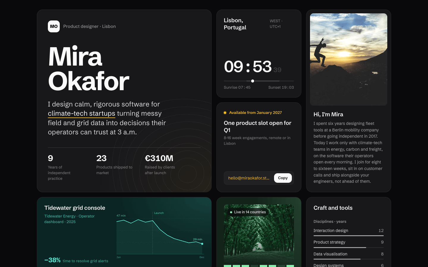
Create a bento grid portfolio in the spirit of Apple's keynote slides: one page of asymmetric tiles whose sizes say what matters, which together say who this person is and what they've made.
Brief
Subject: the portfolio of Mira Okafor, an independent product designer in Lisbon who works with climate-tech startupsUse real-feeling content: project names, clients, outcomes with numbers, a location with live local time, current availabilityThe whole site is one screen of tiles: no navigation bar, no sections below the grid, only a one-line footerDesign Tokens
Use these exact values. Where the spec is silent, stay consistent with them.
colors:
  accent: "#fbbf24"
  background: "#09090b"
  bodyLight: "color-mix(in srgb, #ffffff 84%, #18181b)"
  border: "color-mix(in srgb, #ffffff 7%, #18181b)"
  borderHover: "color-mix(in srgb, #ffffff 20%, #18181b)"
  faint: "color-mix(in srgb, #ffffff 16%, #18181b)"
  muted: "color-mix(in srgb, #ffffff 62%, #18181b)"
  mutedCaption: "color-mix(in srgb, #ffffff 46%, #18181b)"
  projectA: "background #0a2523, ink #5eead4"
  projectB: "background #14231a, ink #86efac"
  surface: "#18181b"
  text: "color-mix(in srgb, #ffffff 98%, #09090b)"
  track: "color-mix(in srgb, #ffffff 6%, #18181b)"
effects:
  heroWash: "radial-gradient(120% 90% at 100% 100%, accent at 6%, transparent 55%) over the card fill"
  projectWash: "radial-gradient(90% 120% at 100% 0%, the project ink at 14%, transparent 60%) over the project background"
  revealBlur: "backdrop-filter: blur(10px) on the reveal panel and the status chip (6px)"
fonts:
  body:
    fallback: "system-ui, -apple-system, sans-serif"
    family: Schibsted Grotesk
    weights: [400, 500, 600]
  display:
    fallback: "system-ui, -apple-system, sans-serif"
    family: Schibsted Grotesk
    weights: [700, 800]
layout:
  breakpoints:
    mobile: 640px
    twoColumns: 1080px
  container: "1240px including the gutters; 32px above the grid, 40px below the footer"
  gutter: "24px, 16px under 640px; grid gap 16px, 12px under 640px"
motion:
  durations:
    border: 250ms
    ping: 2.2s
    reveal: 250ms
  easings:
    all: ease
    ping: "ease-out, infinite, scale 0.5 → 1.8 while fading out"
radii:
  inner: "max(0px, 20px - 8px)"
  pill: 999px
  tile: 20px
shadows:
  everywhere: "none: depth comes from the fill against the background and the 1px border"
spacing:
  gridRows: "minmax(232px, auto)"
  heroPadding: "36px, 24px under 640px"
  tilePadding: "24px, 20px under 640px"
type:
  body:
    font: body
    lineHeight: 1.5
    size: "15px; hero statement clamp(19px, 1.7vw, 23px) at 1.35"
    tracking: 0
    weight: 400
  caption:
    font: body
    lineHeight: 1.45
    size: 13px
    tracking: 0
    weight: 400
  display:
    font: display
    lineHeight: 0.94
    size: "clamp(52px, 6.6vw, 88px)"
    tracking: -0.045em
    weight: 700
  headline:
    font: display
    lineHeight: 1
    size: 54px
    tracking: -0.04em
    weight: 600
  title:
    font: display
    lineHeight: 1.25
    size: 19px
    tracking: -0.01em
    weight: 600
Style Rules
Size signals importance: the hero is 2×2, the strongest projects are 2×1 or 1×2, everything else 1×1Every tile shares the card fill, a 1px border, the tile radius and 24px padding; photos and inner panels use the inner radiusEach tile's content is composed for its size and anchored top and bottom, never centred in the boxTwo project tiles own a colour pair (a deep background and a light ink) taken from the project; their text and visuals use that inkThe accent marks only what's live or clickable: availability, links, the hero underline, the copy success state, the social arrowsOne family, Schibsted Grotesk, with a big jump from the display name to 19px titles and 13px captions; numbers are tabularHover brightens the tile border to 20% white over 250ms; nothing lifts or scalesPage Layout
desktop, 4 columns, gap 16px, rows ≥ 232px
grid-template-areas:
  "hero   hero   time    about"
  "hero   hero   contact about"
  "p1     p1     p2      skills"
  "p3     p4     p2      skills"
  "p5     p5     now     social"
┌─────────────────────┬─────────┬─────────┐
│ ▣ discipline · city │ City tz │┌───────┐│
│                     │ 14:32 07││portrait││
│ NAME                │ ━━●━━━━ │└───────┘│
│ NAME                ├─────────┤ Hi, I'm │
│ statement, one      │● Avail. │ bio …   │
│ phrase underlined   │ slot    │         │
│ 9 yrs · 23 · €310M  │[email·Copy]       │
├──────────┬──────────┼─────────┼─────────┤
│ p1 meta  │ SVG visual│┌ photo ┐│ Craft & │
│ (colour A)          ││● chip  ││ tools   │
├──────────┬──────────┤└───────┘│ bars    │
│ p3   ◔   │ p4  ∿∿   │ p2 meta │         │
├──────────┴──────────┼─────────┼─────────┤
│ p5 meta  │ SVG visual│ Right   │Elsewhere│
│                     │ now     │ ↗ ↗ ↗   │
└─────────────────────┴─────────┴─────────┘
© year Name ··························· accent link
under 1080px, 2 columns: "hero hero" ×2, "about time", "about contact", "p1 p1", "p2 p3", "p2 p4", "p5 p5", "skills now", "skills social"
under 640px, 1 column: hero, about, contact, time, p1, p2, p3, p4, p5, skills, social, now
Sections
Hero Bento Cell — Area 'hero', 2×2 tiles, 36px padding, content anchored top and bottom: the top row, then the name in display size 40px below, the statement 22px below, the stats 36px below; the hero wash and contour lines sit behindContent:The person's name on two linesOne statement of what they do and for whom, 20–30 wordsThree stats: years of practice, products shipped, a client outcome in money or scaleComponents:Top row: a 40px monogram tile (text-colour fill, background-colour initials, weight 800, inner radius), then the discipline and city in muted, 12px apartStatement: lead size, max 30ch, in the body-light colour; one key phrase in the text colour with a 2px accent underline drawn as a background lineStats: three figures under a 1px rule, 36px apart; each number 28px weight 700 tabular over a caption of at most 16chMobile: Padding 24px and at least 480px tall; stats keep three columns at 22pxTime Cell — Area 'time', 1×1: title and time zone on one baseline at the top, clock and track at the bottomContent:City and country as the title, the time zone as a captionCaptions for sunrise and sunset at each endComponents:Clock: headline size, weight 600, tabular, with seconds at 22px in the faint colourDay track: a 4px bar in the track colour with the daylight hours lighter, and a 10px text-colour dot at the current time, ringed in the card colourMobile: At least 200px tallMotion: The clock ticks every secondAbout Cell — Area 'about', 1×2, padding 12px 12px 24px: the portrait fills the top with the inner radius; title and bio (14px, line-height 1.55) 18px below, inset 12pxContent:Title: 'Hi, I'm' and the first nameA three-sentence bio: background, focus, how they workMobile: The portrait becomes 4:3Project Cells — Areas p1 (2×1, coloured A: meta left, SVG visual right, 1fr / 1.35fr), p2 (1×2, coloured B: photo top, meta below), p3 and p4 (1×1, small SVG visual top-right, meta at the bottom), p5 (2×1, meta left, SVG visual right). The whole tile is the linkContent:Five projects from the subject, each with a client, a type, a year for the bigger ones and one outcome with a numberComponents:Project tile: title (title size), a caption with client · type · year, then an outcome line: the number at 22px weight 700 in the text colour and a short muted label beside itReveal panel: inset 10px from the tile's bottom and sides, background at 90% with a 10px blur, 1px white-8% border, inner radius; a two-sentence description and 'Read the case study →' in the accentColoured project A: its own background and ink colour pair, a radial wash of its ink in the top-right corner, its caption and outcome tinted with its inkColoured project B: its own pair; the photo with a status chip (pill, dark 75% with a 6px blur, a 7px ink dot) and an 8-column grid of small squares, some filled with its inkMobile: Wide tiles stack their visual above the meta; small tiles are at least 220px tallMotion: On hover and focus the reveal panel fades in from translateY(8px) over 250ms; the tile border brightensSkills Cell — Area 'skills', 1×2: title, then the two groups 22px apart, rows 11px apartContent:Title: 'Craft and tools'Four disciplines and five tools with years of useComponents:Group heading: caption size in weight 500, muted ('Disciplines · years', 'Tools · years')Row: the name and its years (muted, tabular) on one line, a 3px bar below in the track colour with a light-grey fill for the shareMobile: Full widthContact Cell — Area 'contact', 1×1: availability and title at the top, the email row at the bottomContent:Availability with a quarter or monthA title naming the open slot and a caption with the engagement lengthThe email addressComponents:Availability: an 8px accent dot with a ping ring and the status in the accent, 13px weight 600Email row: inner radius, white-4% fill, 1px border; the address in the accent, ellipsed; a Copy button with a text-colour fill and background-colour textStates:Copy switches to 'Copied' on an accent fill for 2sMobile: At least 200px tallNow Cell — Area 'now', 1×1: title at the top, the list at the bottomContent:Title: 'Right now'Three short lines on what they are working on, reading and planning, each with a 16px iconMobile: At least 200px tallSocial Links Cell — Area 'social', 1×1: title at the top; three rows split by 1px rules, the name (15px, 600) over the handle (12px, muted) and an accent ↗ on the rightContent:Title: 'Elsewhere'Dribbble, LinkedIn and Read.cv, each with a handleStates:Hover turns the name accent and moves the arrow 2px up and rightMobile: At least 200px tallImagery & Icons
Two picsum photos: the portrait (tall, grayscale 0.25 and contrast 1.05) and one project photo (luminosity blend at 80% over its project colour, with a bottom fade into the tile)Project visuals are inline SVG drawn in the tile's own colours: a line chart, a route map, a small dial, a sparkline, a device frameThe hero carries faint topographic contour lines: an inline SVG of 8–10 concentric wobbly paths, 1px, white at 6%, 560px square, anchored past the bottom-right cornerIcons: 16px inline SVG strokes in the muted colour; the social arrows are ↗ in the accentImplementation Notes
Use CSS Grid with grid-template-areas, swapped per breakpoint; the footer line sits 28px below the grid: © year and name on the left, an accent link to the source or colophon on the right, caption sizeThe clock, copy button and reveal-on-touch (@media (hover: none) shows the panel inline) are the only scripts and media rules beyond layoutDon'ts
No navigation bar, hero section or content outside the grid besides the footer lineNo centred text in a box: each tile composes its content for its own size, usually anchored top and bottomNo tracked all-caps labels, pill tags or icon-in-a-circle headers at the top of tilesNo more than two coloured project tiles, and no accent fills on large areasNo gradients other than the washes named in the effects tokensNo fonts, colours, radii or shadows outside the design tokens and rules aboveNo sections, features or effects that this spec doesn't listNo placeholder copy (lorem ipsum, "Elevate your workflow"): every word comes from the subjectNo pill-shaped eyebrow labels above headings and no gradient text, unless this spec asks for themNo grid of identical icon cards: vary size and emphasis by importanceQuality Floor
Mobile-first and responsive from 360px to 1440px and wider, with no horizontal scrollingText contrast meets WCAG 2.1 AA: 4.5:1 for body text, 3:1 for large textSemantic landmarks (header, nav, main, section, footer), one h1, descriptive alt textEvery interactive element has hover, visible focus and active states and works from the keyboardHonour prefers-reduced-motion: keep opacity fades, drop movementTech Stack
Framework: HTML/CSS/JS — Deliver one self-contained index.html: styles in a <style> block, scripts in a <script type="module"> block, no build step.Styling: Vanilla CSS — Plain CSS. Declare every design token as a custom property on :root (--color-accent, --font-display, --radius-card…) and use only those properties for colours, fonts, radii, shadows and timing.Language: JavaScript — JavaScript as ES modules; no TypeScript.UI library: None — No component library: build every component from the design tokens.Motion: CSS only — CSS transitions and keyframes only, with durations and easings from the design tokens.Icons: Inline SVG — Inline SVG icons drawn for this style, with one stroke width and corner treatment across the page.Acceptance Checklist
The desktop grid uses exactly the grid-template-areas in the wireframe: 4 columns, 5 rows, rows at least 232pxTiles share the card fill, a 1px border, the tile radius and the grid gap; inner photos and panels use the inner radiusExactly two project tiles carry their own colour pair; every other tile is the card fillThe accent appears only on availability, links, the copy-button success state, the hero underline and the social arrowsThe local-time tile shows a live clock with seconds and a day track with the current-time dotProject tiles reveal a description panel on hover and focus, and show it inline on touch screensThe copy button copies the email and switches to 'Copied' in the accent for two secondsNo tile starts with a tracked uppercase label; tile titles are sentence caseUnder 1080px the grid becomes two columns and under 640px one column, in the orders givenUnder reduced motion the availability ping and all transitions stop