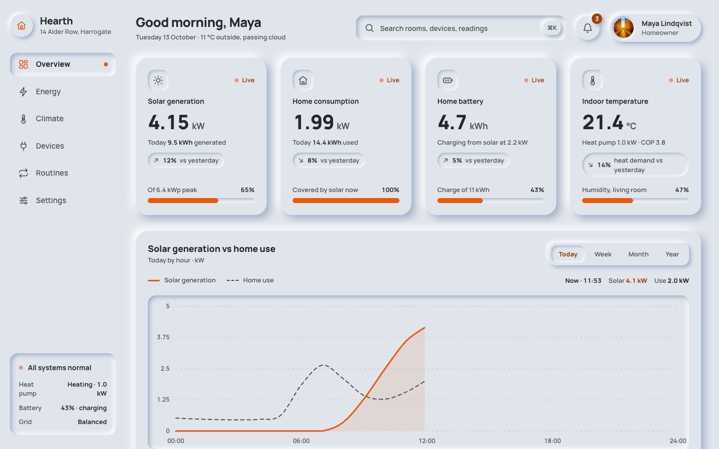
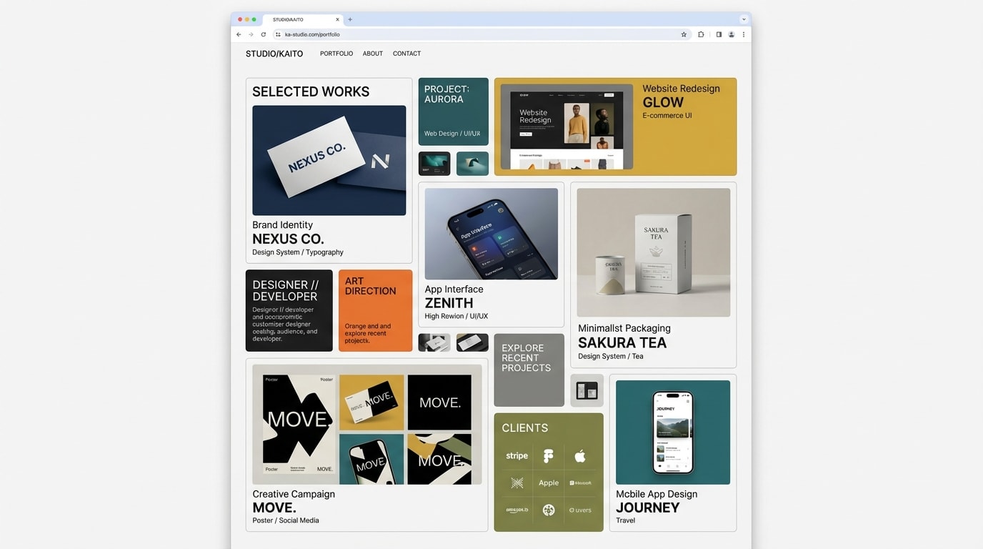
Create a neomorphism (soft UI) dashboard. Every element is moulded from one soft material, raised out of the surface or pressed into it, never placed on top of it.
Brief
Subject: Hearth — a home energy and climate dashboard for a family house with solar panels and a heat pumpFill the dashboard with realistic data for this subject: units, time ranges, device and room names, alerts. The data is what makes it believableIt is a working screen, not a landing page: one signed-in user, today's date, live readings that updateDesign Tokens
Use these exact values. Where the spec is silent, stay consistent with them.
colors:
  accent: "#e8590c"
  accentInk: "color-mix(in srgb, #e8590c 72%, #000)"
  background: "#e0e5ec"
  border: "color-mix(in srgb, #a3b1c6 45%, transparent)"
  muted: "color-mix(in srgb, #a3b1c6 45%, #000)"
  shadowDark: "#a3b1c6"
  shadowLight: "#ffffff"
  surface: "#e0e5ec"
  text: "color-mix(in srgb, #a3b1c6 22%, #000)"
fonts:
  body:
    fallback: "system-ui, -apple-system, 'Segoe UI', sans-serif"
    family: Manrope
    weights: [500, 600, 700]
  display:
    fallback: "system-ui, -apple-system, 'Segoe UI', sans-serif"
    family: Manrope
    weights: [800]
layout:
  breakpoints:
    columns: 1240px
    mobile: 640px
    tablet: 860px
  container: "full width: a 252px sidebar and a fluid main column"
  gutter: main padding 28px 36px 48px 20px; 24px 20px under 860px; 20px 16px under 640px
motion:
  durations:
    eventIn: 400ms
    meter: 600ms
    press: 200ms
    pulse: 2s
  easings:
    all: ease
radii:
  card: 24px
  control: "12px, 14px for nav items and search"
  pill: 999px
  well: 16px
shadows:
  inset: "inset 4px 4px 8px #a3b1c6, inset -4px -4px 8px #ffffff"
  insetSmall: "inset 2px 2px 5px #a3b1c6, inset -2px -2px 5px #ffffff"
  raised: "8px 8px 16px #a3b1c6, -8px -8px 16px #ffffff"
  raisedSmall: "4px 4px 8px #a3b1c6, -4px -4px 8px #ffffff"
spacing:
  cardPadding: "24px, 20px under 640px"
  gridGap: 28px
  mainGap: 32px between rows
type:
  body:
    font: body
    lineHeight: 1.5
    size: 15px
    tracking: 0
    weight: 500
  caption:
    font: body
    lineHeight: 1.4
    size: 13px
    tracking: 0
    weight: 500
  display:
    font: display
    lineHeight: 1
    size: 40px
    tracking: -0.03em
    weight: 800
  headline:
    font: display
    lineHeight: 1.2
    size: "26px, 22px under 640px"
    tracking: -0.02em
    weight: 800
  title:
    font: display
    lineHeight: 1.3
    size: 18px
    tracking: -0.01em
    weight: 800
Style Rules
One base colour for the page and every component; depth comes only from the light and dark shadowsRaised for things you can press (cards, buttons, discs, knobs); pressed for things that hold content or are active (inputs, wells, chart, selected items)Pressing a control moves it from raised to pressed over 200ms; active states also take the accent or accent-ink, so state never depends on shadow aloneThe accent is for live values, active states, chart lines and fills; text in the accent's hue uses accent-inkLabels in sentence case, weight 600–700; readings large, weight 800, tabular figures, with the unit smaller and mutedRadii scale with size: 24px cards, 16px wells and popovers, 12–14px controls, full circles for round controlsPage Layout
┌ sidebar 252px ┐┌ main ─────────────────────────────────────────────────────────┐
│ (◉) Name      ││ Greeting, name          [⌕ pressed search    ⌘K]  (bell·3) (◐ name) │
│   place       ││                                                              │
│ ▣ Overview ●  ││ ( stat )   ( stat )   ( stat )   ( stat )      raised ×4     │
│   Energy      ││ well·label·live / 4.82 kW / total / (trend) / [meter]        │
│   Climate     ││                                                              │
│   Devices     ││ ( Chart title · sub ·········· [Today|Week|Month|Year] )     │
│   Automations ││ ( legend ························ readout )                 │
│   Settings    ││ ( [ pressed well: accent line + area, dashed comparison ] )  │
│               ││ ( [sum] [sum] [sum] [sum] )                                  │
│ [ pressed     ││ ( Recent activity ) 1fr  ( Quick actions ) 1.45fr            │
│   status ]    ││ ( ◯ event · time  )      ( (dial) │ switches ··· [●─] )      │
└───────────────┘│ ( ◯ event · time  )      ( −  +   │ slider ━━━○──── )        │
                 │                          ( ◯ ◉ ◯ modes )                     │
                 └──────────────────────────────────────────────────────────────┘
( ) raised   [ ] pressed
Sections
Sidebar Navigation — A 252px column, sticky and full height, 28px 20px padding; brand at the top, nav 32px below with 8px between items, the footer card pushed to the bottomContent:Five or six nav items from the subject's areasA footer card with a live system statusComponents:Brand: a 46px raised-small circle with the logo mark in the accent, the product name (20px, 800) and a one-line place or plan in muted captionNav item: 22px icon and label, padding 12px 16px, 14px radius, muted weight 600; hover raises it (raised-small) and darkens the label; the current page is pressed (inset), weight 800, its icon in the accent and an 8px accent dot at the rightFooter card: a pressed panel with a status line and two or three key-value rowsMobile: Under 860px it becomes a bottom bar fixed to the viewport (shadow 0 -6px 16px of the dark shadow at 55%): icons above 11.5px labels, the current dot under the icon; brand and footer card hiddenTop Bar — One row with a 20px gap: greeting (grows), search (max 420px), then notifications and profileContent:A greeting with the user's first name (title size 26px, 800) and today's date with one live condition in mutedThree notifications from the subjectComponents:Search: pressed field (inset), 14px radius, padding 14px 48px, search icon inside on the left and a raised-small ⌘K key on the rightNotifications: 48px round raised-small button with a raised count badge in accent-ink; pressing it presses the button and opens a raised popover listing three alerts, each in a pressed-small rowProfile: a raised-small pill with the photo, name and roleStates:Popover closes on Escape and outside click; the button carries aria-expandedMobile: Under 640px the search moves to its own full-width row; the profile shows only the photoStats Cards Row — Four raised cards (24px radius, 24px padding) in a row with a 28px gapContent:Four of the subject's most important live readings, each with a daily total and a comparisonComponents:Stat card: a 42px pressed-small well with the icon, the label (14px, 700) and a live tag with a pulsing 8px accent dot; the reading in display size with its unit; one muted line with a key total; a pressed-small trend pill with an arrow and a percentage; a 10px pressed meter with an accent fill where a share appliesMobile: Two columns under 1240px, one under 640px with a 22px gapMotion: The live dot pulses opacity 1 → 0.35 every 2s; values update every few secondsChart Section — A full-width raised card: title and sub-line left, segmented control right, then legend, chart well and the summary row 20px belowContent:Today's main series against consumption or a target, by hourFour summary totals for the periodComponents:Segmented control: a raised-small strip with four time ranges; the selected one is pressed-small in accent-ink weight 800Legend: a 3px accent line swatch and a 2px dashed muted swatch, plus a readout that shows the hovered time's valuesChart well: pressed (inset), 16px radius; dashed grid lines in the dark shadow colour at 70%; the main series as a 3px accent line over a 10% accent area; the comparison as a 2px dashed muted line; a hover line follows the pointer or arrow keysSummary: four raised-small tiles (12px radius) with a label and a 22px weight 800 valueMobile: The summary goes to two columns under 860px; the readout drops under the legendRecent Activity — A raised card left of quick actions, 1fr / 1.45fr with a 28px gap; header with a raised-small 'View all' buttonContent:Six events from devices, automations and alerts, newest first, with exact timesComponents:Event row: a 40px raised-small round icon (accent for alerts), the title (14px, 700) with an optional pressed accent-ink tag, a muted detail line, the time right-aligned; rows split by 1px border-colour rulesMobile: Full width under 1240pxMotion: A new event fades in from translateY(-4px) over 400msQuick Actions — A raised card with two columns: the dial, buttons and modes on the left, the switch rows and slider on the right, 32px gapContent:The dial controls the subject's main setpoint with a live 'now' valueThree modes with their values; four automations as switches with a one-line description; one limit as a sliderComponents:Dial: a 220px raised circle with a pressed ring 18px inside, an SVG arc track in the dark shadow at 45% and an 8px accent value arc with a knob; a raised-small 124px face shows the target in accent-ink at 34pxRound buttons: 48px raised-small, minus and plus, pressing in while heldMode discs: 58px raised-small circles with icon and label; the active mode is pressed (inset) with the icon in the accentSwitch: a 62×32px raised-small track with a 22px knob; on, the track is pressed and the knob slides 28px and fills with the accentSlider: a 12px pressed track with an accent fill and a 26px raised-small thumb that presses in while dragged; the value in accent-inkStates:Every control is a real button or input with aria-pressed or a value, focusable, with the accent focus ringMobile: One column under 640px; switch rows hide their on/off wordImagery & Icons
Icons: 22px inline SVG stroke icons, 1.8px stroke, round caps and joins, in the muted colour; the accent marks the active or live oneThe profile photo is a 40px picsum portrait in a pressed ring; no other photosCharts, the dial and meters are inline SVG and CSS; no chart librariesImplementation Notes
Every colour and shadow is a custom property derived from the four colour variables, so changing the base re-skins the whole screenLive values tick with small random changes every few seconds; the chart readout, popover, switches, modes, dial and slider workDon'ts
No borders, outlines or background fills on cards and controls: depth is shadow onlyNo state shown by shadow alone: every pressed or active state also changes its icon or label colourNo accent-coloured body text: accent text uses accent-inkNo all-caps labels, decorative gradients or coloured card backgroundsNo marketing sections, hero headline or footer: this is the app screen onlyNo fonts, colours, radii or shadows outside the design tokens and rules aboveNo sections, features or effects that this spec doesn't listNo placeholder copy (lorem ipsum, "Elevate your workflow"): every word comes from the subjectNo pill-shaped eyebrow labels above headings and no gradient text, unless this spec asks for themNo grid of identical icon cards: vary size and emphasis by importanceQuality Floor
Mobile-first and responsive from 360px to 1440px and wider, with no horizontal scrollingText contrast meets WCAG 2.1 AA: 4.5:1 for body text, 3:1 for large textSemantic landmarks (header, nav, main, section, footer), one h1, descriptive alt textEvery interactive element has hover, visible focus and active states and works from the keyboardHonour prefers-reduced-motion: keep opacity fades, drop movementTech Stack
Framework: HTML/CSS/JS — Deliver one self-contained index.html: styles in a <style> block, scripts in a <script type="module"> block, no build step.Styling: Vanilla CSS — Plain CSS. Declare every design token as a custom property on :root (--color-accent, --font-display, --radius-card…) and use only those properties for colours, fonts, radii, shadows and timing.Language: JavaScript — JavaScript as ES modules; no TypeScript.UI library: None — No component library: build every component from the design tokens.Motion: CSS only — CSS transitions and keyframes only, with durations and easings from the design tokens.Icons: Inline SVG — Inline SVG icons drawn for this style, with one stroke width and corner treatment across the page.Acceptance Checklist
The page and every component share the base colour; there are no borders, fills or gradients on componentsRaised and pressed states use only the four shadow tokens, all built from the two shadow variablesThe current nav item, the pressed segmented button, the active mode and the 'on' switches are pressed in and also change colourThe accent appears only on live values, active states, chart lines, meters and focus rings; accent text uses the accent-ink colourText and muted text pass 4.5:1 against the base colourStat readings are 40px weight 800 tabular figures with their unit beside themThe chart is inline SVG with a solid accent line, a 10% accent area, a dashed muted comparison line and a keyboard-inspectable readoutToggles, mode discs, the segmented control, the dial buttons and the slider really change state over 200msUnder 860px the sidebar becomes a fixed bottom bar; under 640px everything is one columnUnder reduced motion the live pulse stops and transitions become instant