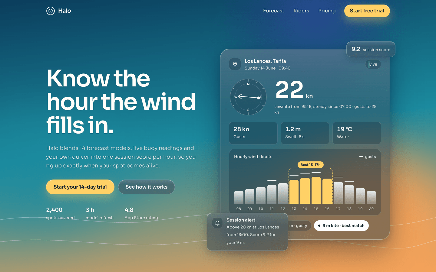
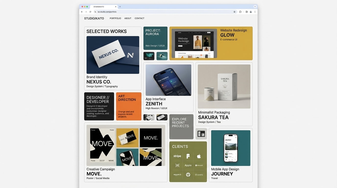
Create a single-page landing page in glassmorphism: frosted, translucent panels floating over a vivid, atmospheric scene. Premium, airy and full of light.
Brief
Subject: Halo — a wind and wave forecast app for kitesurfers and sailorsEvery word, number and readout comes from the subject's world: real feature names, plausible measurements, prices and named users with contextThe background scene comes from the subject too (for a wind and wave app: a dusk sky over water), never a generic purple washDesign Tokens
Use these exact values. Where the spec is silent, stay consistent with them.
colors:
  accent: "#ffd166"
  accentGlow: "color-mix(in srgb, #ffd166 40%, transparent)"
  background: "linear-gradient at 172deg through #0b3d5c → #1b8a9e → #f4a259, stops spread evenly; the first stop is the solid page colour under it"
  border: "rgb(255 255 255 / calc(0.15 * 2))"
  fallback: "#0a344c at 94% opacity"
  fallbackStrong: "#0e4862 at 97% opacity"
  live: "#6ff0c8"
  muted: "color-mix(in srgb, #ffd166 3%, rgb(255 255 255 / 0.88))"
  onAccent: "#10212c"
  surface: rgb(255 255 255 / 0.15)
  surfaceStrong: rgb(255 255 255 / calc(0.15 + 0.11))
  text: "color-mix(in srgb, #ffd166 3%, #ffffff)"
  tint: rgb(6 30 48 / calc(0.4 + 0.15))
  tintStrong: rgb(6 30 48 / calc(0.5 + 0.15))
effects:
  blobNight: "44vmax circle, top -20vmax, right 6vw: radial-gradient(circle, rgb(52 70 160 / 0.75), rgb(30 50 120 / 0.35) 45%, transparent 70%)"
  blobSun: "52vmax circle, bottom -18vmax, right -10vmax: radial-gradient of the gradient's last stop at the centre and at 34%, the last stop at 55% alpha at 52%, transparent at 70%"
  blobSwell: "56vmax × 38vmax ellipse, top 34vh, left -18vmax: radial-gradient of the gradient's middle stop at 85% alpha, at 40% alpha at 45%, transparent at 70%"
  blobs: "position absolute, border-radius 50%, filter blur(50px), behind everything"
  glassBlur: "backdrop-filter: blur(16px) saturate(140%), with the -webkit- prefix"
  highlight: "linear-gradient(180deg, rgb(255 255 255 / 0.14) 0%, transparent 32%), layered over the glass fill"
  insetHighlight: inset 0 1px 0 rgb(255 255 255 / 0.5)
  navGlass: "background rgb(8 40 62 / 0.35) with a white 12% layer, glass blur, 1px bottom border at 22% white, shadow 0 10px 30px rgb(4 22 38 / 0.2)"
  textShadow: 0 1px 2px rgb(4 24 40 / 0.28) on all text except text on accent or white
fonts:
  body:
    fallback: "system-ui, -apple-system, 'Segoe UI', sans-serif"
    family: Sora
    weights: [300, 400]
  display:
    fallback: "system-ui, -apple-system, 'Segoe UI', sans-serif"
    family: Sora
    weights: [600]
layout:
  breakpoints:
    heroColumns: 1000px
    mobile: 760px
    small: 560px
  container: 1200px including the gutters
  gutter: "32px, 20px under 760px"
motion:
  durations:
    button: 350ms
    fade: 900ms
    lift: 450ms
    nav: 400ms
    settle: 1100ms
  easings:
    all: "cubic-bezier(0.2, 0.8, 0.2, 1)"
radii:
  control: 999px
  hero: 30px
  inner: "12px, 18px for chart tiles"
  panel: 22px
  small: 16px
shadows:
  hero: "0 40px 90px rgb(4 22 38 / 0.42), 0 8px 24px rgb(4 22 38 / 0.2)"
  hover: 0 26px 60px rgb(4 22 38 / 0.34)
  panel: 0 18px 48px rgb(4 22 38 / 0.28)
  primaryButton: "0 12px 30px accentGlow, inset 0 1px 0 rgb(255 255 255 / 0.6)"
  small: 0 10px 26px rgb(4 22 38 / 0.22)
spacing:
  heroBottom: "96px, 64px under 1000px"
  heroTop: "150px, 120px under 1000px"
  panelPadding: 26px; 40px for the wide feature and the footer
  section: "104px top and bottom, 72px under 1000px"
type:
  body:
    font: body
    lineHeight: 1.6
    size: 1rem; lead text 1.05–1.2rem
    tracking: 0
    weight: 300
  caption:
    font: body
    lineHeight: 1.45
    size: 0.82rem
    tracking: 0
    weight: 400
  display:
    font: display
    lineHeight: 1.02
    size: "clamp(2.7rem, 7.2vw, 4.75rem)"
    tracking: -0.045em
    weight: 600
  headline:
    font: display
    lineHeight: 1.1
    size: "clamp(2rem, 4.4vw, 3rem)"
    tracking: -0.035em
    weight: 600
  title:
    font: display
    lineHeight: 1.25
    size: 1.18rem
    tracking: -0.02em
    weight: 600
Style Rules
The scene is fixed behind the page: the primary gradient at 172° with three soft blobs and a horizon line, so the blur always has light and colour to refractEvery panel is glass: the dark tint first, then the glass fill and the top highlight as background layers, a 1px glass border, an inset 1px highlight on the top edge, the depth's shadow, and the blur with saturate(140%)Depth follows importance: small glass for chips and floating cards, panel glass for content, hero glass for the product panel and the recommended tierText is near-white with the text shadow; the dark tint under the glass rises with the glass opacity to keep body text readable over the brightest blobThe accent is a signal: only the primary buttons and the highlighted window in the hero chart, with on-accent textHeadings in weight 600 with tight negative tracking; body copy in weight 300; numbers in weight 600 with tabular figuresEverything aligns to the container's left edge; section heads sit above their content, max 640px wide, 40px above itInner tiles (stats, charts, inputs) add a layer of rgb(6 30 48 / 0.25) and a 1px border at 16% whitePage Layout
scene (fixed): gradient 172° · sun blob bottom-right · swell blob left · night blob top-right · horizon lines
container 1200px incl. gutters
◯ Logo ·························· Link  Link  Link  [Trial]   ← nav, glass after scroll
Headline (≤ 12ch)                  ╭─ chip ─╮                 ← hero, ≥ 100vh
Subtext (≤ 44ch)             ╭──────────────────────────╮
[Primary] [Glass]            │ ▣ Place · date     ● Live │
12 · 3h · 4.8                │ (dial) 22 kn  detail      │
                             │ [stat][stat][stat]        │
                             │ ▁▃▅▆[▇▇▇▇]▅▃▁  hours        │
                             │ (chip)(chip)(●match)      │
                          ╭alert╮──────────────────────╯
Section headline / sentence                                   ← features
╭──────────── wide panel: copy │ 7-day score bars ─────────╮
╰──────────────────────────────────────────────────────────╯
╭ icon/title/fact ╮ ╭ icon/title/fact ╮ ╭ icon/title/fact ╮
╭──── lead quote ────╮ ╭ quote ╮                              ← social proof
│                    │ ╰───────╯
╰────────────────────╯ ╭ quote ╮
rating · users · spots
╭ tier ╮ ╭ RECOMMENDED (raised, strong glass) ╮ ╭ tier ╮     ← pricing
╭ newsletter [email····][Subscribe] │ Product Company Help ╮  ← footer panel
╰ © year ······································ legal ╯
Sections
Navigation Bar — Fixed to the top, 72px tall, logo left and links right inside the container. Transparent at the top of the page; after 24px of scroll it becomes the nav glass barContent:Logo with the product nameThree section links, then a trial buttonComponents:Logo: a 30px inline SVG mark and the product name in title size, weight 600, -0.03em, 10px apartLinks: body size, weight 400, padding 10px 14px, pill radius; hover fills them with white at 14%A small primary button (padding 10px 18px) closes the rowStates:The dropdown fades in from translateY(-8px) over 300msMenu button has aria-expandedMobile: Under 760px the links collapse behind a 44px glass menu button; it opens a glass dropdown 16px from both edges with full-width links and the button at the bottomHero — At least the full viewport tall, content vertically centred, 150px top and 96px bottom padding. Two columns 1fr / 1.08fr with a 56px gap: headline (display, max 12ch), subtext 22px below (max 44ch), buttons 32px below with a 12px gap, meta row 40px below; the hero panel on the rightContent:Headline: 5–8 words naming the moment the product predicts, ending in a full stopSubtext: one sentence on what the product combines and what the user getsButtons: a free-trial verb phrase and 'See how it works'Meta row: three figures from the subject (spots covered, update interval, rating), each a title-size number over a captionComponents:Primary button: accent fill, on-accent text, weight 600, padding 14px 24px, pill radius, accent glow shadow, white inset top lineSecondary button: glass fill at the glass opacity, 1px glass border, white textHero panel (hero depth, 28px padding): header row with a 40px location tile, the place name and date, and a 'Live' chip with a 7px live-colour dot; a 'now' row with a 128px wind-direction dial in SVG beside a display-size reading and its unit, one detail line and three stat tiles; an hourly chart tile; a row of pill chips with the best match filled whiteHourly chart: 13 bars with a vertical white gradient and 6px top radius, a 2px gust tick above some bars, hour labels below; four consecutive bars form the best window, filled with the accent and framed by a 1px dashed accent outline labelled by a small accent chip with on-accent textTwo small floating glass cards on the hero panel: an alert card overlapping its bottom-left corner by 44px and 36px, and a one-figure chip overlapping its top-right cornerMobile: Under 1000px one column with the panel below the copy and the floating cards back in the flow under it; padding 120px top, 64px bottomMotion: Headline, subtext and meta fade up 12px over the fade duration with 80ms staggers; the hero panel settles in after themFeatures — Section head (max 640px wide) above a three-column grid with a 22px gap: the first feature is a wide panel spanning all three columns, the other three are compact panels belowContent:Section head: a headline about the outcome and one sentence on how it differs from raw dataFour features named after real capabilities, each with one sentence and one fact with a numberComponents:Feature panel: a 48px icon tile, the title 18px below, the sentence 10px below, then a fact line under a 1px rule at 18% white with its key figure in weight 600Wide panel: copy on the left and a 7-day score chart on the right, 1fr / 1.15fr, 48px gap; each day is a 120px track with a bar from the bottom, its score in weight 600 and the weekday belowMobile: Under 760px one column; the wide panel stacks its chart under its copyMotion: Panels lift 5px on hover over the lift durationSocial Proof — Two columns 1.25fr / 1fr with a 22px gap: the lead quote spans two rows in a 44px-padded panel with the quote in light lead size; two shorter quotes stack on the right. The rating row sits 28px belowContent:Section head: one line on who trusts the productThree quotes from named users with a role and a place: the lead quote tells a specific session or result; the two short ones each name one featureRating row: three figures (store rating, number of users, spots covered)Components:Quote panel: a 34px quote-mark SVG at 80% opacity, the quote, then the person row: avatar, name in weight 600, role and place in muted captionMobile: Under 860px one column, lead quote firstPricing — Three columns with a 22px gap, aligned to the top; the recommended middle tier is raised 18px above the othersContent:Section head: one line on choosing a plan and one on the trialThree tiers from the subject: a free tier, a personal tier and a team tier, with real prices and limitsA footnote on cancelling and refundsComponents:Tier: name in title size, a one-line audience, the price in headline size weight 600 with '/ year' beside it, a billing note, 5–6 lines with 18px check icons, and a full-width button pinned to the bottomRecommended tier: strong glass, hero radius and shadow, a white 'Most popular' tag with on-accent text, the primary button; the others use the secondary buttonMobile: Under 900px one column with the recommended tier first; it is no longer raisedFooter — One large glass panel (40px padding) inside the container with 24px above and 40px below: newsletter on the left and link columns on the right, 1.2fr / 1fr with a 56px gap; the bottom row sits under a 1px rule 32px belowContent:Newsletter name, one sentence on what it sends and whenThree link columns: Product, Company, HelpBottom row: © year and the company, and the legal linksComponents:Newsletter: pill email input with a 1px glass border over the dark tint, 14px 18px padding; secondary 'Subscribe' button beside it; a caption note below for the confirmationLink columns: a caption-size heading in weight 600 and 3–4 muted links each; hover goes to the text colour with an underlineStates:On submit the note confirms the address in one lineMobile: Under 860px the newsletter stacks above the link columns; under 560px the panel padding drops to 28pxImagery & Icons
No photos: the product panel, charts, dial and avatars are HTML, CSS and inline SVGIcons: 26px inline SVG stroke icons, 1.75px stroke in the text colour, each inside a 48px glass icon tile with a 14px radiusThe horizon: one inline SVG of two soft wave lines across the bottom 32vh of the scene, white strokes at 35% opacityAvatars: 46px circles with initials on a 135° gradient between two colours of the primary gradient, 1px border at 40% whiteImplementation Notes
Under @supports not (backdrop-filter: blur(1px)) every panel drops its layers for the fallback colour and the strong glass for the strong fallbackBlur is halved under 760px to keep scrolling smoothThe nav scroll state, the mobile menu and the newsletter confirmation are the only JavaScriptDon'ts
No glass over a flat colour: every panel sits over the gradient sceneNo identical panels: size, radius and depth follow importanceNo accent on headings, icons, borders or decorative shapesNo coloured glow or neon edge on panels or text; shadows are the dark blue-black ones in the tokensNo blur on text or icons, and no blobs placed in front of contentNo fonts, colours, radii or shadows outside the design tokens and rules aboveNo sections, features or effects that this spec doesn't listNo placeholder copy (lorem ipsum, "Elevate your workflow"): every word comes from the subjectNo pill-shaped eyebrow labels above headings and no gradient text, unless this spec asks for themNo grid of identical icon cards: vary size and emphasis by importanceQuality Floor
Mobile-first and responsive from 360px to 1440px and wider, with no horizontal scrollingText contrast meets WCAG 2.1 AA: 4.5:1 for body text, 3:1 for large textSemantic landmarks (header, nav, main, section, footer), one h1, descriptive alt textEvery interactive element has hover, visible focus and active states and works from the keyboardHonour prefers-reduced-motion: keep opacity fades, drop movementTech Stack
Framework: HTML/CSS/JS — Deliver one self-contained index.html: styles in a <style> block, scripts in a <script type="module"> block, no build step.Styling: Vanilla CSS — Plain CSS. Declare every design token as a custom property on :root (--color-accent, --font-display, --radius-card…) and use only those properties for colours, fonts, radii, shadows and timing.Language: JavaScript — JavaScript as ES modules; no TypeScript.UI library: None — No component library: build every component from the design tokens.Motion: CSS only — CSS transitions and keyframes only, with durations and easings from the design tokens.Icons: Inline SVG — Inline SVG icons drawn for this style, with one stroke width and corner treatment across the page.Acceptance Checklist
The background is the full-viewport gradient with the three named blobs and the horizon line, fixed behind every panelEvery panel uses the glass recipe: tint, fill, top highlight, 1px border, inset highlight, blur and saturatePanels come in three depths (small, panel, hero) and the recommended pricing tier uses the strong glassThe hero product panel shows a working app view with live numbers, an hourly chart and a highlighted window in the first 1440×900 viewportThe accent appears only on primary buttons and the chart's highlighted windowAt the default opacity, text on glass passes 4.5:1, helped by the dark tint and the text shadowContent sits in a 1200px container that includes 32px gutters (20px under 760px)The navigation turns into a glass bar after 24px of scroll and into a glass dropdown under 760pxHero panels settle in on load; under reduced motion they only fade, and hover lifts stop movingWithout backdrop-filter support every panel falls back to the opaque fallback colour