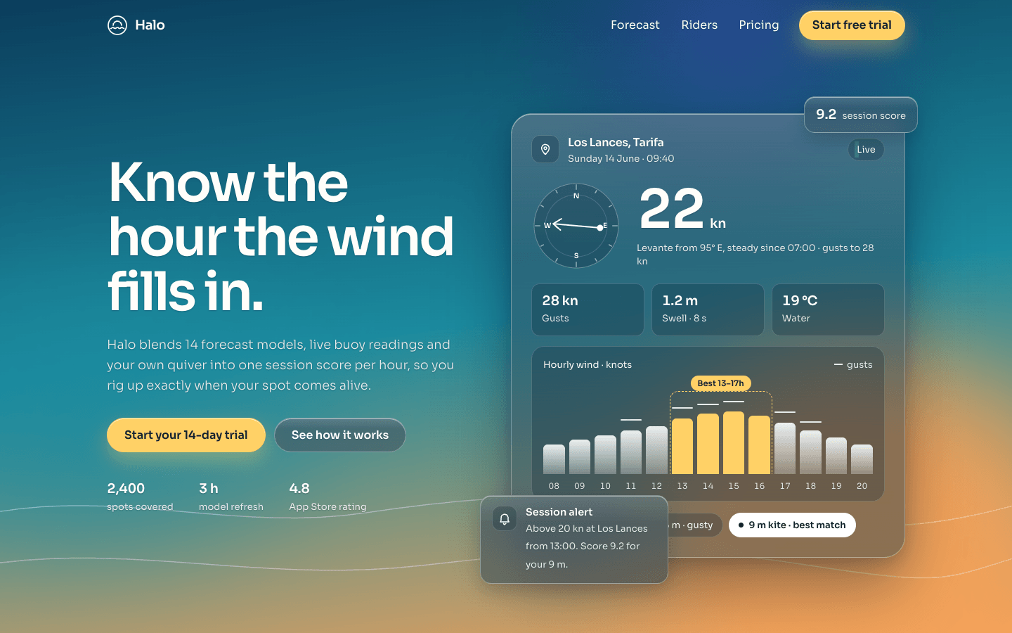
Create a modern, single-page landing page using a glassmorphism design style: frosted, translucent panels floating over a vivid, atmospheric background. It should feel premium, airy and full of light.
Brief
Subject: Halo — a wind and wave forecast app for kitesurfers and sailors
Ground every visual and every word in this subject. Invent a plausible product name, real feature names, numbers, prices and testimonials — no lorem ipsum, no "Elevate your workflow" filler
The background should come from the subject's world (for a weather app: a dusk sky over water), not a generic purple wash
Design Requirements
Background: Full-viewport gradient (#0b3d5c → #1b8a9e → #f4a259) with two or three large, soft colour shapes behind the glass so the blur has something to refract — glass over a flat colour looks like nothing
Glass panels: rgba(255,255,255,0.15) fill, backdrop-filter: blur(16px) saturate(140%), 1px translucent white border and a faint top highlight. Vary panel size and depth by importance — not every box the same
Colour: White text on glass; accent (#ffd166) reserved for the primary CTA and one data highlight
Typography: Sora; hero heading 4–5rem with tight tracking, light weights for body, lines under 70 characters
Layout: A hero with a large glass "product" panel showing real UI from the subject, then content that steps down in scale
Sections to Include
Navigation Bar — Logo left, 3–4 links right; turns into a glass bar once you scroll
Hero — Headline that says what the product does, one line of subtext, primary CTA (accent fill) and secondary glass CTA, beside a large glass panel showing the product in use
Features — Three or four features as glass panels of different sizes (one wide, others compact), each with a small custom icon and a concrete benefit
Social Proof — Two or three testimonials from believable users, with names and context
Pricing — Three tiers on glass; the recommended tier more opaque and slightly raised
Footer — Minimal links and a newsletter field on glass
Technical Details
Responsive, mobile-first; panels stack and the blur radius drops on small screens
Solid fallback background where backdrop-filter isn't supported
Text on glass meets WCAG AA contrast — darken the glass or add a soft text shadow where needed
One orchestrated hero entrance (panels settle into place); hover is a gentle lift, not a glow on everything
Visible keyboard focus; honour prefers-reduced-motion
No all-caps eyebrow labels above headings, and don't colour a single word of the headline