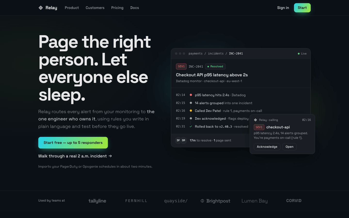
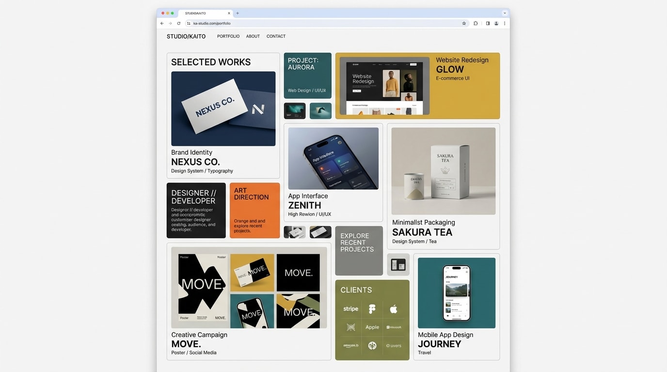
Create a gradient-led modern SaaS landing page: a dark canvas where saturated gradients carry the energy. Gradients should behave like light sources and signals, not wallpaper.
Brief
Subject: Relay — on-call alert routing for small engineering teams
Write real product copy: the name, what it does in one sentence, feature names, integrations, prices, customer quotes with roles. No "Supercharge your workflow" filler
Design Requirements
Base: Dark background (#0b1016) lit by a gradient from #22d3ee to #a3e635
Where gradients go: the glow behind the hero product, primary buttons, a hairline gradient border on the recommended pricing tier, and gradient text on at most one whole headline (never a single word or half a headline). Everything else stays calm and neutral
Typography: Space Grotesk; extra-bold, tightly tracked headlines; body in a lighter weight at a comfortable size
Product visual: Build a convincing product UI in HTML/CSS (e.g. an alert timeline, a routing-rule editor) — never a grey rectangle
Sections to Include
Hero — Clear headline, subtext, primary gradient CTA plus a secondary text CTA, and the product UI floating on a soft gradient glow beside the copy — visible in the first viewport, not pushed below it
Logos Bar — "Used by" row of 5–6 invented company wordmarks in muted grey
Features — Three features with real detail; the most important one gets a larger panel with a mini UI demo
Product Demo — Large product view with annotated callouts explaining what you're looking at
Testimonials — Two or three quotes with name, role and company
Pricing — Three tiers plus a short comparison table; the recommended tier gets the gradient border
CTA Section — Gradient band with a headline and email signup
Footer — Link columns, status and social links
Technical Details
Gradient text via background-clip: text with a solid-colour fallback
One slow animated gradient (the hero glow) — nothing else loops
Mobile-first responsive layout; CSS gradients and inline SVG, no heavy images
Visible focus states; respect prefers-reduced-motion
No pill "eyebrow" badges above headings and no grid of identical icon cards