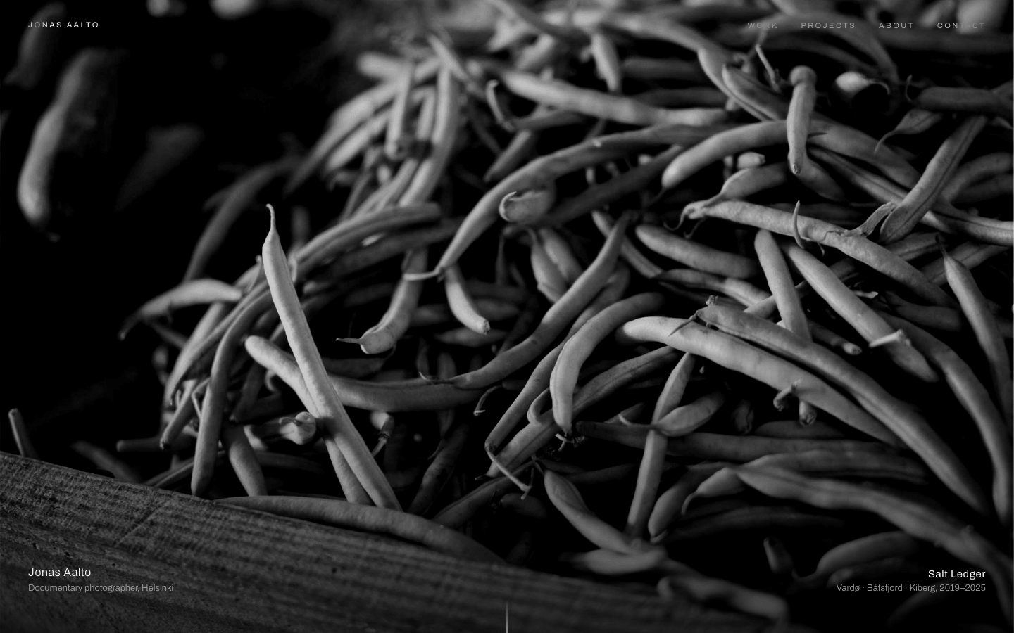
Create a monochrome photography portfolio where the photographs do all the talking. Black, white and greys only: the interface should almost disappear.
Brief
Subject: the portfolio of Jonas Aalto, a documentary photographer working on long-term projects in Nordic fishing townsUse real-feeling project titles, places, years, publications and a short statement in the photographer's own voiceThe photographs do all the talking: the interface is small, quiet text at the edges of full-bleed imagesDesign Tokens
Use these exact values. Where the spec is silent, stay consistent with them.
colors:
  accent: "#ffffff"
  background: "#000000"
  border: "color-mix(in srgb, #e5e5e5 10%, #000000)"
  borderStrong: "color-mix(in srgb, #e5e5e5 25%, #000000)"
  dim: "color-mix(in srgb, #e5e5e5 52%, #000000)"
  muted: "color-mix(in srgb, #e5e5e5 70%, #000000)"
  surface: "color-mix(in srgb, #e5e5e5 5%, #000000)"
  text: "#e5e5e5"
effects:
  captionGradient: "linear-gradient(to top, background at 82%, transparent), 48px top padding"
  imageDefault: "grayscale(100%) contrast(1.12)"
  imageInterlude: "grayscale(100%) contrast(1.3) brightness(0.7)"
  imageLanding: "grayscale(100%) contrast(1.25) brightness(0.78), under linear-gradient(to top, background at 70%, transparent 40%)"
  imagePortrait: "grayscale(100%) contrast(1.2)"
  selection: accent background with background-coloured text
fonts:
  body:
    fallback: "'Helvetica Neue', Arial, sans-serif"
    family: Archivo
    weights: [300, 400]
  display:
    fallback: "'Helvetica Neue', Arial, sans-serif"
    family: Archivo
    weights: [200]
layout:
  breakpoints:
    mobile: 640px
    tablet: 1024px
  container: "full bleed: text sits inside the gutters, images run edge to edge or inside 6px padding"
  gutter: "clamp(16px, 3vw, 40px); 6px between images"
motion:
  durations:
    caption: 1s
    hoverScale: 1.6s
    link: 400ms
    reveal: 1.4s
    underline: 500ms
  easings:
    all: "cubic-bezier(0.22, 0.61, 0.36, 1)"
radii:
  everything: 0
  reelButtons: "50%"
shadows:
  everywhere: none
spacing:
  section: "clamp(80px, 14vh, 160px) above each section head; section heads clamp(32px, 6vh, 64px) above content"
type:
  body:
    font: body
    lineHeight: 1.6
    size: 16px; secondary paragraphs 14px
    tracking: 0
    weight: 300
  caption:
    font: body
    lineHeight: 1.5
    size: 12–13px
    tracking: 0.04em
    weight: 300
  display:
    font: display
    lineHeight: 0.88
    size: "clamp(56px, 11vw, 168px)"
    tracking: -0.045em
    weight: 200
  headline:
    font: display
    lineHeight: 0.95
    size: "clamp(40px, 7vw, 104px)"
    tracking: -0.03em
    weight: 200
  title:
    font: body
    lineHeight: 1.4
    size: 15px
    tracking: 0.04em
    weight: 400
Style Rules
Black, white and greys only: background, text and accent are the variables; every grey is the text colour mixed into the backgroundFull-viewport moments (landing, interlude, about) alternate with dense 6px-gap image gridsType is light and small: weight 300 body at 16px, weight 200 for headlines, 11–15px for every label and captionUppercase with 0.22em tracking at 11px is only for the navigation and footer linksStrong size contrast: headlines at 40–168px against 12–15px captions, nothing in between but the about statementText sits at the edges, inside the gutters; photographs run edge to edgeMotion is slow and quiet: opacity fades and the 1.03 hover scale, with the soft easingPage Layout
full bleed; text inside clamp(16px, 3vw, 40px) gutters
JONAS AALTO ································ WORK  PROJECTS  ABOUT  CONTACT   ← fixed nav, difference blend
████████████████████ landing photo, 100svh ████████████████████████████
█ Name / role, city                  │                  Current project █
█                                    │ cue          places, years     █
Selected                                    note, max 30ch, right      ← gallery head
work
[ ▯ ][ ▭ ][ ▯ ]   masonry, 3 columns, 6px gaps, 12 photos
[ ▭ ][ ▯ ][ ■ ]   caption fades in on hover
████████████████████ interlude photo, 100svh ████████████████████████
█ "quote, max 36ch" — cite                                             █
Project                          │ paragraph, paragraph                ← project
SALT (168px)                     │ Format · Book · Supported by
LEDGER
[▯▯▯ frame ][ text ][▯▯ frame ][▯▯▯ frame ] →  reel, 82svh, snap
(←)(→) ━━━━─────── progress
[▯][▯][▯][▯][▯][▯]  contact strip, 4:5
████ portrait, 50% ████ │ statement, 28px                              ← about
████████████████████████ │ paragraphs / Publications │ Exhibitions
Write to                 │ ─ Commissions ─ Prints ─ Studio ─          ← contact
me                       │
NAME ________ EMAIL ________ MESSAGE ________ [Send message →]
© year Name ··························· INSTAGRAM  MAGNUM  EMAIL       ← footer
Sections
Landing — 100svh (min 560px), one full-bleed photo with the landing treatment and a bottom gradient; the meta row sits clamp(28px, 6vh, 56px) above the bottom, inside the guttersContent:The photographer's name, discipline and cityThe current project's title, places and yearsComponents:Navigation: fixed, padding 22px and the gutter, mix-blend-mode difference in the accent colour; the name as an uppercase mark on the left, four uppercase links on the right at 75% opacity going to 100% with a 1px underline growing from the left over 500msMeta: the name (title size, accent) over the role and city (13px, muted) on the left; the current project in weight 400 accent over its places and years (13px, muted) on the rightScroll cue: a 1px × 48px line fading from transparent to the accent, centred at the bottomMobile: Under 640px the meta stacks left-aligned, the scroll cue hides and the nav shows three linksGallery Grid — Section head with the section-top padding, then CSS columns: 3 columns, a 6px gap and 6px side padding, tiles 6px apart; the interlude follows after another section-top spaceContent:Headline 'Selected work'A one-sentence note on how many photographs from how many projectsTwelve titles with places and yearsOne quote from a subject of the workComponents:Section head: the headline on the left (two words, the second on a new line) and a 13px dim note right-aligned, max 30chTile: overflow hidden on the near-black surface; caption on hover and focus over a bottom gradient (black 82% → 0): the title in title size, accent, over place and year in caption sizeInterlude after the grid: a full-viewport photo with the interlude treatment and a quote bottom-left (max 36ch, clamp(18px, 2vw, 24px), weight 300, accent) with a caption-size citeMobile: 2 columns under 1024px, 1 column with no side padding under 640px; the head stacks left-alignedMotion: On hover the image scales to 1.03 over 1.6s and the caption fades in over 1sProject Pages — Intro with the section-top padding, the reel inside the gutters, controls 24px below, the strip afterContent:Project title in two wordsTwo paragraphs on the projectFormat, publisher and year, fundersSeven frames with titles, places and years; one paragraph in the text frameComponents:Intro: 2fr / 1fr aligned to the bottom; a 13px dim 'Project' label and the title in display size on two lines; on the right two short paragraphs (14px, muted, max 42ch) and a 12px definition list (Format, Book, Supported by) with dim termsReel: a horizontal flex row 82svh tall (min 420px) with 6px gaps, x-mandatory scroll snap and a 3px scrollbar; each frame is the photo at full height minus 64px with a caption row below (title in text colour on the left, place and year in dim on the right); one text frame (max 420px) holds a 17–21px paragraphControls: two 44px round buttons with 1px borders (← →, disabled at the ends at 30% opacity) and a 1px progress line (max 240px) whose accent fill follows the scroll positionContact strip after the reel: six 4:5 photos in a 6-column grid with 6px gapsStates:Arrow keys scroll the focused reel one frame; the buttons do the sameMobile: The intro stacks under 1024px; the reel is 70svh under 640px; the strip has 3 columns under 1024px and 2 under 640pxAbout — Two equal columns, at least 100vh: the portrait full-bleed on the left with a caption bottom-left; text on the right, vertically centred, padding clamp(64px, 12vh, 140px) clamp(24px, 6vw, 96px): the statement (clamp(20px, 2.1vw, 28px), weight 300, accent, max 30ch), paragraphs (14px, muted, max 52ch), lists 48px belowContent:A one-sentence statement in the photographer's voiceTwo paragraphs on background and methodFive publications and five exhibitions with yearsComponents:Lists: two columns under a 1px rule, headed 'Publications' and 'Exhibitions' in 13px dim; rows with a 44px year column in dim and the title in accent, 13px, split by 1px surface linesMobile: Under 1024px the portrait (80vh) sits above the text; under 640px the lists stackContact — 1.2fr / 1fr with a wide gap, generous padding: the headline 48px above a 560px form on the left; the representation blocks aligned to the bottom on the rightContent:Headline 'Write to me'Name, email and message fieldsRepresentation for commissions, prints and the studio addressComponents:Field: a 12px dim label, then an underline-only input (1px border-colour line, 17px accent text, 10px 0 12px padding); hover lightens the line, focus turns it accent and 2pxSubmit: 1px dim-bordered button, 13px, padding 16px 28px, with →; hover fills it with the accent and turns the text background-coloured over 500msRepresentation: three blocks between 1px rules, each with a 12px dim heading and the agency, person, an underlined email and a phoneStates:On submit a one-line muted note confirmsMobile: One column under 1024pxImagery & Icons
All photos from picsum.photos with ?grayscale and a seed per image, sized to their aspect ratio; every img also gets filter: grayscale(100%) contrast(1.12)Counts and ratios: landing 1 full-bleed; masonry 12 mixing 4:5, 2:3, 3:2 and 1:1; interlude 1 full-bleed; reel 7 at full height in their own ratios; contact strip 6 at 4:5; about portrait 1No icons except the ← → arrows of the reel controls, set as textImplementation Notes
Masonry with CSS columns and break-inside: avoid; image reveal with an IntersectionObserverThe footer: a 1px rule, © year and name on the left, uppercase social links on the right, 11px dimDon'ts
No colour of any kind, including in focus rings, selection, icons or form statesNo permanent text on photographs except the landing meta, the interlude quote and touch-screen captionsNo cards, borders around images, rounded corners or shadowsNo hover zoom beyond 1.03, no parallax and no lightboxNo bold weights: the heaviest weight is 400No fonts, colours, radii or shadows outside the design tokens and rules aboveNo sections, features or effects that this spec doesn't listNo placeholder copy (lorem ipsum, "Elevate your workflow"): every word comes from the subjectNo pill-shaped eyebrow labels above headings and no gradient text, unless this spec asks for themNo grid of identical icon cards: vary size and emphasis by importanceQuality Floor
Mobile-first and responsive from 360px to 1440px and wider, with no horizontal scrollingText contrast meets WCAG 2.1 AA: 4.5:1 for body text, 3:1 for large textSemantic landmarks (header, nav, main, section, footer), one h1, descriptive alt textEvery interactive element has hover, visible focus and active states and works from the keyboardHonour prefers-reduced-motion: keep opacity fades, drop movementTech Stack
Framework: HTML/CSS/JS — Deliver one self-contained index.html: styles in a <style> block, scripts in a <script type="module"> block, no build step.Styling: Vanilla CSS — Plain CSS. Declare every design token as a custom property on :root (--color-accent, --font-display, --radius-card…) and use only those properties for colours, fonts, radii, shadows and timing.Language: JavaScript — JavaScript as ES modules; no TypeScript.UI library: None — No component library: build every component from the design tokens.Motion: CSS only — CSS transitions and keyframes only, with durations and easings from the design tokens.Icons: Inline SVG — Inline SVG icons drawn for this style, with one stroke width and corner treatment across the page.Acceptance Checklist
There is no hue anywhere: background, text, greys and accent are the three variables and mixes of themEvery image is grayscale with the contrast and brightness given for its roleThe page alternates full-viewport photographs (landing, interlude, about portrait) with dense 6px-gap grids (masonry, contact strip)Letter-spaced uppercase appears only in the navigation and footer linksSection headlines are weight 200 at 40–104px; the project title reaches 168pxGallery tiles scale to 1.03 and fade in their caption on hover and focus; on touch screens captions are always visibleThe project reel scrolls horizontally with snap points, arrow buttons, a progress line and the keyboardThe navigation stays readable over any photo through mix-blend-mode: differenceImages fade in once as they enter the viewport, and appear instantly under reduced motionThe masonry goes 3 → 2 → 1 columns at 1024px and 640px