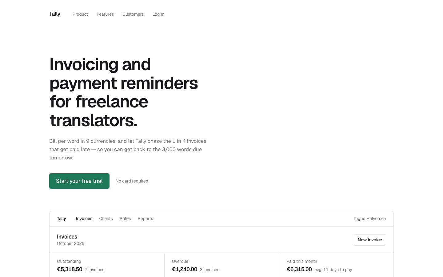
Create a minimalist startup landing page. Less, but better: generous whitespace, precise typography and one idea per section.
Brief
Subject: Tally — invoicing and payment reminders for freelance translatorsMinimal design needs exceptional copy. The headline says exactly what the product does and for whom; every line stays concrete (numbers, real features, a real-sounding customer)Design Tokens
Use these exact values. Where the spec is silent, stay consistent with them.
colors:
  accent: "#1f7a5a"
  accentHover: "color-mix(in srgb, #1f7a5a 78%, #000)"
  background: "#ffffff"
  border: "color-mix(in srgb, #18181b 12%, #ffffff)"
  muted: "color-mix(in srgb, #18181b 60%, #ffffff)"
  onAccent: "#ffffff"
  surface: "color-mix(in srgb, #18181b 2.5%, #ffffff)"
  text: "#18181b"
fonts:
  body:
    fallback: "ui-sans-serif, system-ui, sans-serif"
    family: Geist
    weights: [400, 500, 600]
  display:
    fallback: "ui-sans-serif, system-ui, sans-serif"
    family: Geist
    weights: [500, 600]
layout:
  breakpoints:
    mobile: 640px
    tablet: 900px
  container: 1120px
  gutter: "32px, 20px under 640px"
motion:
  durations:
    heroFade: 800ms
    hover: 150ms
  easings:
    heroFade: ease-out
    hover: ease
radii:
  control: 6px
  screen: 10px
shadows:
  everywhere: none
spacing:
  heroBottom: 72px
  heroTop: 88px
  navY: 32px
  sectionBottom: "160px, 104px under 640px"
  sectionTop: "64px, 48px under 640px"
type:
  body:
    font: body
    lineHeight: 1.6
    size: 1.0625rem
    tracking: 0
    weight: 400
  caption:
    font: body
    lineHeight: 1.45
    size: 0.875rem
    tracking: 0
    weight: 400
  display:
    font: display
    lineHeight: 1.08
    size: "3.5rem, 2.5rem under 640px"
    tracking: -0.035em
    weight: 600
  headline:
    font: display
    lineHeight: 1.08
    size: "3.5rem, 2.5rem under 640px"
    tracking: -0.035em
    weight: 600
  title:
    font: body
    lineHeight: 1.4
    size: 1.0625rem
    tracking: -0.01em
    weight: 600
Style Rules
One accent, used only for the primary button, links, the paid status and the feature icons; everything else is the text colour and its tintsThree type sizes: display, body and caption (title shares the body size); hierarchy comes from size and weight, never from colour or decorationEvery section after the product screen sits under a full-width 1px border-colour rule, starts 64px below it and ends 160px before the next: the space is the designEverything aligns to the container's left edge, hero and CTA included; headings are capped at 14ch and body copy at 46chNo shadows, gradients, background fills or patterns; the only filled shapes are the buttons and the status dotsThe product screen is the one rich element: a believable app view built in HTML/CSS with data from the subjectHover changes colour only: no movement, no underline animationNumbers use tabular figuresPage Layout
container 1120px, everything left-aligned
Logo  Link  Link  Link  Log in                         ← nav
Headline in display size (≤ 14ch)                       ← hero
Muted sentence (≤ 46ch)
[Primary button]  muted note
┌ App  Nav Nav Nav ·················· User ┐            ← product screen,
│ View title ················· [New …]     │              top edge in the
│ Stat │ Stat │ Stat                       │              first viewport
│ table: 6 rows · status dots              │
└ next action ············ Showing 6 of N  ┘
──────────────────────────────────────────── 1px rule
icon / Title / sentence  ×3 columns                     ← features
────────────────────────────────────────────
"Quote in display size (≤ 22ch)"                        ← social proof
Name / role, city
────────────────────────────────────────────
CTA headline (≤ 14ch)                                   ← cta
[email ················][Primary button]  ≤ 520px
muted note
────────────────────────────────────────────
© year Name ······················ Privacy Terms Contact ← footer
Sections
Navigation — Wordmark (body size, weight 600, -0.02em) followed by the links in caption size and muted colour; 40px between wordmark and links, 28px between links; everything left-aligned, 32px above and below, no background, border or sticky behaviourContent:Wordmark: the product nameLinks: three section names, then 'Log in'States:Links go from muted to text on hover; the wordmark goes to accentMobile: Gaps shrink to 24px and 18px; the third link is hiddenHero — Left-aligned. h1 in display size capped at 14ch; subtext 24px below in muted body capped at 46ch; actions 36px below: the primary button with the note 20px to its right. Padding 88px top, 72px bottomContent:Headline: 6–10 words saying what the product does and for whom, ending in a full stopSubtext: one sentence with a concrete number from the subjectButton: a free-trial verb phraseNote: a one-line reassurance in muted caption ('No card required')Components:Primary button: accent fill, white text, weight 500, padding 13px 22px, control radius; hover switches to the hover accentMobile: Padding 48px top and bottom; display size drops to 2.5remMotion: The hero fades in from translateY(6px) over the hero-fade duration; under reduced motion it fades without movingVisual — The product screen at full container width: 1px border, screen radius, caption size at line-height 1.45, 160px below. Its top edge sits inside the first 900px viewportContent:Six table rows from the subject's world: an ID, a client name with a muted sub-line, a quantity, an amount, a due date and a statusStats: outstanding, overdue and paid-this-month, each with a count or averageComponents:App bar: product name in weight 600, 3–4 nav items with the current one in text colour and weight 500, the user's name pushed right in muted; 1px rule belowHeader row: the view's title in title size and a bordered 'New …' buttonStat strip: three figures between 1px rules, split by vertical rules; label in muted, value in body size weight 600 with a muted caption beside itTable: muted header row, 1px row rules, no zebra; amounts right-alignedStatus: a 7px dot plus a word — paid in accent with a filled dot, sent with an outlined dot, overdue in weight 500 with a filled text-colour dot and a muted detail lineFooter bar: surface fill and a 1px rule above; the next scheduled action on the left, 'Showing 6 of N' on the rightMobile: Hide the app-bar nav and user; stack the stats with horizontal rules; hide two secondary table columns and let the table scroll sidewaysThree Features — Three columns with a 48px gap, under a 1px rule, 64px top and 160px bottom padding. Each column: icon, 20px gap, title, 6px gap, sentenceContent:Each feature: a title naming a specific capability and one muted sentence with a concrete detailMobile: One column below 900px with a 40px gapSocial Proof — One quote with no card: display size at weight 500, line-height 1.12, -0.03em, capped at 22ch; caption 40px below. Under a 1px rule, 64px top and 160px bottom paddingContent:Quote: a before-and-after result with two numbers, in the customer's voiceCaption: the name in weight 600 on its own line, then role and city in mutedMobile: Follows the 2.5rem display size; padding 48px top and 104px bottomCTA — Headline in display size capped at 14ch; 40px below, the input and button in one row with a 12px gap, at most 520px wide; the note 16px below in muted caption. Under a 1px rule, 64px top and 160px bottom paddingContent:Headline: 5–8 words restating the outcomeNote: trial length, monthly price and 'Cancel anytime'Components:Email input: 1px border, control radius, padding 12px 16px, muted placeholderThe same primary button as the heroStates:Input border goes muted on hover; focus shows a 2px accent outlineOn submit the note is replaced by a one-line confirmation in accentMobile: Input and button stack at full widthFooter — One row under a 1px rule, caption size, muted: copyright on the left, links pushed right with 24px gaps; 28px top and 40px bottom paddingContent:© year and the product nameLinks: Privacy, Terms, ContactStates:Links go from muted to text on hoverMobile: Wraps; the links move under the copyrightImagery & Icons
No photos, illustrations or decorative graphics: the product screen is built from HTML and CSSIcons: three 20px inline SVG stroke icons (1.5px stroke, no fill) in the accent colour, one per feature, nowhere elseFocus ring everywhere: 2px solid accent with a 3px offsetDon'ts
No second accent colour, tinted section backgrounds or coloured headingsNo centred hero or centred section headingsNo cards, shadows or rounded containers around the features or the testimonialNo more than three type sizes on the pageNo logo strip, pricing table, FAQ or any section not listed aboveNo fonts, colours, radii or shadows outside the design tokens and rules aboveNo sections, features or effects that this spec doesn't listNo placeholder copy (lorem ipsum, "Elevate your workflow"): every word comes from the subjectNo pill-shaped eyebrow labels above headings and no gradient text, unless this spec asks for themNo grid of identical icon cards: vary size and emphasis by importanceQuality Floor
Mobile-first and responsive from 360px to 1440px and wider, with no horizontal scrollingText contrast meets WCAG 2.1 AA: 4.5:1 for body text, 3:1 for large textSemantic landmarks (header, nav, main, section, footer), one h1, descriptive alt textEvery interactive element has hover, visible focus and active states and works from the keyboardHonour prefers-reduced-motion: keep opacity fades, drop movementTech Stack
Framework: HTML/CSS/JS — Deliver one self-contained index.html: styles in a <style> block, scripts in a <script type="module"> block, no build step.Styling: Vanilla CSS — Plain CSS. Declare every design token as a custom property on :root (--color-accent, --font-display, --radius-card…) and use only those properties for colours, fonts, radii, shadows and timing.Language: JavaScript — JavaScript as ES modules; no TypeScript.UI library: None — No component library: build every component from the design tokens.Motion: CSS only — CSS transitions and keyframes only, with durations and easings from the design tokens.Icons: Inline SVG — Inline SVG icons drawn for this style, with one stroke width and corner treatment across the page.Acceptance Checklist
Only three font sizes appear: display, body and captionContent sits in a 1120px container with 32px guttersEvery section after the product screen sits under a full-width 1px rule and ends 160px before the nextThe top of the product screen is visible in a 1440×900 first viewportThe product table holds six rows of data from the subject, set in tabular figuresThe accent appears only on buttons, links, the paid status and the feature iconsHover changes colour onlyThe hero fade is the only animation; under prefers-reduced-motion it keeps the fade and drops the 6px movementAt 640px and below everything stacks and the display size drops to 2.5remMuted, border, surface and hover colours are mixed from the text, background and accent variables