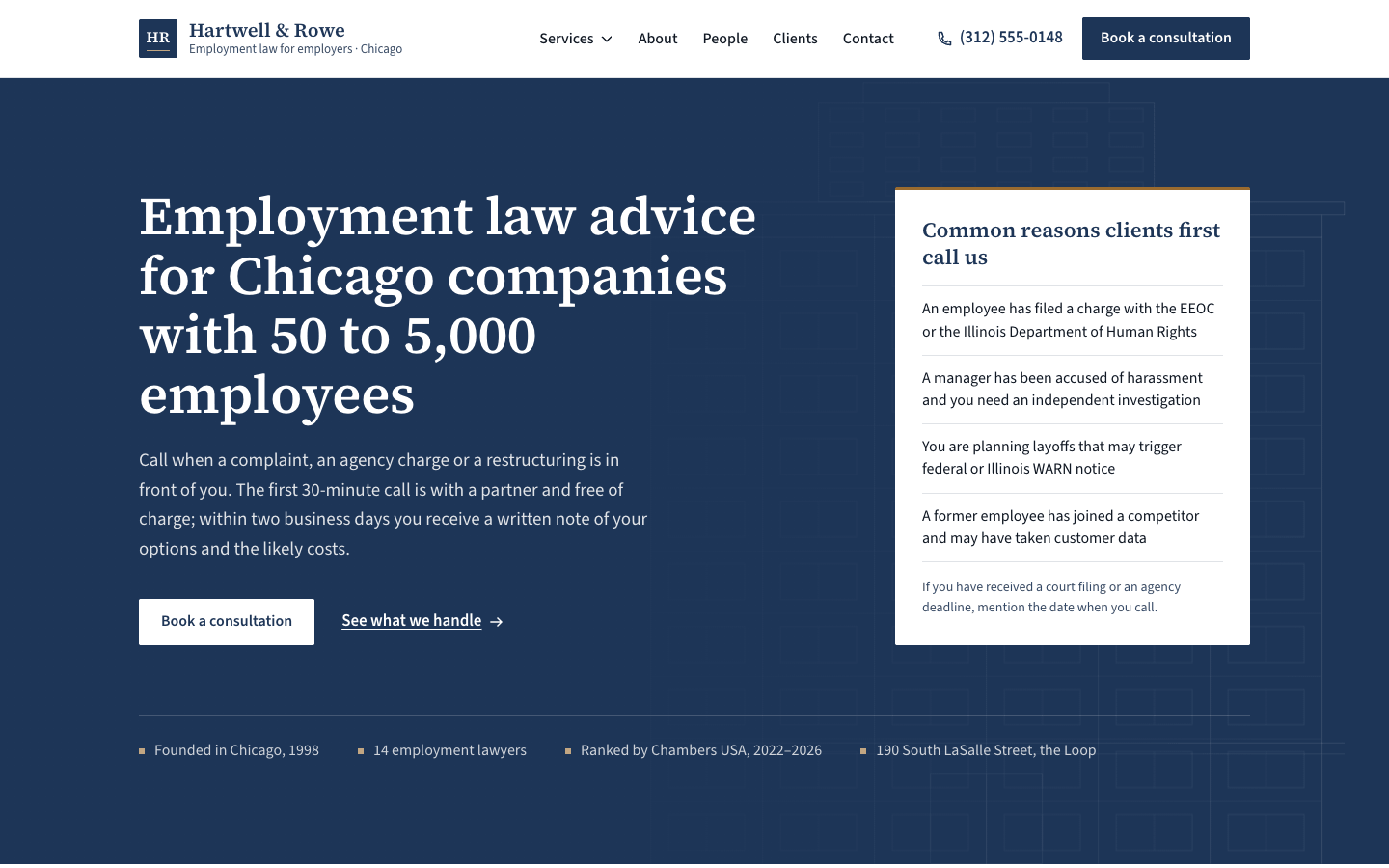
Create a corporate professional website that earns trust through clarity, evidence and calm structure: the kind of site a cautious buyer reads carefully before picking up the phone.
Brief
Subject: Hartwell & Rowe — an employment law firm in Chicago advising companies with 50 to 5,000 staffUse specific, credible content: practice areas or services, named partners, founding year, outcomes, office address, accreditations. Avoid vague claims like "innovative solutions": every claim should be checkableWrite for a cautious buyer reading carefully before they call: plain language, qualifiers on every number, no superlativesDesign Tokens
Use these exact values. Where the spec is silent, stay consistent with them.
colors:
  accent: "#9a6b2f"
  accentLight: "color-mix(in srgb, #9a6b2f 60%, #ffffff)"
  background: "#ffffff"
  border: "color-mix(in srgb, #1d3557 14%, #ffffff)"
  borderInput: "color-mix(in srgb, #1d3557 32%, #ffffff)"
  error: "#a4262c"
  muted: "color-mix(in srgb, #1d3557 45%, #555b63)"
  onPrimary: "#ffffff"
  primary: "#1d3557"
  primaryDark: "color-mix(in srgb, #1d3557 75%, #000)"
  primaryTint: "color-mix(in srgb, #1d3557 8%, #ffffff)"
  surface: "color-mix(in srgb, #1d3557 4%, #ffffff)"
  text: "color-mix(in srgb, #1d3557 30%, #0a0a0a)"
effects:
  heroOverlay: "linear-gradient(90deg, primary 38%, primary at 85% at 55%, primary at 20% at 100%) over the hero art; under 1024px a vertical primary overlay at 92–97%"
fonts:
  body:
    fallback: "-apple-system, 'Segoe UI', Roboto, Helvetica, Arial, sans-serif"
    family: Source Sans 3
    weights: [400, 500, 600]
  display:
    fallback: "Georgia, 'Times New Roman', serif"
    family: Source Serif 4
    weights: [500, 600]
layout:
  breakpoints:
    mobile: 640px
    tablet: 1024px
  container: "1200px including the gutters, 12 columns"
  gutter: "24px, 20px under 640px"
motion:
  durations:
    all: 150ms
  easings:
    all: ease
radii:
  everything: 2px
shadows:
  dropdown: "0 12px 32px primary-dark at 10%"
  mobileMenu: "0 16px 32px primary-dark at 8%"
spacing:
  hero: "112px top, 104px bottom"
  section: "96px top and bottom, 72px under 640px; section heads 48px above their content"
  statsBand: 72px top and bottom
type:
  body:
    font: body
    lineHeight: 1.6
    size: "17px, 16px under 640px; lede 1.125–1.1875rem"
    tracking: 0
    weight: 400
  caption:
    font: body
    lineHeight: 1.5
    size: 0.875rem
    tracking: 0
    weight: 400
  display:
    font: display
    lineHeight: 1.1
    size: "clamp(2.25rem, 4.4vw, 3.5rem)"
    tracking: -0.005em
    weight: 600
  headline:
    font: display
    lineHeight: 1.2
    size: "clamp(1.75rem, 3vw, 2.375rem)"
    tracking: -0.005em
    weight: 600
  title:
    font: display
    lineHeight: 1.25
    size: 1.375rem
    tracking: 0
    weight: 600
Style Rules
A 12-column grid with 24px gutters carries every section; text is left-aligned and capped near 62chPrimary carries the hero, the statistics band, buttons, links and the footer; the secondary colour only as a precise detail (2px rules, numbers, roles, markers, the focus ring)Headings in the heading font at weight 600; body in Source Sans 3 at 17px, line-height 1.6Structure comes from 1px rules and alignment, not boxes: services, values, details and lists are ruled rowsEach section head has a 48px × 2px secondary rule 24px above its headingCorners are 2px; links are underlined 1px with a 3px offset and turn secondary on hoverInteractions are colour and underline changes over 150msPage Layout
12-column grid, container 1200px incl. gutters, everything left-aligned
[HR] Name / descriptor        Services ▾  About  People  Clients  Contact   ☎ phone [Book]  ← sticky header
▓▓ primary field ▓▓▓▓▓▓▓▓▓▓▓▓▓▓▓▓▓▓▓▓▓▓▓▓▓▓▓ architectural art ▒▒▒▒▒▒▒▒▒▒▒▒▒▒▒▒▒▒▒ ← hero
▓ Headline (cols 1–7)                                  ┌ panel cols 9–12 ─────┐
▓ lede                                                 │ Common reasons …     │
▓ [Book a consultation]  See what we handle →          │ ─ situation ×4       │
▓ ▪ 1998  ▪ 14 lawyers  ▪ recognition  ▪ office ─────── └──────────────────────┘
── What we do / lede                                                                ← services
01 │ Title         │ description ·········· │ Typical matters · · ·
02 │ …  (six ruled rows)
muted note ···························································· [Outline button]
░ surface ░ [ 4:5 SVG building ]   Headline / paragraphs / │ 1998 … 2023 / values ← about
▓ primary band ▓ │ 28 yrs │ 1,900 │ 87% │ Band 1 │  each with a qualifier           ← statistics
── Partners  [AB] [CD] [EF] [GH]  monogram · name · role · focus · LinkedIn           ← team
░ surface ░ [sector][sector][sector][sector][sector][sector]                         ← testimonials
▌ quote (6 cols)            ▌ quote (6 cols)
── Book a consultation  [name][company] [email][phone] [topic] [message] [Request]  │ office card + map ← contact
▓ primary-dark ▓ brand │ Firm │ Services │ Accreditations / legal row               ← footer
Sections
Header — Sticky, 80px, background fill and a 1px bottom border; logo left, nav and actions right with 32px between groupsContent:Links: Services (dropdown), About, People, Clients, ContactThe office phone numberComponents:Logo: a 40px primary square with the initials in the heading font and a 1px secondary-light line near its base; the name in the heading font (1.25rem, 600) over a muted 13px descriptorNav links: weight 500, padding 10px 12px; hover turns them primary with a secondary underline 6px belowServices dropdown: 340px, background fill, 1px border with a 2px primary top border, the dropdown shadow; each item a title (600) over a muted one-line descriptionPhone link with an icon, weight 600; then a primary 'Book a consultation' buttonStates:The dropdown chevron rotates 180° when open; Escape closes itMobile: Under 1024px a bordered 'Menu' button opens a full-width panel below the header: links as ruled rows, the dropdown inline with a 2px secondary left border, phone and button stacked at full widthHero — A full-width primary field with the hero art and overlay. Grid with 112px top and 104px bottom padding, aligned to the bottom: copy in columns 1–7 (headline in display, lede max 56ch at 1.1875rem in white at 86%, actions 36px below), the panel in columns 9–12; the trust strip runs along the bottomContent:Headline: who they help and with what, 10–14 wordsLede: one or two sentences on when to call and what happens firstPanel: 'Common reasons clients first call us' and four situations from the subjectTrust strip: founding year, team size, a recognition, the office locationComponents:Buttons: primary on white ('Book a consultation' in the light style: white fill, primary text) and a white text link with an arrowPanel: white, 3px secondary top border, 28px padding; a title-size heading, four ruled lines naming the situations clients call about, and a muted 14px noteTrust strip: under a 1px white-18% rule, four facts in white at 78%, each led by a 6px secondary-light squareMobile: Under 1024px copy spans all columns and the panel takes 8 columns 56px below; the art fades to 55% under a vertical overlay. Under 640px padding is 72px top and 64px bottom and the panel spans all columnsServices — Section head (max 62ch lede, 48px below), then the six ruled rows with a closing rule, the note row 32px belowContent:Section head: 'What we do' and one sentence on who they representSix services or practice areas from the subject, each with a two-sentence description naming laws, standards or deliverables, and three typical mattersComponents:Service row: number (heading font, secondary, column 1), title (title size, columns 2–4), description (columns 5–9), 'Typical matters' (14px muted 600 label and a 3–4 item list with secondary markers, columns 10–12); 32px vertical padding, a 1px rule aboveNote row under the list: one muted sentence and an outline buttonMobile: Under 1024px the title takes a full row and description and matters indent under it; under 640px the number hides and everything stacksAbout / Mission — Surface background. Figure in columns 1–5, copy in columns 7–12, vertically centred: headline, paragraphs, timeline 28px below, values 32px belowContent:Headline on the firm's size or focus as a deliberate choiceTwo short paragraphs: who founded it, when, why; what it is nowFour milestones and three values in plain languageComponents:Timeline: four dated milestones against a 2px secondary left border, the year in the heading font and primaryValues: three ruled rows, the value in the heading font (1.125rem, 600) over one muted sentenceMobile: Under 1024px the figure (max 560px) sits above the copyStatistics Bar — A primary band with 72px padding: four columns of 3, each with a 1px white-18% left rule and 24px left padding; the figure in the heading font at clamp(2.25rem, 3.6vw, 3rem), the label (600) 12px below, the qualifier in 14px white at 72%Content:Four statistics from the subject, each with a figure, a label and a one-sentence qualifier (date range, source or definition)Mobile: Two columns under 1024px, one under 640pxTeam — Four columns of 3 with 48px row gap; the closing line 48px below under a 1px ruleContent:Section head: 'Partners' and one sentence on how they work with clientsFour partners with real-sounding namesA closing line on the wider teamComponents:Person: monogram portrait, name (1.25rem), role in secondary 600, focus area in muted, admissions and education in 14px muted, a LinkedIn link pushed to the bottomMobile: Two columns under 1024px, one under 640pxTestimonials — Surface background: section head, the sector grid 56px above two quotes of 6 columns eachContent:Section head: 'Who we work for' and one sentence on the typical clientSix client sectors with countsTwo substantive quotes from named clients describing a specific matter and its outcomeA one-line disclaimer that past results don't guarantee outcomesComponents:Sector grid: six cells in a 1px ruled grid on white, each the sector in the heading font in primary over a muted countQuote: white, 3px primary left border, 40px padding; the quote in the heading font at 1.25rem; a 48px monogram, the name (600) and organisation; a 14px muted matter line under a 1px ruleMobile: Sectors in three columns under 1024px and two under 640px; quotes full width with 28px paddingContact CTA — Form in columns 1–7, office details in columns 9–12Content:Headline 'Book a consultation' and a sentence on who replies and how fastA legal note under the button with a privacy linkOffice details from the subjectComponents:Form: two columns of fields (name, company, email, phone), then topic (select) and message (textarea) at full width; labels 600 above inputs with 1px input borders, 12px 14px padding, 2px radiusErrors: a 1px error border and a 14px message under the field; on success a primary-tint panel with a 3px primary left border replaces the button rowOffice card: 3px primary top rule, the office name, the address, a ruled list of label/value rows (phone, email, hours, transit) with 96px labels, and the SVG mapStates:Inputs turn primary-bordered on hover; focus shows the 3px secondary outlineMobile: Stacks under 1024px; fields go to one column under 640pxFooter — Primary-dark background, 72px top padding, text in white at 80%: brand in 4 columns, Firm 2, Services 2, Accreditations 4; the legal row under a 1px white-18% rule in 14px white at 62%Content:Brand block with the logo inverted (white square, primary initials) and one sentenceColumns: Firm links, Services links, Accreditations & memberships (each with a 6px secondary-light square)Legal row: © year and the entity, a one-paragraph attorney-advertising or regulatory note, legal linksMobile: Brand on its own row, then two columns under 1024px, one under 640pxImagery & Icons
No photos: the hero art, the about figure and the office map are inline SVG in the primary family of coloursHero art: an abstract architectural elevation (a grid of columns, floor lines and window bays) drawn with 1px white strokes at 8–14% opacity across the right 58% of the heroAbout figure: a 4:5 primary frame with a line drawing of the office building in secondary-light and white strokes, captioned with the addressPortraits: square monograms (the initials in the heading font on the primary tint, a 2px primary bottom border and a 36px secondary dash)Implementation Notes
Only the dropdown, the mobile menu and the form validation use JavaScriptDon'ts
No eyebrow labels above headings and no centred hero or section headsNo icon cards, stock 'handshake' or skyline photos, or illustrations of peopleNo radius above 2px, no soft card shadows, no gradients other than the hero overlayNo secondary-colour fills, buttons or backgroundsNo animation beyond colour, underline and the dropdown chevronNo fonts, colours, radii or shadows outside the design tokens and rules aboveNo sections, features or effects that this spec doesn't listNo placeholder copy (lorem ipsum, "Elevate your workflow"): every word comes from the subjectNo pill-shaped eyebrow labels above headings and no gradient text, unless this spec asks for themNo grid of identical icon cards: vary size and emphasis by importanceQuality Floor
Mobile-first and responsive from 360px to 1440px and wider, with no horizontal scrollingText contrast meets WCAG 2.1 AA: 4.5:1 for body text, 3:1 for large textSemantic landmarks (header, nav, main, section, footer), one h1, descriptive alt textEvery interactive element has hover, visible focus and active states and works from the keyboardHonour prefers-reduced-motion: keep opacity fades, drop movementTech Stack
Framework: HTML/CSS/JS — Deliver one self-contained index.html: styles in a <style> block, scripts in a <script type="module"> block, no build step.Styling: Vanilla CSS — Plain CSS. Declare every design token as a custom property on :root (--color-accent, --font-display, --radius-card…) and use only those properties for colours, fonts, radii, shadows and timing.Language: JavaScript — JavaScript as ES modules; no TypeScript.UI library: None — No component library: build every component from the design tokens.Motion: CSS only — CSS transitions and keyframes only, with durations and easings from the design tokens.Icons: Inline SVG — Inline SVG icons drawn for this style, with one stroke width and corner treatment across the page.Acceptance Checklist
Content sits on a 12-column grid in a 1200px container that includes 24px gutters, every block flush leftThe hero is a deep primary field with the architectural art on the right, white copy across 7 columns and a white panel across columns 9–12Services are a ruled list (number, title, description, typical matters), never cardsHeadings use the heading font; body copy is the body sans at 17pxThe secondary colour appears only on rules, numbers, roles, markers and the focus ring, never as a fillEvery statistic has a qualifier line under itCorners are 2px everywhere; the only shadows are the dropdown and the mobile menuThe services dropdown and the mobile menu work from the keyboard with aria-expandedThe form has labelled fields, inline errors and a confirmation panelUnder 1024px the grid collapses as specified and the header becomes a menu button