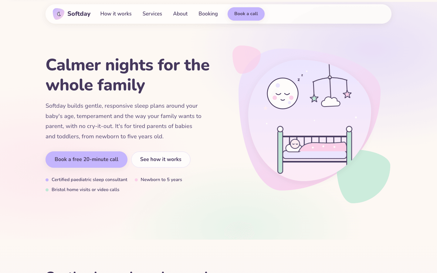
Create a pastel, soft wellness website. It should feel calm, gentle and reassuring: a page that lowers your shoulders as soon as it loads.
Brief
Subject: Softday — a sleep coaching practice that helps new parents and their babies sleep through the nightWrite warm, plain, specific copy: who it's for, what a session involves, prices, availability, practitioner credentials, real-sounding client storiesCalm, gentle and reassuring: a page that lowers your shoulders as it loads, while every word stays easy to readDesign Tokens
Use these exact values. Where the spec is silent, stay consistent with them.
colors:
  accent: "color-mix(in srgb, #c4b5fd 45%, #241040)"
  background: "#fdf8f3"
  border: "color-mix(in srgb, #c4b5fd 22%, #fdf8f3)"
  muted: "color-mix(in srgb, #c4b5fd 40%, #1c1028)"
  primary: "#c4b5fd"
  primaryTint: "color-mix(in srgb, #c4b5fd 35%, #ffffff)"
  secondary: "#fbcfe8"
  secondaryTint: "color-mix(in srgb, #fbcfe8 40%, #ffffff)"
  surface: "color-mix(in srgb, #fdf8f3 30%, #ffffff)"
  tertiary: "#bfe8d6"
  tertiaryTint: "color-mix(in srgb, #bfe8d6 40%, #ffffff)"
  text: "color-mix(in srgb, #c4b5fd 25%, #1c1028)"
  warmTint: "color-mix(in srgb, #fbcfe8 25%, #fdf8f3)"
effects:
  blob: "border-radius 30% 70% 70% 30% / 30% 30% 70% 70%"
  footerWash: "linear-gradient(180deg, primary tint, secondary tint)"
  heroWash: "radial-gradient(60% 60% at 85% 20%, primary at 38%, transparent 70%), radial-gradient(50% 50% at 10% 70%, secondary at 35%, transparent 70%), radial-gradient(40% 40% at 55% 95%, tertiary at 35%, transparent 70%)"
  sectionWashes: "services: linear-gradient(180deg, background 0%, a 50/50 mix of background and primary tint at 40%, a 50/50 mix of background and secondary tint at 100%); testimonials: background, a 50/50 mix of background and tertiary tint at 50%, background"
  waves: inline SVG paths 70px tall in the colour of the section below
fonts:
  body:
    fallback: "system-ui, -apple-system, 'Segoe UI', sans-serif"
    family: Nunito
    weights: [500, 600, 700]
  display:
    fallback: "system-ui, -apple-system, 'Segoe UI', sans-serif"
    family: Nunito
    weights: [800]
layout:
  breakpoints:
    columns: 960px
    mobile: 780px
    small: 420px
  container: "1140px plus 20px gutters: width min(1140px, 100% - 40px)"
  gutter: 20px
motion:
  durations:
    button: 250ms
    heroRise: "1.1s, art 0.3s later"
    hover: 200ms
    sway: 6s
  easings:
    heroRise: "cubic-bezier(0.2, 0.7, 0.2, 1)"
    other: "ease, sway ease-in-out infinite"
radii:
  card: 28px
  day: 16px
  large: 40px
  pill: 999px
  small: 20px
shadows:
  soft: "0 4px 20px rgb(0 0 0 / 0.06), the only shadow"
spacing:
  hero: "72px top, 120px bottom"
  section: "96px top and bottom, 72px under 780px; intros 48px above content"
type:
  body:
    font: body
    lineHeight: 1.75
    size: 1.0625rem; leads 1.125–1.2rem
    tracking: 0
    weight: 500
  caption:
    font: body
    lineHeight: 1.5
    size: 0.95rem
    tracking: 0
    weight: 600
  display:
    font: display
    lineHeight: 1.2
    size: "clamp(2.2rem, 4.6vw, 3.4rem)"
    tracking: -0.01em
    weight: 800
  headline:
    font: display
    lineHeight: 1.25
    size: "clamp(1.8rem, 3.4vw, 2.5rem)"
    tracking: 0
    weight: 800
  title:
    font: body
    lineHeight: 1.3
    size: 1.3rem
    tracking: 0
    weight: 700
Style Rules
Pastels are light and surface: fills, tints, blobs and washes; text is deep plum mixed from the primary pastel, never pastelRadius scales with size: 20px for small rows, 28px for cards, 40px for big panels, pills for buttons, chips and slots, blob shapes for decorationOne soft shadow everywhere: 0 4px 20px at 6% black; no borders except 2px border-colour outlines on soft controlsCards are near-white on the background; feature panels each take one tint so sections feel varied but quietThe font at 500 for body with 1.75 line-height; headings at 800 with -0.01emSoft washes, not stripes: radial pastels behind the hero, gentle vertical gradients behind services, testimonials and the footerMotion is slow and small: a gentle entrance, a 2px lift on hover, a swaying mobilePage Layout
container 1140px + 20px gutters; soft pastel washes; ◖◗ pill, ◌ blob
◖ ◌ Name ······ How it works  Services  About  Booking ······ (Book a call) ◗   ← sticky pill bar
Headline, a calm promise              ◌ blob   ╭ organic frame ╮ ◌             ← hero
lead, muted                                  │ moon · cot ·   │
(Book a free call) (See how it works)        │ swaying mobile │
● note  ● note  ● note                ◌      ╰────────────────╯
Section intro                                                                  ← services
╭ mint panel ──────────╮ ╭ lavender panel ──────╮
│ age · name · bullets │ │ …                    │
│ ─ ─ (75 min) £145    │ │                      │
╭ pink panel ──────────╮ ╭ warm panel ──────────╮
╭ What a session involves: ◌1 ◌2 ◌3 ◌4 ─────────╮
◌(portrait circle)◌    Hi, I'm … / paragraph / ╭credential╮ ×3 / approach        ← about
╭ quote ╮ ╭ quote ╮ ╭ quote ╮                                                    ← testimonials
╭ calendar: ‹ Month › 7 × 6 days ─────┬ slots: (09:30)(10:15) … / [session ▾] / summary / (Request) ╮ ← booking
FAQ · FAQ · FAQ
∿∿∿∿∿ wave ∿∿∿∿∿                                                                ← footer
brand · socials ◯◯◯ │ links │ contact / ─ ─ © · legal
Sections
Header — Sticky 14px from the top, inside the containerContent:Practice nameFour links: How it works, Services, About, BookingComponents:Bar: a pill on near-white at 88% with a 10px backdrop blur and the soft shadow, padding 10px 12px 10px 24pxLogo: a 38px blob filled with a 135° gradient from the primary to the secondary pastel holding a small moon, and the name at 1.3rem 800Links: 600 weight, padding 8px 16px, pill radius; hover fills them with the primary tintA small primary pill button: 'Book a call'Mobile: Under 780px a 44px round menu button in the primary tint opens a rounded 28px panel of links; the button hidesHero — 72px top and 120px bottom over the hero wash; two columns 1.05fr / 1fr with a 56px gap: headline (display), lead (1.2rem, muted, max 520px), buttons 32px below, notes 28px below; the art on the rightContent:Headline: a calm promise of 5–8 wordsLead: two sentences on the approach and who it's forButtons: a free first call and 'See how it works'Notes: three facts (certification, age range, format)Components:Primary button: the primary pastel fill, plum text, 700 weight, padding 14px 28px, pill, the soft shadow; hover darkens it slightly and lifts 2pxSoft button: near-white fill, plum text, a 2px border-colour outlineNotes: three short reassurances, each with a 10px dot in one of the pastelsArt: a square (max 520px) with blob A (inset 2% 6% 8% 4%, a 150° gradient from the primary tint to the secondary pastel), blob B (34%, tertiary at 80%, bottom-right) and blob C (18%, secondary at 70%, top-left); the organic frame inset 9% 12% 14% 10% with radius 42% 58% 55% 45% / 45% 42% 58% 55%, a vertical gradient from the primary tint to the secondary tint, the soft shadow, holding the SVG sceneMobile: One column under 960px with the art (max 420px) belowMotion: Copy rises 14px and fades in over 1.1s; the art follows 0.3s later; the mobile sways ±3° every 6sServices — Over the services wash: section intro (max 640px, 48px below), a 2 × 2 grid with 24px gaps, the steps card 64px belowContent:Headline and a lede on how every plan startsFour offerings from a free call to the full programme, with ages, durations and pricesFour session stepsComponents:Service panel: 40px radius, padding 36px 36px 32px, the soft shadow, its own tint (tertiary, primary, secondary, warm), a white-45% blob in the top-right corner; an age or audience line (700, muted), the name (title), two sentences, three bullet points, and a meta row under a 2px dashed border-colour rule with white-75% chips (duration, format) and the price (1.6rem 800, unit in small muted)Steps card: near-white, 40px radius, 40px padding; 'What a session involves' and four steps, each a 46px blob number in a tint, a bold name and one sentenceMobile: One column under 960px; steps two by two, then one column under 780pxAbout — Two columns 0.9fr / 1.1fr with a 64px gap, vertically centredContent:'Hi, I'm' and the first nameA paragraph on background and why they do thisThree credentialsA paragraph on the approach and a link to bookComponents:Portrait: a 400px circle with the 8px border and the soft shadow; behind it a blob with a 140° gradient from the tertiary pastel to the primary tint and a smaller secondary blob at the bottom-rightCredentials: three near-white rows (20px radius, 14px 18px padding, the soft shadow) with a tinted icon circle and a bold credential plus detailMobile: One column under 960px with the portrait firstTestimonials — Over the testimonials wash: intro, then three equal cards with 24px gapsContent:Headline and a short ledeThree stories from parents with a before-and-after detailComponents:Card: near-white, 28px radius, 32px padding, the soft shadow; a 3.4rem quote mark in the primary pastel, the quote, then a 46px avatar circle with initials on a tint, the parent's first name (700) and the child's age (muted)Mobile: One column under 960pxBooking/Schedule — One near-white card with 40px radius and the soft shadow, split 1.1fr / 0.9fr; the note 24px below; the FAQ row 56px belowContent:Headline and a lede on how booking worksSix to eight time slots per available daySession options with durations and pricesA note with an email for other timesThree short FAQ answers in a row belowComponents:Calendar side (36px padding): the month in title size with two 42px round buttons in the primary tint; a 7-column grid of square days with 16px radius: available days on the tertiary tint (hover: the tertiary pastel, lift 1px), today ringed 2px in the secondary pastel, the selected day on the primary pastel at 800, others in muted plum; a legendSlots side (36px padding, a 170° gradient from the secondary tint to the primary tint): a title and hint, time slots as near-white pills in two columns (selected: primary pastel), a session select (pill, 2px border), a near-white summary box (20px radius) and a full-width primary button, disabled until a day and time are chosen; the confirmation appears on the tertiary pastelStates:Days and slots are buttons with aria-pressed; the month buttons disable at the range endsMobile: Stacks under 960px; padding 24px under 780pxFooter — 60px below the last section: a 70px wavy SVG edge in the primary tint, then the footer wash; three columns 1.4fr / 1fr / 1fr, 48px top paddingContent:Practice name, one sentence and three 46px round social buttonsLinks and contact details© year and legal links under a dashed ruleStates:Social buttons lift 2px and take the tertiary tint on hoverMobile: Two columns under 960px, one under 420pxImagery & Icons
Hero: an inline SVG night scene (a sleeping moon with closed eyes, a cot, a hanging mobile of stars and clouds) in the pastel tints with plum line details, inside the organic framePractitioner: one picsum portrait cropped to a circle with an 8px near-white border, blobs behind itIcons: 18px rounded inline SVG strokes in plum, inside 34px tinted circles; the logo mark is a small moon in a 38px blobImplementation Notes
The calendar, slots, select, summary and confirmation work with a small script; the mobile menu togglesDon'ts
No text in pastel colours and no white text on pastelsNo all-caps pill label above the headline and no highlighted single wordNo sharp corners, hard edges, borders darker than the border token or dark sectionsNo beige or sand surfaces layered on the background: cards are near-white, panels are pastel tintsNo stock photos of babies, bedrooms or yoga: the hero is an illustrationNo fonts, colours, radii or shadows outside the design tokens and rules aboveNo sections, features or effects that this spec doesn't listNo placeholder copy (lorem ipsum, "Elevate your workflow"): every word comes from the subjectNo pill-shaped eyebrow labels above headings and no gradient text, unless this spec asks for themNo grid of identical icon cards: vary size and emphasis by importanceQuality Floor
Mobile-first and responsive from 360px to 1440px and wider, with no horizontal scrollingText contrast meets WCAG 2.1 AA: 4.5:1 for body text, 3:1 for large textSemantic landmarks (header, nav, main, section, footer), one h1, descriptive alt textEvery interactive element has hover, visible focus and active states and works from the keyboardHonour prefers-reduced-motion: keep opacity fades, drop movementTech Stack
Framework: HTML/CSS/JS — Deliver one self-contained index.html: styles in a <style> block, scripts in a <script type="module"> block, no build step.Styling: Vanilla CSS — Plain CSS. Declare every design token as a custom property on :root (--color-accent, --font-display, --radius-card…) and use only those properties for colours, fonts, radii, shadows and timing.Language: JavaScript — JavaScript as ES modules; no TypeScript.UI library: None — No component library: build every component from the design tokens.Motion: CSS only — CSS transitions and keyframes only, with durations and easings from the design tokens.Icons: Inline SVG — Inline SVG icons drawn for this style, with one stroke width and corner treatment across the page.Acceptance Checklist
Text is the deep plum mixed from the primary pastel; no text is set in a pastelPastels appear as fills, tints, blobs and washes only; every tint is mixed from the three pastel variablesRadii scale with size: 20px small panels, 28px cards, 40px large panels, pills for buttons and slots, blob shapes for decorationThe only shadow is 0 4px 20px at 6% blackThe hero art is an inline SVG scene inside an organic frame with three blobs around itEach service panel has its own tint, a duration chip and a priceThe booking calendar marks available days, selects a day and a time, fills a summary and confirmsWavy SVG edges sit above the footer; section washes are soft vertical gradients between tintsNo pill label above the headline and no highlighted single wordUnder reduced motion the hero appears in place and the mobile stops swaying