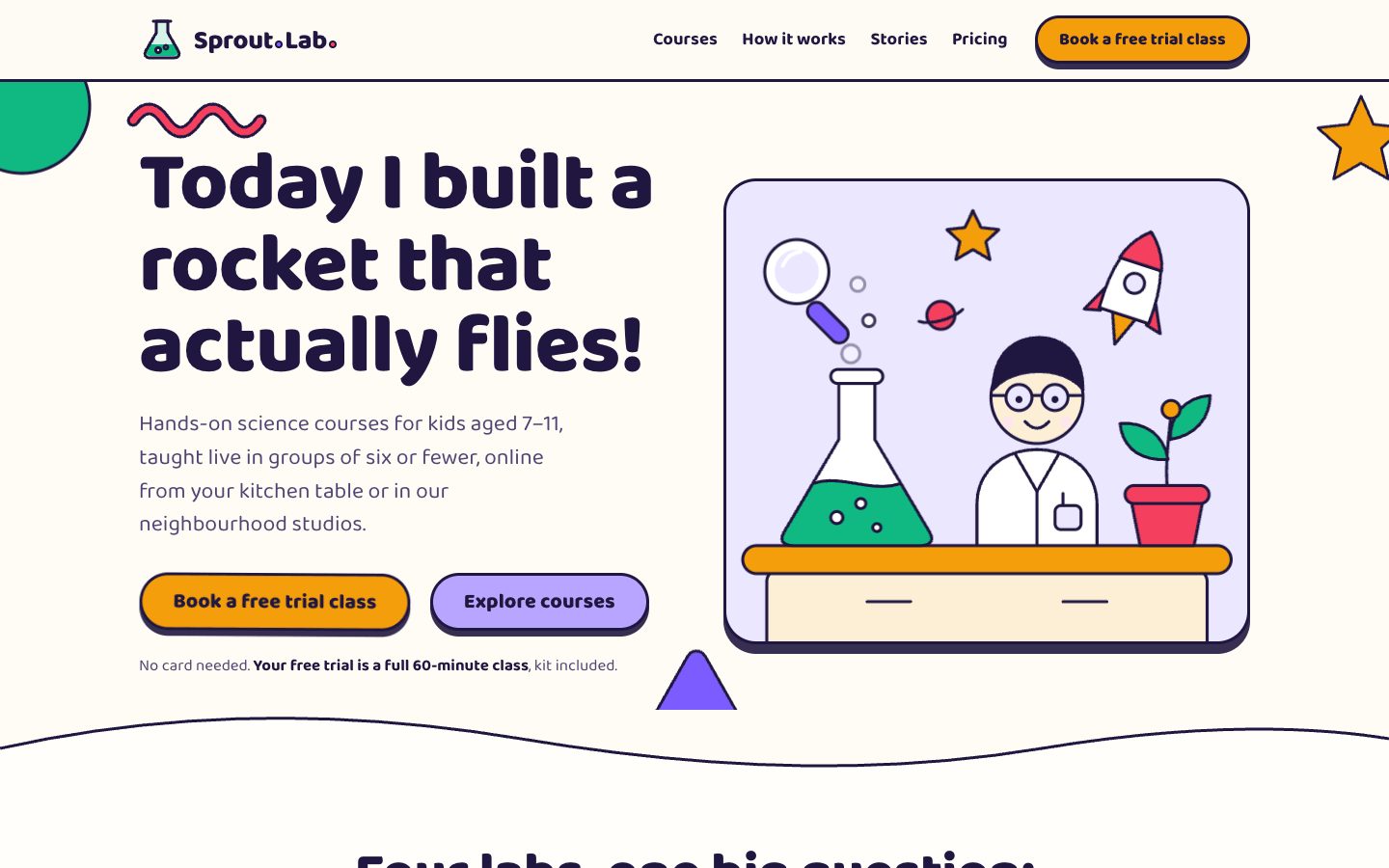
Create a playful, colourful education website: a bright, energetic playground for learning that still makes it easy for a parent to understand the offer and sign up.
Brief
Subject: Sprout Lab — after-school science courses for kids aged 7–11, online and in small groupsSpeak to both audiences: fun course names and projects for kids, clear facts for parents (ages, schedule, group size, price, teacher qualifications)A bright, energetic playground for learning that still makes it easy for a parent to understand the offer and sign upDesign Tokens
Use these exact values. Where the spec is silent, stay consistent with them.
colors:
  accent: "#f59e0b"
  background: "color-mix(in srgb, #f59e0b 4%, #ffffff)"
  border: "color-mix(in srgb, #7c5cff 25%, #000)"
  colour1Tint: "color-mix(in srgb, #f59e0b 17%, #ffffff)"
  colour2: "#7c5cff"
  colour2Soft: "color-mix(in srgb, #7c5cff 55%, #ffffff)"
  colour2Tint: "color-mix(in srgb, #7c5cff 15%, #ffffff)"
  colour3: "#10b981"
  colour3Tint: "color-mix(in srgb, #10b981 17%, #ffffff)"
  colour4: "#f43f5e"
  colour4Tint: "color-mix(in srgb, #f43f5e 13%, #ffffff)"
  muted: "color-mix(in srgb, #7c5cff 30%, #3a3a3a)"
  surface: "color-mix(in srgb, #f59e0b 1.5%, #ffffff)"
  text: "color-mix(in srgb, #7c5cff 25%, #000)"
  textOnInk: "color-mix(in srgb, #7c5cff 12%, #ffffff)"
effects:
  dottedPath: "an SVG path with a 3px ink stroke, dasharray 2 12, round caps"
  waves: "inline SVG paths 70px tall in the next band's colour; the footer wave is three layered paths, 110px"
fonts:
  body:
    fallback: "system-ui, -apple-system, 'Segoe UI', sans-serif"
    family: Baloo 2
    weights: [400, 600, 700]
  display:
    fallback: "system-ui, -apple-system, 'Segoe UI', sans-serif"
    family: Baloo 2
    weights: [800]
layout:
  breakpoints:
    mobile: 640px
    tablet: 900px
    wide: 1100px
  container: 1200px including the gutters
  gutter: 24px
motion:
  durations:
    bounce: 450–500ms
    float: 5.5–8s
    nudge: 3.2s
    press: 150ms
    rise: 3.4s
  easings:
    float: "ease-in-out, infinite"
    spring: "cubic-bezier(0.68, -0.55, 0.27, 1.55)"
radii:
  bubble: 34px
  card: 28px
  circle: "50%"
  pill: 999px
shadows:
  hard: "0 6px 0 ink at 90%"
  hardLarge: "0 10px 0 ink at 90%"
  small: 0 4px 0 ink
spacing:
  hero: "4rem top, 2rem bottom"
  section: "4.5rem top, 5rem bottom; heads 3rem above content"
type:
  body:
    font: body
    lineHeight: 1.55
    size: "1.15rem; leads clamp(1.2rem, 1.8vw, 1.45rem)"
    tracking: 0
    weight: 400
  caption:
    font: body
    lineHeight: 1.3
    size: 0.95rem
    tracking: 0
    weight: 700
  display:
    font: display
    lineHeight: 0.98
    size: "clamp(2.8rem, 6.4vw, 5.4rem)"
    tracking: -0.01em
    weight: 800
  headline:
    font: display
    lineHeight: 1.05
    size: "clamp(2.2rem, 4.6vw, 3.6rem)"
    tracking: -0.01em
    weight: 800
  title:
    font: display
    lineHeight: 1.05
    size: 1.65rem
    tracking: -0.01em
    weight: 800
Style Rules
Four colours used liberally but by ownership: each course, section band and stat owns one, as mappedEverything has a cartoon outline: 3px ink borders and hard 6px ink drop shadows with no blurRounded everything: 28px cards, 34px bubbles, pill buttons and chips, circles for steps and iconsThe font chunky and large: 800 headings, 1.15rem body, nothing below 0.95remInk text on colours 1, 3 and 4 and on tints; colour 2 is softened for buttons, or carries only large textBands alternate cream, white, ink and tints, joined by wavy SVG edgesMotion is springy (cubic-bezier(0.68, -0.55, 0.27, 1.55)): hover lifts and tilts, press squashesPage Layout
container 1200px incl. gutters; ▣ = 3px ink outline + hard shadow
⚗ Name•• ········· Courses  How it works  Stories  Pricing  ▣(Book a free trial)  ← sticky, cream
● ∿                                                         ★                    ← hero, cream
Headline in ink, chunky              ▣ SVG lab: beaker ° ° bubbles,
lead for parents                       rocket, plant, kid scientist
▣(Book a free trial) ▣(Explore)          floating
note                                 ▲
∿∿∿∿ wave ∿∿∿∿
Centred head                                                                    ← courses, white
▣ colour 1 ▣ colour 2 ▣ colour 3 ▣ colour 4   art / title / chips / you'll make / →
▓▓ ink band: ◖4,200◗ colour 1  ◖5.4◗ colour 2  ◖4.9◗ colour 3  ◖92%◗ colour 4 ▓▓   ← stats
░ colour 3 tint: ◯1 ⋯ ◯2 ⋯ ◯3 ⋯ ◯4 ⋯ ◯5  (even steps lower) / ▣ teacher card ░    ← how it works
░ colour 4 tint: ▣ bubble   ▣ bubble (lower)   ▣ bubble   + avatars ░            ← testimonials
░ colour 1 tint: ▣ plan   ▣ POPULAR (-2.5°, badge)   ▣ plan / note ░            ← pricing
∿∿∿ colour 1 ∿∿∿ colour 2 ∿∿∿ colour 3 ∿∿∿
▓▓ ink footer: brand │ links │ links │ contact ▓▓
Sections
Header — Sticky, the cream background at 92% with an 8px blur and a 3px ink bottom border; logo left, links and button rightContent:NameFour links: Courses, How it works, Stories, PricingComponents:Logo: a 48px SVG flask and the name in 800 at 1.7rem, with two round dots in colours 2 and 4 inside the wordmark; hover tilts it -3° and scales 1.04Links: 700 weight with a 3px underline in a colour appearing on hoverButton: 'Book a free trial class' on colour 1Mobile: Under 900px a 52px round menu button (colour 2 tint, 3px ink border, three bars that turn into an X) opens a stacked panelHero — 4rem top and 2rem bottom; two columns 1.05fr / 1fr with a 2rem gap: headline (display), lead (max 34ch, muted), buttons, note; the hero scene on the right; background shapes around the edges; a wave into the courses sectionContent:Headline: a 6–10 word promise kids would say out loudLead: one sentence for parents with group size, format and age rangeButtons: a free trial and 'Explore courses'Note: no card needed and the trial lengthComponents:Big button: colour 1 fill, ink text, 800 at 1.35rem, padding 1rem 2rem 0.9rem, pill, 3px ink border, the hard shadowSecond button: colour 2 soft fillNote: a short line in muted with one bold phraseMobile: One column under 900px, scene below; two background shapes hideMotion: Scene objects float ±8px on 5.5–8s loops with offsets; bubbles rise and fade every 3.4s; the big button nudges once every 3.2sCourse Cards — White band, section padding; centred head (max 720px, 3rem below); four cards in a row with 1.5rem gapsContent:Headline and a lede on what a course isFour courses, one per colour, with real projects, ages and session countsComponents:Course card: the course tint, 28px radius, 3px ink border, the hard shadow, overflow hidden; the illustration on the full course colour with a 3px ink line under it; body (1.3rem padding): title (title size), a one-line kid pitch in muted, white pill chips with 2px ink borders (ages, sessions, format), a 'You'll make' line, and a 'See the lab →' link with a 3px underline in the course colourMobile: Two columns under 1100px, one under 640pxMotion: Hover lifts a card 10px and tilts it ±1.5° (alternating) over 500ms with the spring; press squashes it to 0.97Stats — An ink band with white headings; four centred stats with 2rem gaps; blobs in colours 1–4Content:Headline and ledeFour real numbers: kids taught, average group size, parent rating, return rateComponents:Stat: a coloured blob with the number in 800 at 3.2rem (ink) inside, a white title and one light sentence with a jokeMobile: Two columns under 900pxMotion: Hovering a stat scales its blob to 1.08 and turns it -4°How It Works — Colour 3 tint band: head, five steps in a row with even steps 3.2rem lower, the teacher card belowContent:Headline counting the steps and a ledeFive steps from trial to first projectThe teacher cardComponents:Path: a dotted SVG line (3px ink dashes) curving through the step circlesStep: a 112px circle in a colour with a 3px ink border and a 0 6px 0 ink shadow, a 56px icon, a 40px white number badge at its top-right; title and one sentence (max 22ch)Teacher card: white, 28px radius, 3px border, the hard shadow; one heading and two sentences on qualifications and checksMobile: One column under 900px, the path hidden, steps left-aligned with circles beside textMotion: Hovering a step scales its circle to 1.1 and turns it 8°Testimonials — Colour 4 tint band: three columns, the middle one 2.5rem lowerContent:Headline and ledeTwo parent quotes with specifics and one kid quote in the kid's wordsComponents:Bubble: white (or colour 1 tint, or colour 2 tint for kids), 34px radius, 3px border, the hard shadow, 1.12rem text, a skewed tail at the bottom-leftSpeaker: a 64px illustrated avatar, the name in 800 and a role ('Parent of Maya, 8' or the kid's age)Mobile: One column under 900pxMotion: Hover tilts a bubble -1.5° and lifts it 6pxPricing — Colour 1 tint band: three columns 1fr / 1.15fr / 1fr, vertically centred, 1.75rem gaps; the note 2.5rem belowContent:Headline and a lede on contractsThree plans with real monthly and term prices and per-session mathsA note on sibling discounts or free kitsComponents:Plan: white, 28px radius, 3px border, the hard shadow, padding 2rem 1.75rem; a 64px colour circle with an icon, the name (1.8rem), audience, the price at 3.4rem 800 with the unit, a per-session line, a check list with 22px coloured checks, a full-width buttonPopular plan: colour 2 tint, tilted -2.5° and scaled 1.04, a 10px hard shadow, the price at 4rem, a badge ('Most picked!') on colour 4 rotated 6° hanging over the top-right edgeMobile: One column under 900px, the popular plan first and untiltedFooter — A 110px three-layer wave (colours 1, 2, 3) on the pricing tint, then an ink band with light text: four columns 1.4fr / 1fr / 1fr / 1.2fr, 3rem top paddingContent:Name and one sentenceLinks: Courses, Studios, Help, AboutContact and a newsletter field© and legalMobile: Two columns under 900px, one under 640pxImagery & Icons
Hero scene: an inline SVG lab with a bubbling beaker (bubbles rising), a small rocket, a sprouting plant, a magnifier and a kid scientist built from circles and rounded rectangles, all with 3px ink outlines in the four coloursFour course illustrations at 10:7 on their course colour, one per lab theme, same styleBackground shapes around the hero: a circle, a squiggle, a star and a rounded triangle in the colours, partly croppedAvatars: 64px illustrated faces in circles; stat blobs: organic SVG blobs 190 × 180 in the colours; step icons 56pxImplementation Notes
Animate transform only; the mobile menu is the only script besides the CTA nudge timerDon'ts
No coloured words inside headlines and no pill or tag labels above section headingsNo sharp corners, thin hairlines or soft blurred shadowsNo grey sections: every band is ink, white, the cream background or a colour tintNo photos, emoji or clip-art: one illustration style, simple shapes with ink outlinesNo motion that ignores reduced motionNo fonts, colours, radii or shadows outside the design tokens and rules aboveNo sections, features or effects that this spec doesn't listNo placeholder copy (lorem ipsum, "Elevate your workflow"): every word comes from the subjectNo pill-shaped eyebrow labels above headings and no gradient text, unless this spec asks for themNo grid of identical icon cards: vary size and emphasis by importanceQuality Floor
Mobile-first and responsive from 360px to 1440px and wider, with no horizontal scrollingText contrast meets WCAG 2.1 AA: 4.5:1 for body text, 3:1 for large textSemantic landmarks (header, nav, main, section, footer), one h1, descriptive alt textEvery interactive element has hover, visible focus and active states and works from the keyboardHonour prefers-reduced-motion: keep opacity fades, drop movementTech Stack
Framework: HTML/CSS/JS — Deliver one self-contained index.html: styles in a <style> block, scripts in a <script type="module"> block, no build step.Styling: Vanilla CSS — Plain CSS. Declare every design token as a custom property on :root (--color-accent, --font-display, --radius-card…) and use only those properties for colours, fonts, radii, shadows and timing.Language: JavaScript — JavaScript as ES modules; no TypeScript.UI library: None — No component library: build every component from the design tokens.Motion: CSS only — CSS transitions and keyframes only, with durations and easings from the design tokens.Icons: Inline SVG — Inline SVG icons drawn for this style, with one stroke width and corner treatment across the page.Acceptance Checklist
Each course and each section owns one of the four colours, as mapped in the wireframeEvery card, button, bubble and circle has a 3px ink outline and a hard 6px ink shadow with no blurText is ink on colours 1, 3 and 4 and on light tints; colour 2 at full strength carries only illustrations and text of 24px bold or largerHeadlines are ink only: no coloured words, no pill labels above section headsAll illustrations are inline SVG built from simple geometric shapes with ink outlinesButtons and cards bounce with the spring easing on hover and squash on pressThe how-it-works steps follow a dotted path, alternating up and downThe popular plan is larger, tilted -2.5° and carries a tilted badgeWavy SVG dividers separate sections, and a three-colour wave tops the footerUnder reduced motion floating shapes, bubbles, the CTA nudge and bounces stop