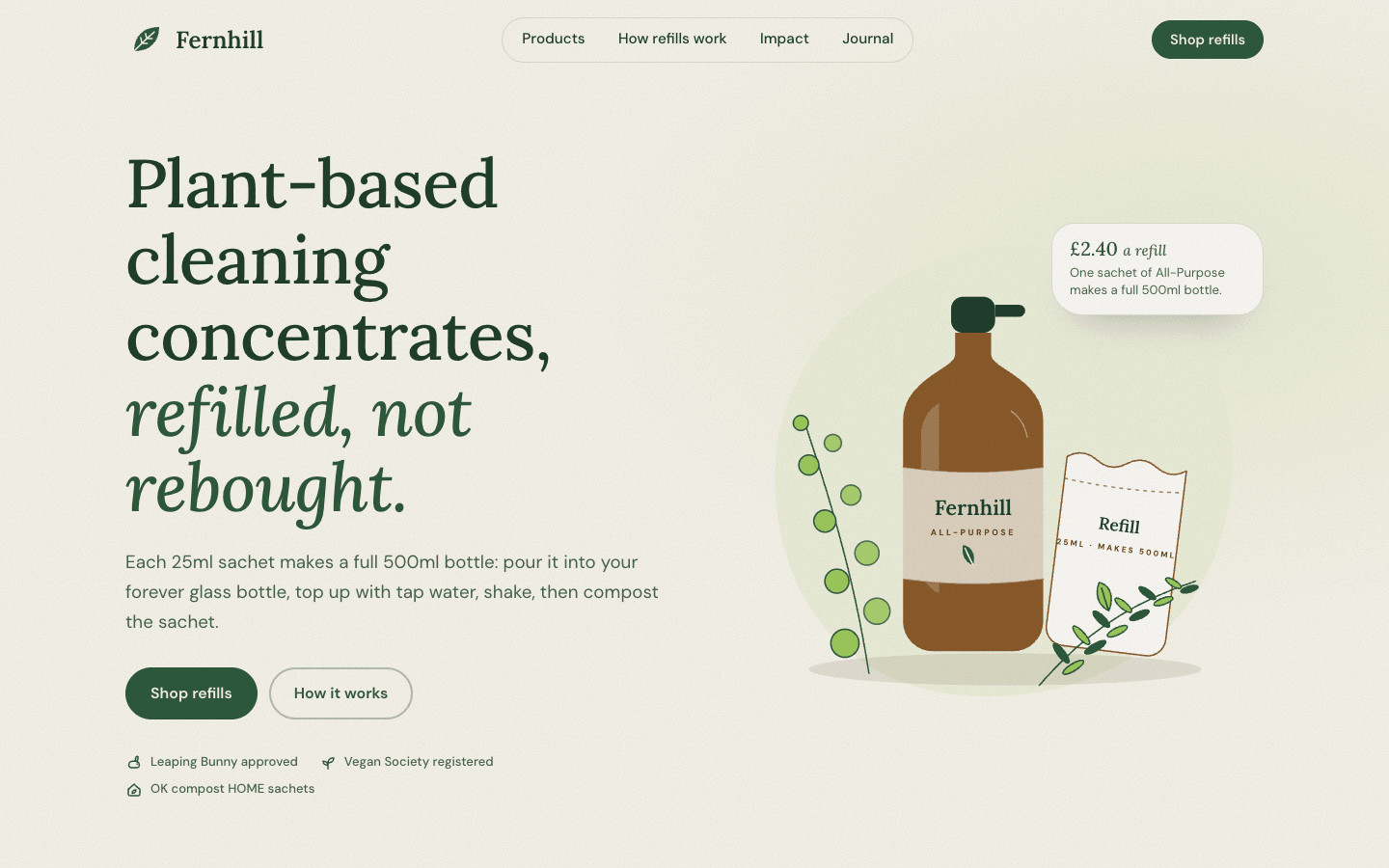
Create an organic, nature-inspired website for an eco-friendly brand. It should feel grounded, tactile and honest: closer to a seed catalogue than a tech startup.
Brief
Subject: Fernhill — refillable household cleaning products made from plant-based ingredientsBack the sustainability story with specifics: ingredients, how refills work, prices, impact numbers with what they mean, certifications. No vague "save the planet" copyGrounded, tactile and honest: closer to a seed catalogue than a tech startupDesign Tokens
Use these exact values. Where the spec is silent, stay consistent with them.
colors:
  accent: "#2d5a3d"
  background: "#f6f3ea"
  border: "color-mix(in srgb, #2d5a3d 16%, transparent)"
  card: "color-mix(in srgb, #f6f3ea 50%, #ffffff)"
  earth: "#8a5a2b"
  earthDark: "color-mix(in srgb, #8a5a2b 67%, #000)"
  forestDeep: "color-mix(in srgb, #2d5a3d 70%, #000)"
  kraft: "color-mix(in srgb, #8a5a2b 12%, #f6f3ea)"
  kraftPaper: "color-mix(in srgb, #8a5a2b 22%, #f6f3ea)"
  leaf: "#9cc95c"
  muted: "color-mix(in srgb, #2d5a3d 55%, #6b6b60)"
  sage: "color-mix(in srgb, #9cc95c 12%, #f6f3ea)"
  surface: "color-mix(in srgb, #f6f3ea 50%, #ffffff)"
  text: "color-mix(in srgb, #2d5a3d 60%, #0d0d08)"
effects:
  grain: "a fixed overlay of SVG feTurbulence (fractalNoise, baseFrequency 0.85, 2 octaves) in a 220px tile at 22% opacity, mix-blend-mode multiply"
  heroGlow: "radial-gradient(ellipse 60% 50% at 85% 30%, leaf at 16%, transparent 70%) over the cream"
  kraftFibres: "repeating-linear-gradient(90deg, earth at 3% 0 1px, transparent 1px 7px) on the packet"
  leafBorder: "a row of 14px leaf shapes repeating every 28px in the leaf colour at 40%"
  waves: "inline SVG paths 72px tall at the bottom of each band, filled with the next band's colour"
fonts:
  body:
    fallback: "system-ui, -apple-system, 'Segoe UI', sans-serif"
    family: DM Sans
    weights: [400, 500, 700]
  display:
    fallback: "Georgia, 'Times New Roman', serif"
    family: Lora
    weights: [500, 600]
layout:
  breakpoints:
    mobile: 640px
    tablet: 900px
  container: "1180px plus 20px gutters: width min(1180px, 100% - 40px)"
  gutter: 20px
motion:
  durations:
    button: 250ms
    counter: 1.6s
    fade: 700ms
    header: 300ms
    lift: 300ms
    photo: 600ms
  easings:
    all: ease-out
radii:
  card: 38px
  innerPacket: 28px
  note: 24px 30px 26px 32px
  pebble: "46% 54% 42% 58% / 52% 44% 56% 48%"
  pill: 999px
shadows:
  header: "0 6px 30px -18px forest-deep at 45%"
  packet: "0 30px 60px -40px earth-dark at 55%"
  product: "0 24px 40px -28px forest-deep at 55%"
spacing:
  band: "110px top, 170px bottom (the wave sits in the bottom space)"
  hero: 150px top and bottom
type:
  body:
    font: body
    lineHeight: 1.65
    size: 1.0625rem; ledes 1.1–1.18rem
    tracking: 0
    weight: 400
  caption:
    font: body
    lineHeight: 1.4
    size: 0.82rem
    tracking: 0
    weight: 500
  display:
    font: display
    lineHeight: 1.12
    size: "clamp(2.5rem, 5.2vw, 4.4rem)"
    tracking: -0.01em
    weight: 500
  headline:
    font: display
    lineHeight: 1.12
    size: "clamp(2rem, 3.6vw, 3rem)"
    tracking: -0.01em
    weight: 500
  title:
    font: display
    lineHeight: 1.2
    size: 1.3–1.45rem
    tracking: 0
    weight: 500
Style Rules
Earth palette in bands: cream, sage, kraft and forest sections alternate, joined by organic waves, never straight edgesShapes are found in nature: pebble radii for images and visuals, 38px cards, pills for controls, leaf and vine drawingsHeadings in Lora at 500, with an italic second line in forest or earth; body copy in the font variable at 1.0625remThe leaf colour is a highlight, used in exactly four places; forest carries buttons and emphasisTexture is quiet: a paper grain overlay and fine botanical line drawingsNumbers always come with what they meanMotion is minimal: one fade per section on entry, gentle lifts on hoverPage Layout
container 1180px + 20px gutters; paper grain over everything; ∿ = organic wave
❧ Name ········· ( Products · How refills work · Impact · Journal ) (Shop refills)  ← fixed, transparent
Headline line one,                 ◌ leaf glow ◌  [ SVG: bottle · sachet · sprigs ]  (note £2.40)  ← hero, cream
italic line two.
lede / (Shop refills) (How it works) / ✓ cert ✓ cert ✓ cert
∿∿∿∿∿∿∿∿∿∿∿∿∿∿∿∿∿∿∿∿∿∿∿∿∿∿∿∿∿∿∿∿∿∿∿∿∿∿∿∿∿∿∿
░ sage: fern drawing │ headline / paragraph / pillar · pillar · pillar │ seed head ░   ← mission
∿∿∿∿
▒ kraft: head / ( ◖bottle◗ name · notes · size · £ (Add) ) × 4 ▒                      ← products
∿∿∿∿
▓ forest: head / 1,284,000+ │ 52,300 │ 186 t  — each with what it means / footnote ▓  ← impact
∿∿∿∿
cream: head / ~~~~ vine ~~❧~~~~❧~~~~❧~~~~❧~~ / ① ② ③ ④ / (Starter set) (FAQ)       ← process
∿∿∿∿
░ sage: head ············ All articles → / ◖photo◗ ◖photo◗ ◖photo◗ ░                   ← journal
cream: ╭ seed packet: flap / ┆ seedling │ SOW · SPACING / headline / (email)(Plant the seed) ┆ ╮  ← newsletter
∿∿∿∿ forest-deep footer, leaf border, columns ∿∿∿∿
Sections
Header — Fixed and transparent over the hero with 18px vertical padding; after scrolling it takes cream at 92% with an 8px blur, the header shadow and 10px padding over 300msContent:NameLinks: Products, How refills work, Impact, JournalComponents:Logo: a 42px leaf mark and the name in Lora 600 at 1.55rem in forest-deepNav: a pill group on cream at 60% with a 1px border, links 500 at 0.96rem padded 0.55em 1.05em, sage on hoverA small primary button: 'Shop refills'Mobile: Under 900px the nav collapses into a pill menu buttonHero — 150px top and bottom over the hero glow; two columns 1.05fr / 1fr with a 48px gap: headline (display), lede (1.18rem, muted, max 34em), buttons 2rem below, trust row; the SVG composition on the right with the note card at its top-right; a wave into the mission bandContent:Headline: what the products are on line one, why better on the italic line twoLede: one sentence with the refill size and how it worksButtons: 'Shop refills' and 'How it works'Three certificationsComponents:Primary button: forest fill, cream text, 600 1rem, padding 0.95em 1.5em, pill; hover deepens to forest-deep and lifts 1pxGhost button: a 2px forest-35% border on cream at 50%; hover sageTrust row: three certifications with small iconsNote card: on card colour, radius 24px 30px 26px 32px, 1px border, a soft shadow; a price per refill in Lora 1.25rem forest and one lineMobile: One column under 900px with the art below; padding 120px topMission — Sage band, 110px top and 170px bottom: three columns 200px / 1fr / 170px with a 56px gap: a fern drawing, the copy (paragraph max 38em, pillars in three columns below), a seed-head drawingContent:Headline: an honest statement about showing rather than claimingA paragraph with the founding story, year and placeThree pillars, each a short title and two sentences with a numberMobile: Under 900px the drawings shrink to 120px above and below the copy; pillars stackProducts — Kraft band, 110px top and 170px bottom: section head (max 640px, 3rem below), then cards in an auto-fit grid of minmax(255px, 1fr) with 24px gapsContent:Headline and a lede on pricing and subscriptionsFour concentrates with real prices, scents, ingredients and sizesComponents:Card: card colour, 38px radius, a 1px earth-16% border, padding 14px 14px 22px; the visual: 230px tall in a pebble shape on a tint, a sprig drawing at 55% behind, the SVG bottle with a soft drop shadow; a pebble badge (compostable or certified) on the visualBody: the name (title), scent notes in italic muted, the key ingredients, refill size, then the price in Lora 1.3rem and a small primary 'Add' buttonMobile: Cards stack as the grid reflowsMotion: Hover lifts a card 4px over 300ms with the product shadowImpact Counter — Forest band with cream text, 110px top and 170px bottom, a large fern drawing at 9% behind the top-right; three columns with 24px gaps: the number in Lora 500 at clamp(3rem, 6vw, 4.5rem) with its unit or '+' in the leaf colour, then title, sentence and the meaning in cream at 78%Content:Headline about what the numbers add up to and a lede on contextThree counters: bottles avoided, refill packs posted, CO₂e saved, each with a title, one sentence and a meaning line ('= 48.8 tonnes of new plastic')A footnote on the methodMobile: One column under 900pxMotion: Numbers count up once over 1.6s when they enter the viewportProcess — Cream band, 110px top and 170px bottom: section head, four steps in a row with 28px gaps under the vine, buttons centred 3rem belowContent:Headline counting the steps and a ledeFour steps from the forever bottle to composting the sachetTwo buttons: a starter set with its price and the FAQComponents:Vine: an SVG curve across the top of the step row with a leaf node above each stepStep: a 72px drawing, a title and two sentences (0.95rem, muted, max 24em), centredMobile: Two columns under 900px, one under 640px; the vine hidesBlog/Journal — Sage band: head and link on one row, then three columns with 28px gaps: a 10:7 photo in its own pebble shape, the category in earth 0.82rem, the title (title size), summary (muted) and the meta in earthContent:Headline naming the journal and a ledeThree articles with an earthy category, title, two-sentence summary, date and reading timeAn 'All articles' linkMobile: One column under 900pxMotion: Hover scales the photo to 1.04 over 600ms and draws a 2px leaf underline under the title over 350msNewsletter — Cream band, 120px top and 180px bottom, the packet centredContent:Newsletter name and frequencyOne sentence on what each letter containsPacket facts: when it's sent, how oftenComponents:Packet: max 900px, the kraft-paper colour with faint vertical fibre lines, radius 20px 20px 40px 40px, the packet shadow and a 1px earth-25% inset line; a torn flap drawn in SVG along the topInner: a 1.5px dashed earth-dark-45% border, 28px radius, 32px padding, columns 200px / 1fr: a seedling drawing on a cream pebble; packet labels (0.75rem, 0.2em tracking, uppercase, earth-dark: the newsletter's 'Sow' day and 'Spacing'), a two-line headline (second line italic in earth), one sentence and the formForm: a pill email input on cream and a primary 'Plant the seed' button; a confirmation lineMobile: Inner columns stack under 640px; padding 48px 24pxFooter — A wave into forest-deep, then a band of small repeating leaves in the leaf colour at 40%; columns in cream at 82%; a bottom row under a cream-16% ruleContent:Name and one sentenceLink columns: Shop, Learn, CompanyCertifications and contact© and legalMobile: Two columns under 900px, one under 640pxImagery & Icons
Hero composition in inline SVG: an amber glass bottle with a sleeve, a paper refill sachet, sprigs of rosemary and eucalyptus, in the greens, earth and leaf colours with fine line detailsBotanical line drawings in inline SVG (fern, seed head, sprigs, a vine) in the forest colour at 1.5px, used in the mission, products, process and impact sectionsJournal photos from picsum.photos with a seed each, at 10:7 in pebble shapes, treated sepia(0.25) saturate(0.85)Icons: 18px rounded inline SVG strokes in the forest colourImplementation Notes
Counters and the header scroll state use a small script and an IntersectionObserver; content is visible without itDon'ts
No Fraunces, and no serif other than LoraNo sharp angles, hard rectangles or straight section edgesNo leaf emoji, stock greenery photos or globe iconsNo surfaces beyond the cream, sage, kraft, card and forest tokens; no beige editorial layeringNo eyebrow labels above headingsNo fonts, colours, radii or shadows outside the design tokens and rules aboveNo sections, features or effects that this spec doesn't listNo placeholder copy (lorem ipsum, "Elevate your workflow"): every word comes from the subjectNo pill-shaped eyebrow labels above headings and no gradient text, unless this spec asks for themNo grid of identical icon cards: vary size and emphasis by importanceQuality Floor
Mobile-first and responsive from 360px to 1440px and wider, with no horizontal scrollingText contrast meets WCAG 2.1 AA: 4.5:1 for body text, 3:1 for large textSemantic landmarks (header, nav, main, section, footer), one h1, descriptive alt textEvery interactive element has hover, visible focus and active states and works from the keyboardHonour prefers-reduced-motion: keep opacity fades, drop movementTech Stack
Framework: HTML/CSS/JS — Deliver one self-contained index.html: styles in a <style> block, scripts in a <script type="module"> block, no build step.Styling: Vanilla CSS — Plain CSS. Declare every design token as a custom property on :root (--color-accent, --font-display, --radius-card…) and use only those properties for colours, fonts, radii, shadows and timing.Language: JavaScript — JavaScript as ES modules; no TypeScript.UI library: None — No component library: build every component from the design tokens.Motion: CSS only — CSS transitions and keyframes only, with durations and easings from the design tokens.Icons: Inline SVG — Inline SVG icons drawn for this style, with one stroke width and corner treatment across the page.Acceptance Checklist
Headings use Lora at 500 with an italic second line; body copy uses the font variableSection bands rotate cream, sage, kraft and forest, each joined by a 72px organic SVG waveThe leaf colour appears only in the four named places: the hero glow, illustration leaves, the impact units and the journal hover underlineImages and product visuals sit in pebble shapes; cards have 38px radii; there are no sharp cornersA paper grain overlay covers the page at low opacityProduct cards show price, scent notes, refill size and a compostable badgeImpact numbers count up once and each has a sentence saying what it meansProcess steps hang from a drawn vine with leaf nodesThe newsletter is a seed packet: kraft paper, a flap, a dashed inner border and packet factsUnder reduced motion the counters show final values and nothing fades or lifts