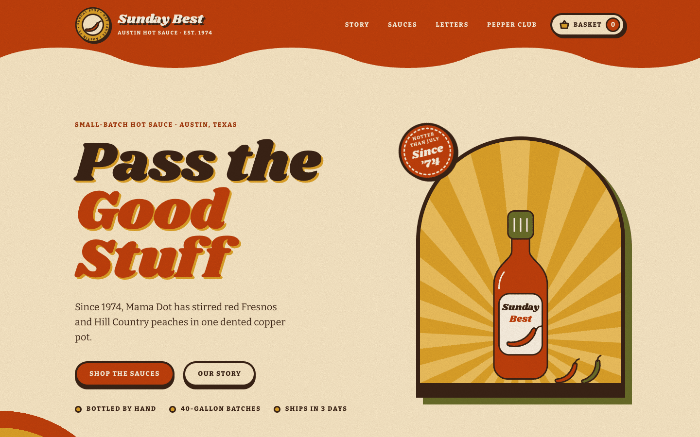
Create a retro/vintage brand website with 1960s–70s nostalgia: warm earthy colour, groovy display type, and the grain and wear of printed ephemera.
Brief
Subject: Sunday Best — a family-run hot sauce company from Austin, Texas, making small batches since 1974Write in a warm, period-flavoured brand voice: product names, heat levels or variants, prices, a founding story with a year, customer lettersDesign Tokens
Use these exact values. Where the spec is silent, stay consistent with them.
colors:
  accent: "#c2410c"
  accentDeep: "color-mix(in srgb, #c2410c 80%, #000)"
  background: "#fbeccb"
  border: "#3b2416"
  mustard: "#dfa52a"
  mustardLight: "#f0c461"
  muted: "color-mix(in srgb, #3b2416 75%, #fbeccb)"
  olive: "#6b6f2a"
  oliveDeep: "#545722"
  surface: "color-mix(in srgb, #fbeccb 45%, #fff)"
  text: "#3b2416"
effects:
  airmailBorder: "10px border-image of repeating-linear-gradient(45deg): accent 0–14px, cream 14–22px, mustard 22–36px, cream 36–44px"
  grain: "fixed full-page overlay: SVG feTurbulence (fractalNoise, baseFrequency 0.85, 3 octaves) tinted with the text colour, opacity 0.22, mix-blend-mode multiply, pointer-events none"
  heroRings: "radial-gradient: transparent to 150px, then 35px rings of olive, mustard and accent"
  ruledPaper: "repeating-linear-gradient(to bottom): transparent 0–33px, text colour at 14% 33–35px, over the surface colour"
  stripeRule: "linear-gradient to bottom: accent 0–33%, mustard 33–66%, olive 66–100%"
  sunburst: "repeating-conic-gradient: mustard 0–9deg, mustard-light 9–18deg (cards use their tint and a lighter mix of it)"
  wavyEdge: "inline SVG path, full width, 34–76px tall (clamp), filled with the section above"
fonts:
  accent:
    fallback: cursive
    family: Kalam
    weights: [400, 700]
  body:
    fallback: "Rockwell, Georgia, serif"
    family: Bitter
    weights: [400, 600, 800]
  display:
    fallback: "Cooper Black, Georgia, serif"
    family: Shrikhand
    weights: [400]
layout:
  breakpoints:
    large: 980px
    medium: 760px
    nav: 880px
    small: 560px
  container: 1180px
  gutter: "24px, 16px under 560px"
motion:
  durations:
    buttonPress: 150ms
    cardLift: 250ms
    postcard: 300ms
    stampTurn: 40s
    sunburstTurn: 90s
  easings:
    interactions: ease
    rotations: linear
radii:
  arch: 999px 999px 0 0
  card: 28px
  factBadge: 999px 999px 18px 18px
  pill: 999px
  postcard: 20px
shadows:
  aboutArch: -14px 14px 0 accent
  badge: 4px 4px 0 text
  button: 0 6px 0 text
  card: "8px 8px 0 in the card tint: accent, mustard, olive and text colour for cards 1–4"
  heroArch: 14px 14px 0 olive
  newsletter: 12px 12px 0 text
  postcard: 8px 8px 0 text
spacing:
  cardGap: 30px
  heroY: "clamp(80px, 10vw, 130px) top, clamp(60px, 8vw, 100px) bottom"
  postcardGap: 34px
  sectionHead: 56px below
  sectionY: "clamp(60px, 8vw, 110px)"
type:
  body:
    font: body
    lineHeight: 1.65
    size: 1.0625rem
    tracking: 0
    weight: 400
  caption:
    font: body
    lineHeight: 1.3
    size: "0.8rem, uppercase"
    tracking: 0.15em
    weight: 800
  display:
    font: display
    lineHeight: 0.86
    size: "clamp(3.4rem, 9vw, 7.25rem)"
    tracking: -0.01em
    weight: 400
  headline:
    font: display
    lineHeight: 0.95
    size: "clamp(2.6rem, 6.5vw, 4.75rem)"
    tracking: -0.01em
    weight: 400
  title:
    font: display
    lineHeight: 0.95
    size: 1.9rem
    tracking: 0
    weight: 400
Style Rules
Section backgrounds run in a fixed order: accent header, cream hero, mustard About, cream products, accent letters, olive newsletter, text-colour footer; each meets the next on a wavy SVG edge (34–76px tall) in the upper section's colourEvery component has a thick solid border in the text colour (4px controls, 5–6px cards and badges, 8px arches) and a hard offset shadow with no blurShapes come from 70s packaging: arches, circles, pills and sunbursts; corners are always generously roundedHeadings use the display font at weight 400 with tight leading and a 4px 4px 0 misprint shadow in mustard, which turns cream on mustard sections and text colour on accent sectionsLabels, nav and buttons use the body font at weight 800, uppercase, with 0.08–0.2em trackingButtons are pills with a 4px border and a 0 6px 0 dark shadow that drops to 4px on hover and 0 on click, moving the button down to matchA three-band striped rule (accent, mustard, olive; 140×18px with a 3px border) sits above each section headBadges, stickers and postcards tilt between -14° and 12°; the grid itself stays straightThe handwriting font is reserved for postcards, captions, the sign-off and form fieldsPage Layout
container 1180px
[ACCENT]  (badge) Name · tagline        STORY  PRODUCTS  LETTERS  CLUB  [BASKET 0]
~~~~~~~~~~~~~~~~~~~~~~~~~~~~~~~~~~~~~~~~~~~~~~~~~~~~~~~~~~ wavy edge
[CREAM]   KICKER                                 (sticker)┌─ arch 4:5 ─┐
          Headline line one                               │  sunburst  │
          LINE TWO IN ACCENT                              │  product   │
          lead (≤ 34ch)                                   └────────────┘
          [Shop]  [Story]     ● meta  ● meta  ● meta
~~~~
[MUSTARD] ┌ photo arch ┐(stamp)    ═══ striped rule
          └────────────┘           Headline
          caption (hand)           Story with drop cap…   [fact] [fact] [fact]
~~~~
[CREAM]              ═══  Headline  · one sentence (centred)
          [card $] [card $] [card $] [card $]
          ( olive bundle bar ·························· [button] )
~~~~
[ACCENT]             ═══  Headline (centred)
          /postcard/   postcard   /postcard/      ← tilted, ruled paper
~~~~
[OLIVE]   ┌ message · headline · sign-off ┊ stamp · name ___ · email ___ · [Send] ┐
~~~~
[TEXT]    (badge) blurb   | Visit | Shop | Follow
          ══════ stripe band ══════
          © year · small print
Sections
Header — Accent background, cream text; logo on the left, nav on the right; a wavy accent edge (28–56px) hangs over the heroContent:Brand name with a short descriptorLinks: story, products, letters, a club or newsletter name, BasketComponents:Badge logo: a 74px circle with a 3px drop-shadow offset in the text colour, beside the name in display type (1.7rem) and a tiny uppercase taglineNav links: uppercase caption labels in 999px pills with a transparent 3px border that turns cream on hoverBasket link: a cream pill with a dark border and a round accent counter that bumps when items are addedStates:Menu button toggles aria-expandedMobile: Below 880px the nav collapses behind a pill 'Menu' button into a cream dropdown card with a 5px border and a 6px offset shadow; the badge shrinks to 58pxHero — Cream background, two columns at 1.15fr / 0.85fr; copy on the left, the arch (max 430px) on the rightContent:Kicker line: product type and place, as plain uppercase caption textHeadline: 3–6 words in display size; the second line in the accent colourLead: one or two sentences with the founding year and a vivid detail, at most 34chButtons: shop (primary) and story (cream)Meta: three short promisesComponents:Arch: 4:5, 8px border, mustard fill, 14px olive offset shadow; inside, a sunburst of 9° mustard and mustard-light rays turning once every 90s, with the product illustration standing at the bottom; a 22px text-colour base under itSticker: a 118px accent circle with a dashed cream inner ring, rotated -14°, overlapping the arch's top-left, reading a short claim and the founding yearMeta row: three uppercase labels, each after a 14px mustard dot with a 3px borderA decorative half-circle of olive, mustard and accent rings peeks from the bottom-left cornerMobile: One column below 880px, centred copy, the arch underneath; the decorative rings are hiddenMotion: The sunburst rotates (linear, infinite); stops under reduced motionAbout — Mustard background, two columns at 0.9fr / 1.1fr: the photo arch, then the striped rule, headline and storyContent:Story: three short paragraphs — the founding moment, the first sale, the family todayFacts: years running, generations, batch sizeComponents:Photo arch: 3:4, 8px border, a -14px/14px accent offset shadow; a handwritten caption below, rotated -1.5°Est. stamp: a 160px circular badge with ring text and the year, overlapping the photo's bottom-right, its ring rotating once every 40sDrop cap: the first letter of the story in display type, 4.2rem, accent with a text-colour misprint shadowFact badges: three cream tombstone shapes (radius 999px 999px 18px 18px) with a big accent number in display type over a short labelMobile: One column; the fact badges stack as pills below 560pxProducts/Services — Cream background; centred section head (max 680px, 56px below); four cards in an auto-fit grid (min 250px, gap 30px); the bundle bar 50px belowContent:Head: a short label, a headline, one sentence on how the range runs from mild to wildFour products, each with a playful name, the flavour, a price and a sizeBundle: all four with a free extra and a priceComponents:Card: surface fill, 6px border, card radius, an 8px offset shadow in the card's tint (accent, mustard, olive, text colour for cards 1–4); art window on top: an arch with a sunburst of the tint at 50% 85% and the product illustrationPrice badge: an 86px mustard circle with a dashed inner ring, rotated 12°, overlapping the card's top-right corner; price in display type over a small size labelRibbon on the signature product: an accent pill rotated -8° across the art's left edgeCard body: an uppercase kicker in the deep accent, the name in title size, two sentences, a dotted rule, then a heat or variant label with a 1–4 icon ratingFull-width 'Add to Basket' button that turns olive and reads 'Added' when pressedBundle bar: an olive pill with a 6px border and an 8px dark offset shadow: title and offer on the left, a mustard button on the rightStates:'Add to Basket' toggles its own added state and bumps the header counterMobile: Cards stack; the bundle bar becomes a 32px-radius blockMotion: Cards lift 6px and rotate -0.6° on hover, and the shadow grows to 12px 14pxTestimonials — Accent background with cream text; centred head with a cream-banded striped rule; three postcards in an auto-fit grid (min 280px, gap 34px), tilted -2°, 1.6° and -1°, the middle one 30px lowerContent:Three short letters from customers in different towns, each mentioning a specific product and a family momentComponents:Postcard: surface fill ruled every 35px, 5px border, postcard radius, 8px dark offset shadow; an uppercase 'Post Card' label and a postmark in the top cornerThe letter in the handwriting font at 1.18rem with a 35px line height; the signature in handwriting bold in the deep accent, the town in an uppercase label belowOne postcard carries a small rotated mustard 'Fan favourite' pillMobile: Postcards stack and keep their tilt; the middle offset is removedMotion: A postcard straightens and scales to 1.02 on hoverNewsletter — Olive background; the postcard form centredContent:Headline: an invitation to the clubWhat members get, once a monthA friendly sign-off from the familyComponents:Postcard form: max 1000px, cream, 6px border, 26px radius, 12px dark offset shadow, and an airmail border of diagonal accent and mustard stripesLeft half: the headline in accent with a mustard misprint shadow, two sentences, a handwritten sign-offRight half, after a 3px dashed divider: a postage stamp illustration rotated 4°, a postmark, then name and email fields written in the handwriting font on a 3px underline, and a primary buttonStates:Fields: on focus the underline turns accent over a mustard washOn submit a handwritten confirmation appears below the buttonMobile: The halves stack and the dashed divider becomes horizontal; the postmark is hiddenFooter — Text-colour background, cream text; a 1.4fr/1fr/1fr/1fr grid: a 120px badge with an accent drop shadow and the blurb, then three columns with mustard display-type headings; a 30px three-band stripe, then the bottom lineContent:Brand blurb (at most 32ch)Visit: the street address and opening daysShop and Follow: three short links eachBottom line: © year, a small-print jokeStates:Links are underlined in mustard and turn mustard on hoverMobile: Two columns below 880px, one below 560pxImagery & Icons
Illustrations are inline SVG in the palette with flat fills and a 3px outline in the text colour: the product (bottle or jar), chillies or variant icons, the badge logo, stamps and a postmarkOne photo, in About: https://picsum.photos/seed/<keyword>/600/800 with filter sepia(.55) saturate(1.1) contrast(1.05) and multiply blending, inside the archThe badge logo is a circle with the brand name on a ring of text and a small illustration at the centreDon'ts
No pill-shaped eyebrow labels above headings; the striped rule does that jobNo gradients beyond the decorative ones defined in the effects tokens (sunbursts, striped rule and band, ruled paper, airmail border, hero rings)No blurred or soft shadows: every shadow is a hard offsetNo sans-serif body text and no thin bordersNo photos except the one in AboutNo fonts, colours, radii or shadows outside the design tokens and rules aboveNo sections, features or effects that this spec doesn't listNo placeholder copy (lorem ipsum, "Elevate your workflow"): every word comes from the subjectNo pill-shaped eyebrow labels above headings and no gradient text, unless this spec asks for themNo grid of identical icon cards: vary size and emphasis by importanceQuality Floor
Mobile-first and responsive from 360px to 1440px and wider, with no horizontal scrollingText contrast meets WCAG 2.1 AA: 4.5:1 for body text, 3:1 for large textSemantic landmarks (header, nav, main, section, footer), one h1, descriptive alt textEvery interactive element has hover, visible focus and active states and works from the keyboardHonour prefers-reduced-motion: keep opacity fades, drop movementTech Stack
Framework: HTML/CSS/JS — Deliver one self-contained index.html: styles in a <style> block, scripts in a <script type="module"> block, no build step.Styling: Vanilla CSS — Plain CSS. Declare every design token as a custom property on :root (--color-accent, --font-display, --radius-card…) and use only those properties for colours, fonts, radii, shadows and timing.Language: JavaScript — JavaScript as ES modules; no TypeScript.UI library: None — No component library: build every component from the design tokens.Motion: CSS only — CSS transitions and keyframes only, with durations and easings from the design tokens.Icons: Inline SVG — Inline SVG icons drawn for this style, with one stroke width and corner treatment across the page.Acceptance Checklist
Section backgrounds run accent → cream → mustard → cream → accent → olive → text colour, joined by wavy edgesEvery card, badge, button and arch has a thick solid border in the text colour and a hard offset shadow with no blurThe paper-grain overlay covers the whole pageThe hero has a 4:5 arch with a rotating sunburst, an illustrated product and a rotated stickerProduct cards carry a rotated circular price badge and a heat or variant ratingButtons press down: the shadow shrinks on hover and disappears on clickTestimonials are three tilted postcards on ruled paper, written in the handwriting fontThe handwriting font appears only on postcards, captions, the sign-off and form fieldsHeadings carry the misprint shadow in the colour that suits their sectionUnder prefers-reduced-motion nothing rotates or transitions