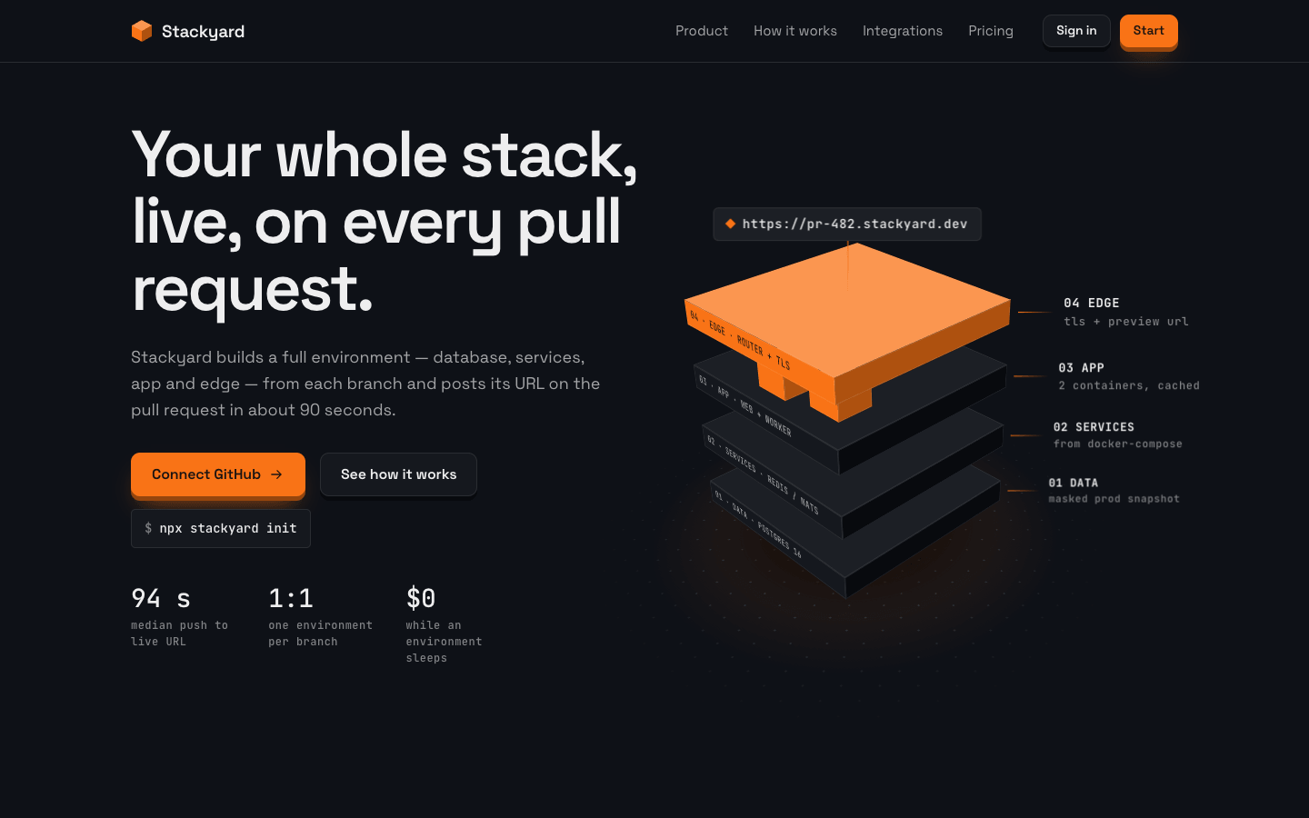
Create a 3D / isometric tech landing page where the interface is built as a scene: stacked layers, floating blocks and real depth made with CSS 3D transforms.
Brief
Subject: Stackyard — a platform that spins up a full preview environment for every pull requestThe 3D scenes should explain the product (the layers of the stack, one environment per branch), not just decorate. Write concrete copy: features, integrations, pricesReal depth from CSS 3D transforms: boxes with top, front and side faces, cards that show their thickness, soft shadows under everything that floatsDesign Tokens
Use these exact values. Where the spec is silent, stay consistent with them.
colors:
  accent: "#f97316"
  background: "#0e1117"
  border: "color-mix(in srgb, #ffffff 12%, #0e1117)"
  dim: "color-mix(in srgb, #ffffff 48%, #0e1117)"
  faceLeft: "#f97316"
  faceRight: "color-mix(in srgb, #f97316 70%, #000)"
  faceTop: "color-mix(in srgb, #f97316 75%, #ffffff)"
  ink: "color-mix(in srgb, #f97316 15%, #000)"
  muted: "color-mix(in srgb, #ffffff 62%, #0e1117)"
  primaryDeep: "color-mix(in srgb, #f97316 60%, #000)"
  primaryLight: "color-mix(in srgb, #f97316 55%, #ffffff)"
  primaryTint: "color-mix(in srgb, #f97316 85%, #ffffff)"
  surface: "color-mix(in srgb, #ffffff 3%, #0e1117)"
  surface2: "color-mix(in srgb, #ffffff 6%, #0e1117)"
  text: "color-mix(in srgb, #ffffff 93%, #0e1117)"
effects:
  dotFloor: "radial-gradient(border colour 1px, transparent 1.5px) every 24px on a plane with the isometric transform under each scene"
  floorGlow: "radial-gradient(closest-side, primary at 20%, transparent) under the hero stack and the platform"
  floorShadow: "radial-gradient(closest-side, black at 85%, black at 45% at 55%, transparent), blur 8px (14px under the platform)"
  isometric: "rotateX(60deg) rotateZ(45deg) with preserve-3d, inside a parent with perspective 1000px"
  tilt: "12deg, halved under 760px"
fonts:
  body:
    fallback: "ui-sans-serif, system-ui, -apple-system, sans-serif"
    family: Space Grotesk
    weights: [400, 500]
  display:
    fallback: "ui-sans-serif, system-ui, -apple-system, sans-serif"
    family: Space Grotesk
    weights: [600, 700]
  mono:
    fallback: "ui-monospace, SFMono-Regular, Menlo, Consolas, monospace"
    family: JetBrains Mono
    weights: [400, 500, 700]
layout:
  breakpoints:
    mobile: 760px
    nav: 860px
    stack: 960px
    twoColumn: 1080px
  container: 1200px including the gutters
  gutter: 24px
motion:
  durations:
    box: 500ms
    button: 150ms
    fan: "1s, staggered 90ms per level"
    flip: 800ms
    float: 7–8s
    tileReturn: 350ms
  easings:
    box: "cubic-bezier(0.2, 0.8, 0.2, 1)"
    fan: "cubic-bezier(0.2, 0.9, 0.25, 1)"
    float: "ease-in-out, infinite"
radii:
  button: 10px
  card: 4px
  chip: 5px
shadows:
  buttonDepth: "0 5px 0 primary-deep, 0 16px 26px -12px primary at 70%; hover 0 7px 0; pressed translateY(4px) with 0 1px 0"
  thickness: "tiles 12px, flip cards 14px, platform 30px, drawn as a side face in primary-deep or the background shade"
spacing:
  cta: "100px top, 140px bottom"
  hero: "64px top, 72px bottom"
  section: 120px top and bottom; section heads 64px above content
type:
  body:
    font: body
    lineHeight: 1.6
    size: 17px; ledes 18px
    tracking: 0
    weight: 400
  caption:
    font: mono
    lineHeight: 1.5
    size: 12–13px
    tracking: 0.04em
    weight: 500
  display:
    font: display
    lineHeight: 1.02
    size: "clamp(2.6rem, 5.2vw, 4.5rem)"
    tracking: -0.045em
    weight: 600
  headline:
    font: display
    lineHeight: 1.05
    size: "clamp(2rem, 3.6vw, 3rem)"
    tracking: -0.035em
    weight: 600
  title:
    font: display
    lineHeight: 1.2
    size: 22px
    tracking: -0.02em
    weight: 600
Style Rules
Every 3D object is a real box: preserve-3d with a top face, a front face and a side face, shaded light, base and darkPrimary boxes use the primary face tints; neutral boxes use surface 2 on top, surface in front and the background shade on the sideScenes live in fixed-size stages that scale down as a whole on small screens, so geometry never reflowsLabels on faces and callouts are JetBrains Mono at 10–13px; headings and body are Space GroteskDepth is reinforced by blurred elliptical floor shadows, never by drop-shadows on flat cardsFlat UI (section heads, lists, the config block) stays flat and left-aligned around the scenesHover raises objects toward the viewer; nothing spins on its ownPage Layout
container 1200px incl. gutters; dark background
◆ Name ······· Product  How it works  Integrations  Pricing ······ [Sign in] [Start]   ← sticky header
Headline, max 12.5ch                       ◇ https://pr-482… (chip)                  ← hero
lede                                      ◢◣ 04 EDGE ─── tag
[Connect]▄ [See how]▄  $ npx init         ◢◣ 03 APP ▣▣ ─── tag
94 s · 1:1 · $0                           ◢◣ 02 SERVICES ─── tag
                                          ◢◣ 01 DATA ─── tag
                                           ░ floor shadow + glow ░
Section head                                                                          ← features
⟋tile, tilted, 12px edge⟋  ⟋tile⟋  ⟋tile⟋     ellipse shadows under each
◢◣ ◢◣ ◢◣ ◢◣ ◢◣ fanned boxes, labelled │ 01 step … 05 step / [config file]           ← how it works
head + category list │ ▣ ▣ ▣ ▣ / ▣ ▣ ▣ ▣ / ▣ ▣ ▣ ▣  cubes on a dotted iso floor       ← integrations
⟋flip⟋  ⟋FEATURED flip⟋  ⟋flip⟋   mono note                                          ← pricing
⟋ floating platform, 30px thick: headline │ [dark button]▄ $ cmd / meta ⟋             ← cta
░ shadow + glow ░
Sections
Hero — 64px top and 72px bottom; two columns 1fr / 1.02fr with a 32px gap, vertically centred: headline (display), lede (muted, 18px) 26px below, the button row and command chip, the stats 40px below; the stack on the rightContent:Headline: what the product gives, 7–10 words, max 12.5ch per lineLede: one sentence on what it builds from whereButtons: a connect action and 'See how it works'Three stats: build time, the 1:1 promise, idle costComponents:Buttons: primary (primary fill, ink text, 600 16px, padding 14px 22px, 10px radius, the button depth) and ghost (surface fill, 1px border, a dark 5px depth)Command chip: mono 14px, '$ ' and the install command on surface with a 1px borderStats: three figures in mono 500 at 28px with a caption eachHero stack: four slabs (data, services, app, edge) in an isometric stage of 540 × 530px, floating 70px apart; each slab's front face carries a mono label ('01 · DATA · …'); the app slab has two small cubes on top; the top slab uses the primary faces, the others the neutral faces; a URL chip floats above; callout lines (34px, primary fading out) lead to mono tags on the right; a floor shadow and a primary floor glow under itMobile: Under 960px one column with the stage scaled to 0.66, and to 0.6 under 760pxMotion: The stack floats 8px up and down over 7s while its floor shadow breathesFeatures — Section head (max 720px, 64px below), then three tiles with a 40px gap, each inside a parent with the perspective variableContent:Section head with a headline on the problem it removes and a ledeThree features with concrete numbers and three mono chips eachComponents:Tile: a panel face (linear-gradient(165deg, surface 2, surface), 4px radius, 1px inner border) rotated rotateX(tilt) rotateY(-tilt) with a 12px edge in primary-deep below and to the right; a small isometric box scene at its top; the mono index top-right; title; two muted sentences; mono chipsAn elliptical blurred shadow 36px below each tileMobile: One column (max 460px) with 56px gaps under 960pxMotion: Moving the pointer over a tile tilts it toward the pointer (up to the tilt angle) and lifts it translateZ(22px) over 120ms linear; leaving eases back over 350msHow It Works — Two columns 1.1fr / 0.9fr with a 40px gap: the fan stage on the left, the steps and config block on the rightContent:Headline naming the number of layers and the build timeFive steps in build orderA short config fileComponents:Fan stage (560 × 580px): five neutral boxes stacked flat, each with a mono label on its front face; when the section enters the viewport they rise apart 76px per level over 1s, staggered 90ms, with callout tagsSteps list: a mono number, the step name (title), one muted sentenceConfig block: a mono panel with the subject's config file (6–9 lines), keys in muted, values in primary-lightMobile: One column under 1080px with the stage scaled downIntegrations — Two columns 0.8fr / 1.2fr: section head and category list on the left, the cube grid on the rightContent:Headline about plugging into existing tools and a ledeFour categories (source, runtime, data, workflow) with real tool namesTwelve monogramsComponents:Category list: rows split by 1px lines, a 96px mono category in primary-light and the integrations in textCube grid (680 × 470px): twelve 56px cubes on an isometric dotted floor, grouped by category with mono row tags; variants: primary faces, primary-deep faces, neutral and neutral-light; each top face has a two-letter monogramMobile: One column under 1080px; the grid scales to fitMotion: Hovering a cube raises it 20px over 500ms and brightens its facesPricing — Section head, then three cards with 36px gaps; the note centred 72px belowContent:Headline on how it's priced and a lede on what doesn't countThree plans with real prices per environment-hour or monthA mono note on billing belowComponents:Flip card: 450px tall, rotateX(tilt), 14px thick; front: plan name, a one-line audience, the price at 64px weight 600 with its unit, an included-summary line under a rule, a mono hint; back: a 6-item check list and a full-width buttonFeatured front: linear-gradient(150deg, primary-light, primary-tint 40%, primary) with a white top highlight and ink textA blurred elliptical shadow under each cardMobile: One column (max 460px) under 960pxMotion: Hover, focus or tap flips a card rotateY(180deg) over 800msCTA — 100px top and 140px bottom; the platform at container width with copy and actions in 1.25fr / 1frContent:Headline of 3–5 words (max 13ch)One sentence on what happens on the next pull requestButton, command and a meta line with supported hosts and a certificationComponents:Platform: a slab 30px thick tilted rotateX(tilt); its face linear-gradient(140deg, primary-light, primary-tint 38%, primary) with a white top highlight, 60px 56px padding, ink textDark button: background fill, primary-light text, a black 5px depthA command chip in ink at 12% with an ink-20% border, and a mono meta lineA large blurred shadow and a primary glow under the platformMobile: Under 960px the platform stacks its columns with 44px 32px paddingMotion: The platform floats 10px over 8s, its shadow growing and shrinking with itImagery & Icons
No photos or illustration files: every visual is an isometric CSS scene of boxes, slabs and cubes, with mono labels on their facesIntegration marks are two-letter mono monograms on the top faces of cubes, rotated -45° to read straightIcons: 18px inline SVG strokes in the muted colour or primary-light; checkmarks in primary-lightImplementation Notes
A sticky header: background at 74% with a 12px blur and a 1px border; logo (a small isometric cube and the name, 19px 600), four muted 15px links, a small ghost and a small primary button; links hide under 860pxThe fan-out and pointer tilt use an IntersectionObserver and pointer events; flip cards toggle a class on tap and work with keyboard focus; a footer under a 1px rule holds links and © in 14px dimDon'ts
No coloured word in a headline, no pill badge or eyebrow label above headingsNo 3D on body text, and no tilt on anything that holds a form field or a paragraph longer than three lines except the cards specifiedNo second accent hue: depth comes from tints and shades of the primary and the neutral surfacesNo WebGL, canvas or images: every scene is HTML and CSS transformsNo motion that ignores reduced motionNo fonts, colours, radii or shadows outside the design tokens and rules aboveNo sections, features or effects that this spec doesn't listNo placeholder copy (lorem ipsum, "Elevate your workflow"): every word comes from the subjectNo pill-shaped eyebrow labels above headings and no gradient text, unless this spec asks for themNo grid of identical icon cards: vary size and emphasis by importanceQuality Floor
Mobile-first and responsive from 360px to 1440px and wider, with no horizontal scrollingText contrast meets WCAG 2.1 AA: 4.5:1 for body text, 3:1 for large textSemantic landmarks (header, nav, main, section, footer), one h1, descriptive alt textEvery interactive element has hover, visible focus and active states and works from the keyboardHonour prefers-reduced-motion: keep opacity fades, drop movementTech Stack
Framework: HTML/CSS/JS — Deliver one self-contained index.html: styles in a <style> block, scripts in a <script type="module"> block, no build step.Styling: Vanilla CSS — Plain CSS. Declare every design token as a custom property on :root (--color-accent, --font-display, --radius-card…) and use only those properties for colours, fonts, radii, shadows and timing.Language: JavaScript — JavaScript as ES modules; no TypeScript.UI library: None — No component library: build every component from the design tokens.Motion: CSS only — CSS transitions and keyframes only, with durations and easings from the design tokens.Icons: Inline SVG — Inline SVG icons drawn for this style, with one stroke width and corner treatment across the page.Acceptance Checklist
Every 3D box shows three faces shaded from the primary colour (top lighter, front primary, side darker) or from the neutral surfacesIsometric scenes use rotateX(60deg) rotateZ(45deg) inside a parent with the perspective variableFeature tiles, pricing cards and the CTA platform tilt by the tilt variable and show their thicknessEverything that floats has a blurred elliptical shadow under itThe hero stack, the fan-out diagram and the integration grid label their parts in mono calloutsPricing cards flip on hover, focus and tap, with the details on the backButtons have a hard 5px depth edge, rise 2px on hover and press 4px downNo headline word is coloured and no pill or eyebrow label sits above a headingUnder 760px the tilt halves and the scenes scale down to fit without horizontal scrollingUnder reduced motion the fan-out shows its final state, floats stop and flips become instant