Make It Look Like Linear: Testing a Reference Site Prompt
One brief, two runs: "make it look like Linear" vs the same name plus a list of what to borrow. Both compared to Linear's live site. Real outputs inside.
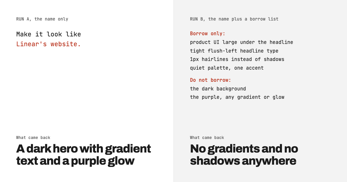
"Make it look like Linear's website" does not give the model one reference. It gives it a bundle, and the model unpacks all of it: the dark background, the purple, a glow behind the hero, a "New" pill badge, keyboard-shortcut hints, even a fake changelog link. Some of it, like the centered gradient headline, is not on Linear's site today. When we kept the name but added four lines saying what to borrow and two saying what to leave, the same brief came back as a light page with the product on the first screen and no gradients or shadows anywhere. Name the parts you want, not the site.
Key takeaways
- With the name alone, the output used Linear's own page color (#08090a) and Linear's purple (#5e6ad2) on a veterinary scheduling product, plus 4 gradients and 3 shadows.
- It also copied a version of Linear that is not on linear.app now: a centered hero and gradient headline text. On 9 November 2026 Linear's homepage was flush-left with plain white headline text.
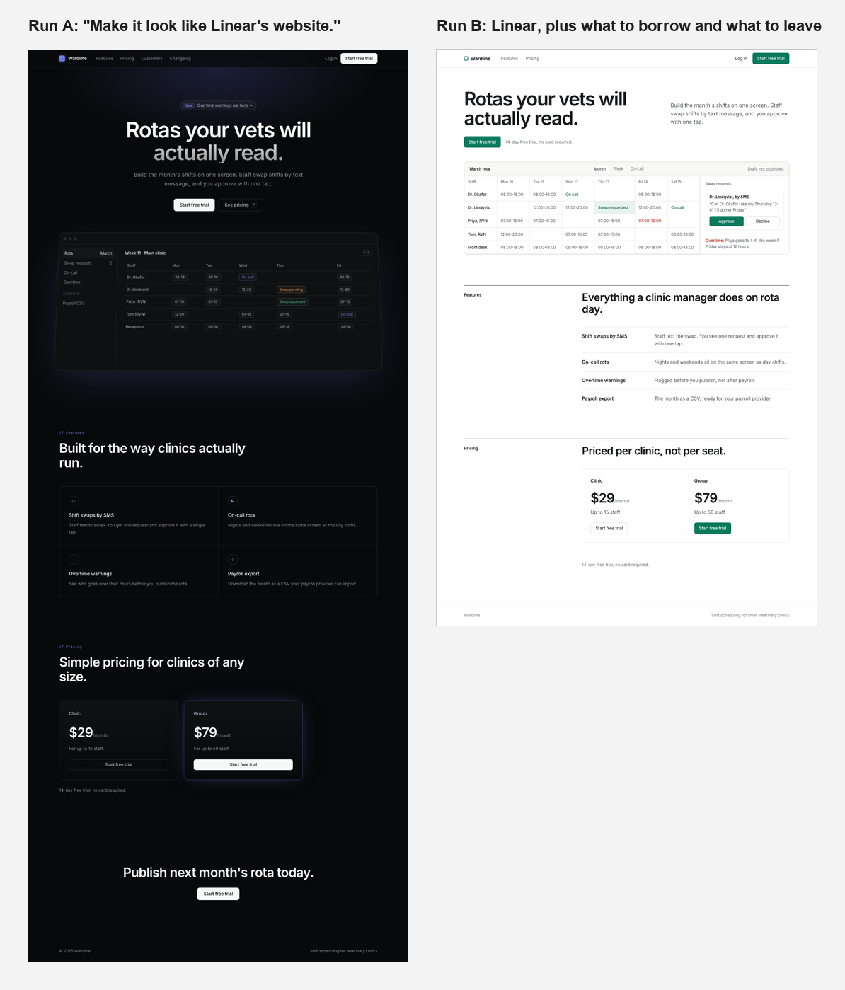
- The borrow list was followed line by line. The page got shorter (about 1,930px against 3,060px) and the trial terms moved onto the first screen.
- The list did not stop invented details. One of them is a wrong number: an overtime warning says 44 hours where the shifts on screen add up to 36.
How did we test it?
We wrote one brief for Wardline, a scheduling product we invented for this test, and ran it twice. Run A added one sentence naming Linear. Run B kept the name and added a borrow list. One generation each, no retries, no edits to the HTML or the screenshots. The model was Claude Opus 5.5, in November 2026. The brief:
Design a single-page marketing site for Wardline, shift scheduling software for small veterinary clinics.

Content:
- Headline: Rotas your vets will actually read.
- Subhead: Build the month's shifts on one screen. Staff swap shifts by text message, and you approve with one tap.
- Features: shift swaps by SMS, on-call rota, overtime warnings before you publish, payroll export as CSV.
- Pricing: Clinic $29/month for up to 15 staff. Group $79/month for up to 50 staff. 14-day free trial, no card required.
- Primary action: Start free trial.

Output one self-contained HTML file with inline CSS.
Run A added this line at the end:
Make it look like Linear's website.We picked Linear because it is the reference people name most often for "clean SaaS", and because our own April post on why AI websites look generic recommended exactly this move, calling a reference like Linear "a single point" for the model. That advice had never been tested. This is the test.
What does "make it look like Linear" produce?
It produces a dark SaaS page assembled from Linear's visual habits, applied to a product for vet clinics.
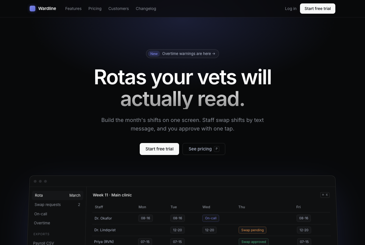
What came with the name, counted in the generated CSS and HTML:
- Linear's colors, not Wardline's. The page background is #08090a, and the logo, the glows and the pill badge use #5e6ad2, Linear's purple. The text greys (#f7f8f8, #b4bcd0, #8a8f98) are also in Linear's live stylesheet. Nothing in the brief asked for purple.
- Effects. 4 gradients (gradient headline text, a radial glow behind the hero, a gradient logo square, a gradient wash on the pricing cards) and 3 shadows, all of them tinted purple.
- Product theatre. A "New" pill announcing "Overtime warnings are here", nav links to Customers and a Changelog that Wardline does not have, a command-palette hint (⌘ K) and a "P" shortcut on the pricing button. These are habits of a developer tool. A clinic manager has no use for keyboard shortcuts on a marketing page.
- Layout. Centered hero, then a tilted app window, a 2x2 grid of icon features, two pricing cards with the second one glowing. The price and the trial terms are not on the first screen; the page runs to about 3,060px.
Is that what Linear's site looks like?
Partly. We checked linear.app in a browser on 9 November 2026, the day of the test. The live homepage uses #08090a and Inter, like Run A. But its headline sits flush-left, at 56px and weight 510, in plain white text with no gradient, and the buttons are pale grey pills. Run A centered the headline at 72px and faded its second line from white to grey, a treatment we found zero instances of on the live page.
So the name pulled in a remembered Linear, a composite of how the site and its many imitators have looked over the years, not the site you would see if you opened it. If your client says "like Linear" and means the page they looked at this morning, the model may hand them something older. This is the mechanism Anthropic describes in its post on frontend design: without guidance, models fall back on the most common patterns in their training data. A famous name is a strong pull toward those patterns, because so many pages have copied it.
What changes when you say what to borrow?
The output follows the list and drops the rest of the bundle. Run B kept "Linear" but added this block after the brief:
Use Linear's website as the reference, but only for these things:
- the product UI shown large, directly under the headline
- tight, flush-left headline type
- 1px hairline borders instead of shadows
- a quiet palette with one accent color

Do not borrow:
- the dark background (our buyers are clinic managers on bright front-desk screens)
- Linear's purple, and any gradient or glow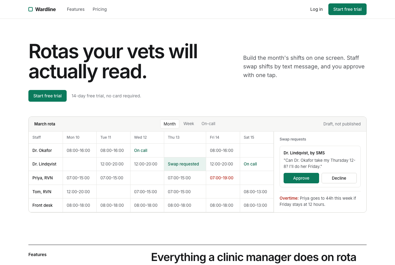
Line by line:
- Product UI under the headline. The rota starts 378px from the top, inside the first screen, and it shows the whole product story: a pending swap, the SMS that triggered it, an Approve button and an overtime warning. In Run A the app window started at 617px and showed tags without the flow.
- Flush-left type. 64px, weight 600, letter-spacing of -0.04em, with the subhead set to the right rather than stacked underneath.
- Hairlines, no shadows. 0 box-shadows and 0 gradients in the CSS. Pricing became two columns divided by a single rule, not two floating cards.
- One accent. A dark green, #0b7a5c, which the model chose itself. White text on it measures 5.31:1, which passes WCAG AA.
The reason in brackets ("clinic managers on bright front-desk screens") is worth keeping. It tells the model why the dark background is wrong for this product, and the page stayed light everywhere, including the app mock.
What did the borrow list get wrong?
Four things, and none of them were covered by the list.
- A second color. "One accent color" was not quite kept: overtime is marked in red (#b4261a) in the table and the side panel. That is the right call for a warning, and it is the same lesson as our dark mode test, where "one accent" stripped the status colors instead. Either way, status colors need their own line.
- A wrong number. The overtime note says "Priya goes to 44h this week if Friday stays at 12 hours." Her shifts on screen add up to 36 hours. A mock with fake data still gets read as a promise of what the product calculates, so check the numbers in any generated UI.
- Invented copy. The SMS text, "Draft, not published", and the pricing heading "Priced per clinic, not per seat" are not in the brief. The last one is a fair reading of the prices, but it is now a positioning claim someone has to approve.
- Inter came along anyway. The list said nothing about the typeface, so Linear's font arrived with the name. Whether a list with no name at all would have chosen differently, we did not test.
Should you name a reference site at all?
Use the name as a label for the list, never as the whole instruction. The name is useful shorthand: it helped Run B get the tight headline and the product-first layout without us describing either in detail. Anthropic's own prompting guide includes a sample frontend prompt that tells the model to draw on IDE themes and cultural aesthetics for inspiration. The problem is what comes attached. A name carries a palette, a set of effects and a product category, and the model cannot tell which of those you meant.
There is a second cost the screenshots make obvious. Run A looks like a Linear knock-off with a vet logo. Anyone in the buyer's world who knows Linear will see that, and a clinic manager who does not will see a developer tool. Borrowing decisions instead of a look avoids both.
Here are the two complete pages side by side, at the same scale:
A reference prompt you can reuse
Put the name in, then fence it. Fill in the brackets:
Use [site name] as the reference, but only for these things:
- [layout decision, e.g. where the product appears]
- [type decision, e.g. headline size, weight, alignment]
- [surface decision, e.g. borders vs shadows, corner radius]
- [palette decision: how many colors and where they go]

Do not borrow:
- [the reference's most recognizable visual trait] ([why it is wrong for your buyers])
- [its brand color], and [any effect you never want]

Status colors (warnings, errors, success) are allowed in addition to the accent, only for status.
Two rules for filling it in. First, the "Do not borrow" lines matter more than the "Borrow" lines: what you leave out of the list is what the name will fill in, so name the reference's signature traits and decide on each one. Second, give a reason for the biggest refusal; it carried through the whole page in our run. The last line about status colors is our fix for failure 1 and was not part of the tested prompt.
If you would rather start from a full style than a reference site, the prompt library has 20 tested starting points, and the prompt builder lets you set palette and type before you generate.
Test notes
- Model: Claude Opus 5.5, run on 2026-11-09. Both pages were generated in the same Claude Code session that wrote this article, each as a single pass from exactly the prompt shown. That is different from our October posts, where each run came from a fresh session.
- Before generating Run A, we had opened linear.app to record its colors and type for the comparison. That can only have pulled Run A closer to the live site (its #08090a page color may come from that look), so the differences we report, the centered gradient headline and the glow, are if anything understated.
- One generation per prompt. No retries, no cherry-picking, no edits to the HTML or the screenshots. Screenshots are 1280x860 in headless Chrome with Inter loaded from Google Fonts. The side-by-side image is built from full-page renders of the same two files.
- Contrast figures use the WCAG 2.1 relative-luminance formula on the hex values in the generated CSS.
- We did not run a third version with the borrow list and no site name, we did not check mobile widths, and we did not run these prompts in ChatGPT, v0 or any other tool. Linear's homepage was checked once, on the test date; it may have changed since.