How to Describe a Design Style to AI (Three Real Runs)
Adjectives get you Fraunces on cream. A style name gets you close. A name plus six decisions gets followed line by line. Real outputs and a template.
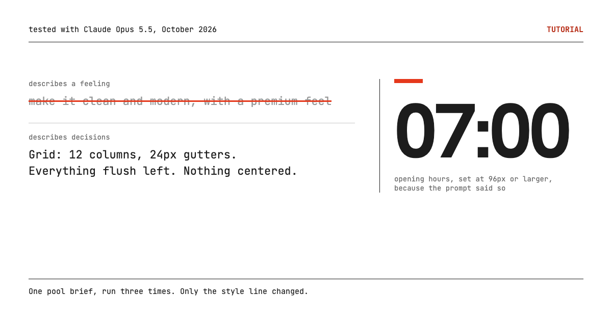
Describe a design style to AI as a list of decisions, not a feeling. Name the style first, because the name pulls in a whole visual vocabulary, then translate it into the five or six choices you would otherwise leave to the model: typeface, grid, type scale, where color is allowed, how information is shown, and what is banned. We ran one swimming pool brief three times with only the style line changed. Adjectives produced the default "premium" look. The style name alone got surprisingly close. The name plus decisions was followed almost line by line, and it still made mistakes worth knowing about.
Key takeaways
- "Clean and modern, with a premium feel" is not a style. It produced Fraunces and Inter on cream, a rounded gradient hero, pill badges and price cards.
- Naming the style did most of the work. "Swiss International Typographic Style" alone produced a grid, Helvetica, ruled price tables and numbered sections.
- The name alone still left choices open, and the model filled them: an off-white page, a second accent color, red section numbers that fail AA contrast, and a header jammed against the left edge.
- Six decision lines closed those gaps. They did not stop the model from inventing weather rules that were never in the brief.
How did we test it?
One brief, three prompts, three separate generations. Each run went to a fresh Claude Opus 5.5 session in October 2026 with nothing else in context, one generation each, no retries and no edits. Ostbad is a pool we invented for the test. Here is the shared brief, exactly as sent:
Build a single-page website for Ostbad, a public outdoor swimming pool. Season runs 15 May to 15 September. Open daily 7:00 to 20:00. Adult entry 8 CHF, children 4 CHF, season pass 120 CHF. One 50 m pool with 8 lanes; lanes 1 and 2 are reserved for lap swimming before 9:00. Address: Uferweg 12, 8008 Zürich. Include a notice area for weather closures. Deliver one self-contained HTML file.Each run added one block after a blank line. Nothing else changed.
We picked the Swiss style on purpose. It has a long, well documented rulebook, so we can check the output against it instead of against taste. Smashing Magazine's overview of Swiss Style lists the core moves: a rigid grid, sans-serif faces such as Akzidenz Grotesk and Helvetica, generous whitespace, large type contrast to lead the eye, and form following function. A pool timetable is close to the ideal subject for it, since the content is almost all numbers.
What do adjectives produce?
The look you get when you do not decide anything. Run A added this line to the brief:
Make it look clean and modern, with a premium feel.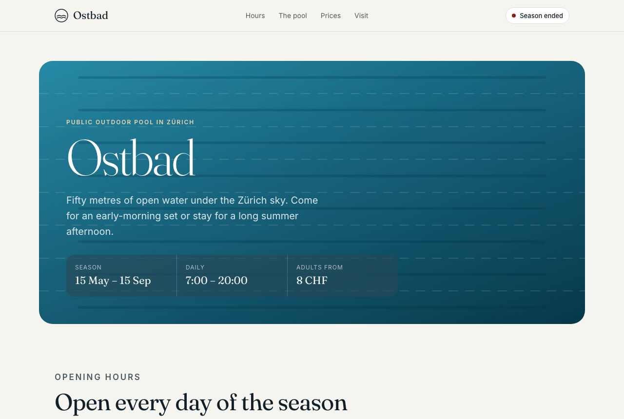
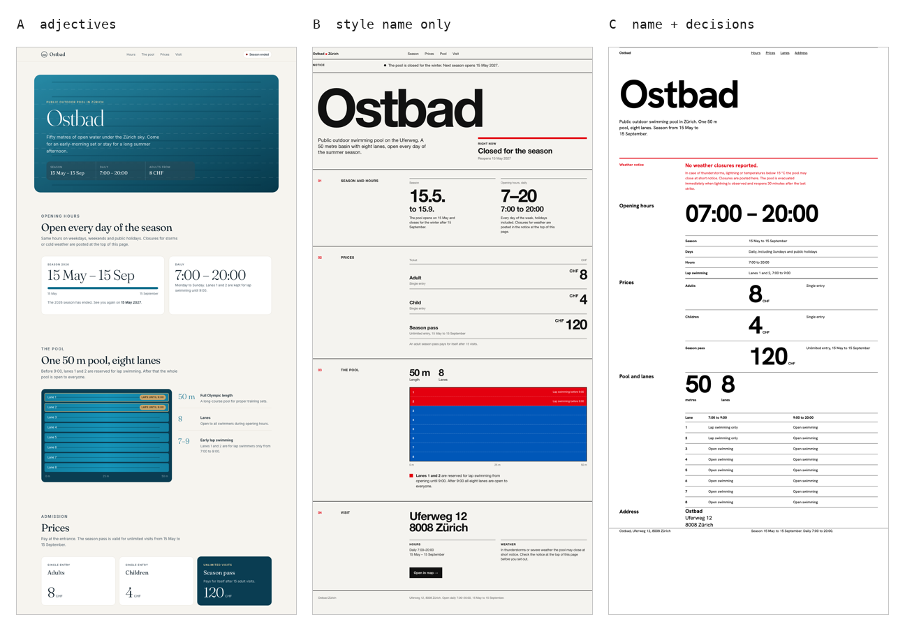
It is competent. It is also a checklist of the defaults this site exists to get people away from. The fonts are Fraunces for display and Inter for text, on a cream background (#f6f4ef). The hero is a rounded teal card with a gradient and faint lane lines. Every section opens with a small uppercase eyebrow label, the season status is a pill badge, and the three prices sit in three rounded cards, the third one filled dark for emphasis. The stylesheet has thirteen border-radius declarations, five of them 999px pills.
To be fair to it, the first screen carries the useful facts: season dates, hours and the adult price. The lane diagram further down is a good idea. But nothing about the look comes from the pool or from any named tradition. "Premium" got translated into the most common premium signals in the model's training data, which is exactly what an adjective asks for.
Is naming the style enough?
Almost. Run B replaced the adjectives with a name:
Design it in the Swiss International Typographic Style.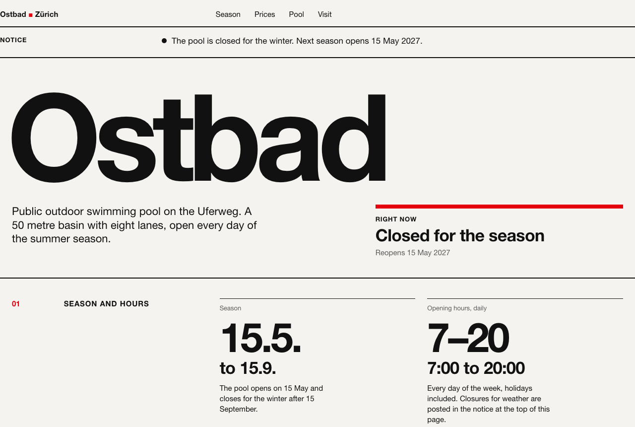
One sentence did more than any adjective could. The page sits on a 12-column grid, the type is a Helvetica Neue stack, sections are numbered 01 to 04 with flush-left labels, the season and hours are set as big numerals, and the prices are a ruled table with the figures right-aligned. It even used the Swiss date format, 15.5. to 15.9. A style name is a compressed instruction, and this one decompressed well.
Look closer and you can see every choice the name left open, and what the model picked:
- Paper. The background is off-white (#f4f3ef), not white. Defensible, but it is the warm "editorial" tint again, sneaking back in.
- Color count. The name implies black, white and one accent. The model added a second, a blue (#0057b8), for the lane diagram, so the page now has red, blue and black competing.
- Where red goes. Red marks the logo square, the section numbers, the lap lanes, a legend swatch, hover states and the focus ring. The weather notice, the one thing that should be loud, is a black bullet on the off-white page in its normal state.
- Contrast. The red section numbers are 15px bold #e3000f on #f4f3ef, which measures 4.43:1. That misses the WCAG AA minimum of 4.5:1 for text that size.
- A layout bug. The header and the notice row start at the very left edge of the window. The wrapper sets a 24px side padding, then a more specific rule resets it to zero, so those two rows lose their margin while the rest of the page keeps it.
- Fonts. No webfont was loaded. The stack falls back from Helvetica Neue to Helvetica, Nimbus Sans and finally Arial, so the page will look different on a machine without Helvetica.
None of these are wrong in a way the prompt ruled out. That is the point. Naming a style hands the model a vocabulary. It does not hand it your decisions.
What does translating the style into decisions add?
Control over exactly the gaps Run B exposed. Run C kept the name and added six lines, one per decision:
STYLE: Swiss International Typographic Style, translated into decisions:
- Type: Hanken Grotesk only (Google Fonts), weights 400 and 700. No second family.
- Grid: 12 columns, 24px gutters. Everything flush left, ragged right. Nothing centered.
- Scale: body 16px; the opening hours and prices set as display numerals, 96px or larger.
- Color: black on white. One red (#e30613) used only for the weather closure notice.
- Information is the design: hours, prices and lane rules as ruled tables with 1px black rules, not cards.
- Never: photos, icons, shadows, rounded corners, gradients, hero background images.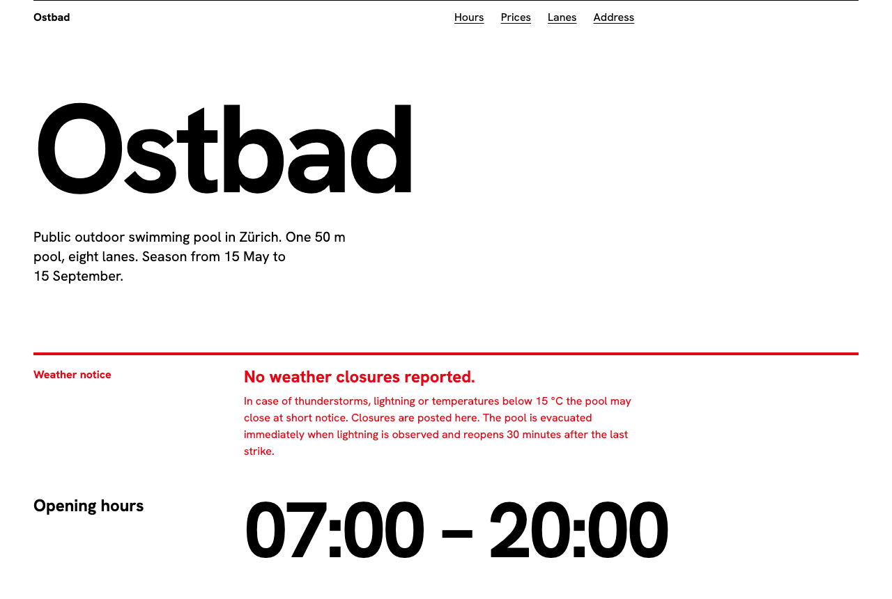
Every line shows up in the output. Hanken Grotesk loaded in both weights and nothing else. The background is white. Red (#e30613) appears in the weather notice and nowhere else in the stylesheet, and as text on white it measures 4.88:1, so it passes AA. The hours, all three prices and the pool length are set as display numerals. The lane rules became an eight-row table with a column for 7:00 to 9:00 and a column for 9:00 to 20:00, divided by 1px black rules. There is not a card, a shadow or a rounded corner on the page.
The difference between B and C is not that C looks more Swiss. B arguably has more character. The difference is that every visible decision in C is one you made, so you can predict it, change it and reuse it on the next page.
What did the decision list still get wrong?
Four things, and each one maps to a decision the prompt did not make.
- The loudest element says nothing happened. The prompt said red is only for the weather notice. It did not say the notice only appears when there is a closure. So the red block is always there, second on the page, announcing "No weather closures reported." On a normal summer day the most prominent thing on the site is a non-event.
- It invented pool policy. The notice says the pool may close below 15 °C and reopens 30 minutes after the last lightning strike. Neither rule is in the brief. They read as plausible, which makes them worse: a visitor would believe them. The same thing happened in our brutalist test, where asking for density made the model invent facts to fill the space.
- Prices are below the fold. At 1280 by 860, the first screen holds the wordmark, the notice and the hours. The adult price starts further down. We set the size of the numerals and never said which ones must be visible first. Run A, with no style decisions at all, got this right.
- The address runs into the footer. The last section has no bottom spacing, so the address sits directly on the footer rule. A spacing scale line would have caught it.
None of these are style problems. They are content and priority decisions, and a style description, however precise, cannot make them for you.
How do you translate any style name into decisions?
Write the name, then answer the six questions the model would otherwise answer for you. This is the block we ran in Run C with the specific values turned into brackets:
STYLE: [style name], translated into decisions:
- Type: [one family, source], weights [n] and [n]. No second family.
- Grid: [columns], [gutter]px gutters. [alignment rule]. [what is never centered].
- Scale: body [px]; [the two or three facts that matter most] set as display numerals, [px] or larger.
- Color: [text] on [background]. One [accent] (#[hex]) used only for [one job].
- Information is the design: [your key content] as [the form it takes], not cards.
- Never: [the moves this style forbids, plus the defaults you keep getting].
A few rules for filling it in, based on where our three runs went right and wrong:
- Keep the name. Run B shows how much it carries. The decision lines refine the vocabulary; they do not replace it.
- Write the decision the name leaves open. If you would accept either answer, leave it out. If you have a preference, the model will not guess it.
- Give color a job, not a hue. "Red only for the closure notice" worked exactly. Then add when that job is visible, which our prompt forgot.
- Ban the defaults by name. The "Never" line is where you list what you got last time. Anthropic's own prompting guidance makes the same point in general terms: being specific about the output you want gets better results than hoping the model infers it.
- Put the facts in the brief, not the style. The style line cannot stop invented details. Only real content can.
If you would rather not write the six lines from scratch, the Prompt Builder exposes most of these decisions as variables, and every style in the prompt library is already written as a set of decisions you can copy and edit.
Test notes: all three runs generated by Claude Opus 5.5 in October 2026, each in a fresh session with no other context, one generation per prompt, no retries and no manual edits. Each session also received a one-line instruction naming the file path to save to; the prompt text was otherwise exactly as shown. We tested Claude only. The same approach should carry over to ChatGPT, v0 or other tools, but we have not run it there, so we make no claim about their output. Ostbad, its prices and its address are invented. Screenshots at 1280x860 in headless Chrome with fonts confirmed loaded; the side-by-side image is the same pages rendered 2600px tall and scaled down. Contrast ratios computed from the generated hex values with the WCAG 2.1 formula. Hanken Grotesk is licensed under the SIL Open Font License per its Google Fonts metadata.