Brutalist Web Design Prompt: Why You Get Neobrutalism
Ask AI for a brutalist site and you get yellow fills and offset shadows. A six-line spec gets real web brutalism. Both outputs and the spec inside.
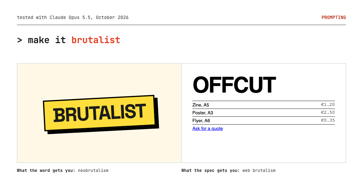
Type "brutalist" into a website prompt and you will almost certainly get neobrutalism: cream background, thick black borders, hard offset shadows, a rotated sticker, a marquee. That is a real style, but it is not what most people mean when they point at Craigslist or a raw 1990s page. To get web brutalism, stop naming the style and name its rules: system type, default blue links, visible tables and rules, every number on the first screen, and an explicit ban on the neobrutalist kit.
Key takeaways
- "Brutalist" is two styles sharing one word. Models resolve it to the recent, decorated one: neobrutalism.
- Our bare run put 7 hard offset shadows above the fold and not one price.
- A six-line spec flipped it. Prices, recent jobs and the address all landed on the first screen, in Helvetica and default blue links.
- Ask for density and the model will invent data to fill it. Bring the real numbers.
Why does "brutalist" produce neobrutalism?
Because the word now points at two different things, and the newer one dominates recent design writing. Nielsen Norman Group describes web brutalism (Kate Moran, 2017) as design that intentionally looks raw, haphazard or unadorned, in the spirit of 1990s websites and the brutalist architecture of the 1950s. Its neobrutalism article (Hayat Sheikh, 2025) describes something else: bold colors, thick borders, and stark single-color offset drop shadows. One is about removing decoration. The other is a decoration system.
A model reading "brutalist style" has to choose, and it chooses the one with the more recognizable visual kit. That is a guess about mechanism, but the output below is consistent with it.
What does the bare prompt produce?
Textbook neobrutalism. Here is the brief, exactly as sent. Offcut is a studio we invented for the test.
Build a homepage for Offcut, a small risograph print
studio in Berlin that prints zines, posters and flyers
for artists and bands. Sections: nav, hero, services
with prices, recent jobs, contact. Brutalist style.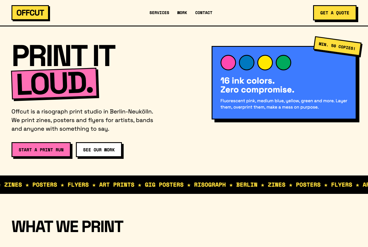
Count what is on the first screen. Seven elements carry a hard black offset shadow: the logo, the quote button, the LOUD block, both hero buttons, the blue card and the sticker. Two elements are rotated. The marquee repeats the service names that the next section lists again. The fonts are Space Grotesk and Space Mono. And the one thing a print customer actually wants, the price per copy, starts below the fold.
It also fails accessibility in one spot. The white body text on the blue card measures 3.84:1, under the 4.5:1 WCAG AA minimum for normal-size text. Neobrutalism's saturated fills make this easy to miss, because the borders look so high-contrast that the text inside them feels high-contrast too.
None of this is a bad neobrutalist page. It is a competent one. It is just not brutalism in the NN/g sense, and if you wanted the raw version you would now be rewriting it by hand.
What does a brutalist spec need to say?
It has to describe raw, unadorned design as concrete decisions, because "raw" alone is as ambiguous as "brutalist". We added this block under the same brief and changed nothing else:
BRUTALIST SPEC (web brutalism, not neobrutalism):
- type: one system sans stack (Helvetica, Arial,
  sans-serif) for everything, monospace only for
  numbers. Body 15px. One oversized size, used once.
- color: black text on white. Links are default blue
  #0000ee and underlined. One extra color, for one job.
- show the structure: tables, 1px rules, plain lists.
  No cards, no shadows, no rounded corners, no
  section background fills.
- density over air: prices, the job list with dates
  and the address all visible on the first screen.
- nothing decorative that carries no information:
  no offset shadows, no rotated stickers, no marquee,
  no illustrations, no emoji.
- keep it usable: WCAG AA contrast, works at 375px.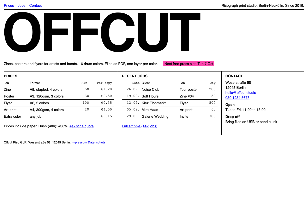
The spec was followed almost line by line (the one slip is covered below). Every price, five recent jobs with dates, the address and the opening hours sit on the first screen. The only oversized type is the wordmark. The single extra color went to the single time-sensitive fact, the next free press slot, as black on fluorescent pink at 6.8:1. The default blue links measure 9.4:1. There is not one shadow on the page.
We did not run the spec without its ban line, so we cannot say how much of the change came from the bans and how much from the positive rules. We would keep them anyway. Run A shows exactly which kit the word summons, and the bans name that kit item by item. Naming the forbidden moves is the same lesson as giving AI a brand style guide: the model needs to know what you are steering away from, not just toward.
Where did the spec go wrong?
In three places, and each one points to a line worth changing.
It invented facts to hit the density target. Our brief gave no prices, clients or address, so both runs made those up. Run B went further, because the spec demanded a full first screen: a founding year, an archive of "142 jobs", a phone number, opening hours and a drop-off policy. The model filled the space with plausible fiction. On a real project, give it the real price list and job log, or you will ship invented numbers.
It read "no illustrations" as "no images at all". For a print studio that is a loss. Brutalist sites still show the work; they just show it without frames, hover zooms or carousels. If your product is visual, add a line that allows raw photos of real work. We have not re-run the prompt with that line, so treat it as a likely fix, not a tested one.
Monospace leaked into the table headers. "Monospace only for numbers" became monospace for the "Min." and "Per copy" header cells too, because the model put its number class on whole columns. Small, but typical: the model applied a rule about characters to whole columns.
The desktop shot also ends with about a third of the screen empty. That is what density does on a short page, and it is honest: there is nothing else to say.
Does it hold up on a phone?
Yes. The spec asked for 375px and the output handles it without a single horizontal scroll.

The three columns collapse to one, the wordmark scales down with clamp(), and both tables fit at 375px without scrolling sideways. Brutalist layouts are easy on mobile for a simple reason: there is nothing to rearrange. Text, tables and rules stack. A layout built from rotated stickers and floating cards has to decide where each one goes.
The reusable brutalist spec
Fill the brackets and paste it under any brief. This is the exact block we ran, with the brief-specific parts turned into variables.
BRUTALIST SPEC (web brutalism, not neobrutalism):
- type: one system sans stack ([font stack]) for
  everything, monospace only for numbers.
  Body [px]. One oversized size, used once.
- color: black text on white. Links are default blue
  #0000ee and underlined. One extra color ([color]),
  for one job: [the one fact it marks].
- show the structure: tables, 1px rules, plain lists.
  No cards, no shadows, no rounded corners, no
  section background fills.
- density over air: [the facts a visitor needs] all
  visible on the first screen.
- nothing decorative that carries no information:
  no offset shadows, no rotated stickers, no marquee,
  no illustrations, no emoji.
- keep it usable: WCAG AA contrast, works at 375px.
If you actually want the louder end, where type overlaps, rotates and mixes typefaces on purpose, that is closer to what NN/g calls antidesign, and our Brutalist Creative Agency prompt goes there deliberately. For a lineup of real sites in either direction, Brutalist Websites collects them. And since the spec only works with real facts behind it, the Website Brief generator is a fast way to get your prices, pages and audience written down before you paste anything.
Test notes: both runs generated with Claude Opus 5.5 in October 2026, one generation each, no retries and no manual edits to either output. Offcut, its prices and its clients are invented. Desktop screenshots at 1280x860 in headless Chrome. The phone view was rendered in a 375px-wide frame, because headless Chrome will not lay out a window narrower than 500px. Contrast ratios computed from the hex values in the generated CSS with the WCAG 2.1 formula.