How to Give AI a Brand Style Guide (Same Brief, Two Very Different Sites)
We ran the identical landing page brief through the same model twice: once bare, once with an eight-line style guide block. Here are both real outputs, the exact block, and the template to reuse.
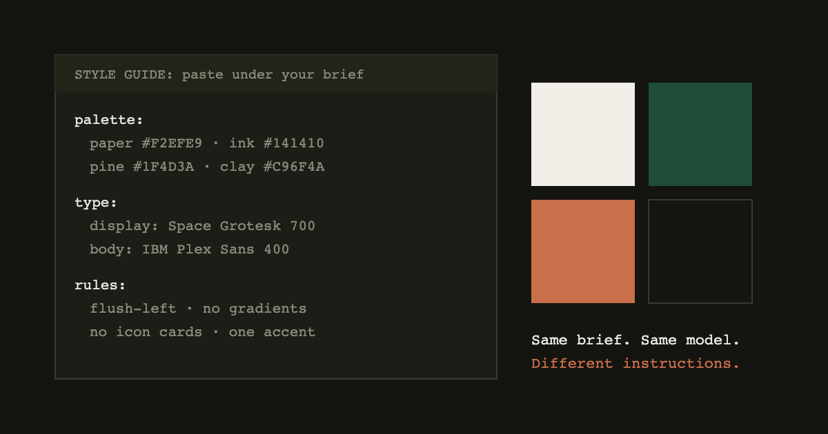
An AI model does not have bad taste. It has no stake in yours. Give it a brief with no visual constraints and it retreats to the statistical middle: Inter, a violet gradient, three icon cards, everything centered. Give the same model eight lines of brand tokens and it builds something that looks decided.
We tested exactly that, and this post shows both raw outputs. One brief, one model, one variable changed.
The experiment
The brief, identical in both runs:
Build a landing page for Driftwood, a specialty coffee
subscription. Independent roasters, taste matching,
flexible delivery. Sections: nav, hero, three features.
Run A got nothing else. Run B got the brief plus this block:
STYLE GUIDE (follow strictly):
- palette: paper #F2EFE9, ink #141410, pine #1F4D3A,
  clay #C96F4A. No other colors. No gradients.
- type: Space Grotesk 700 for display, tight leading,
  -0.03em tracking. IBM Plex Sans 400 for body.
- layout: flush-left. Asymmetric grid. No centered hero.
- headline voice: short, concrete, no "elevate/discover".
- features: numbered editorial rows, NOT icon cards.
- one accent color used sparingly (clay). CTA is pine.
Both outputs were generated with Claude in September 2026 and screenshotted as-is, no manual cleanup. Run the same two prompts yourself and you will land within arm's reach of these results; that reproducibility is the point.
Run A: the brief alone
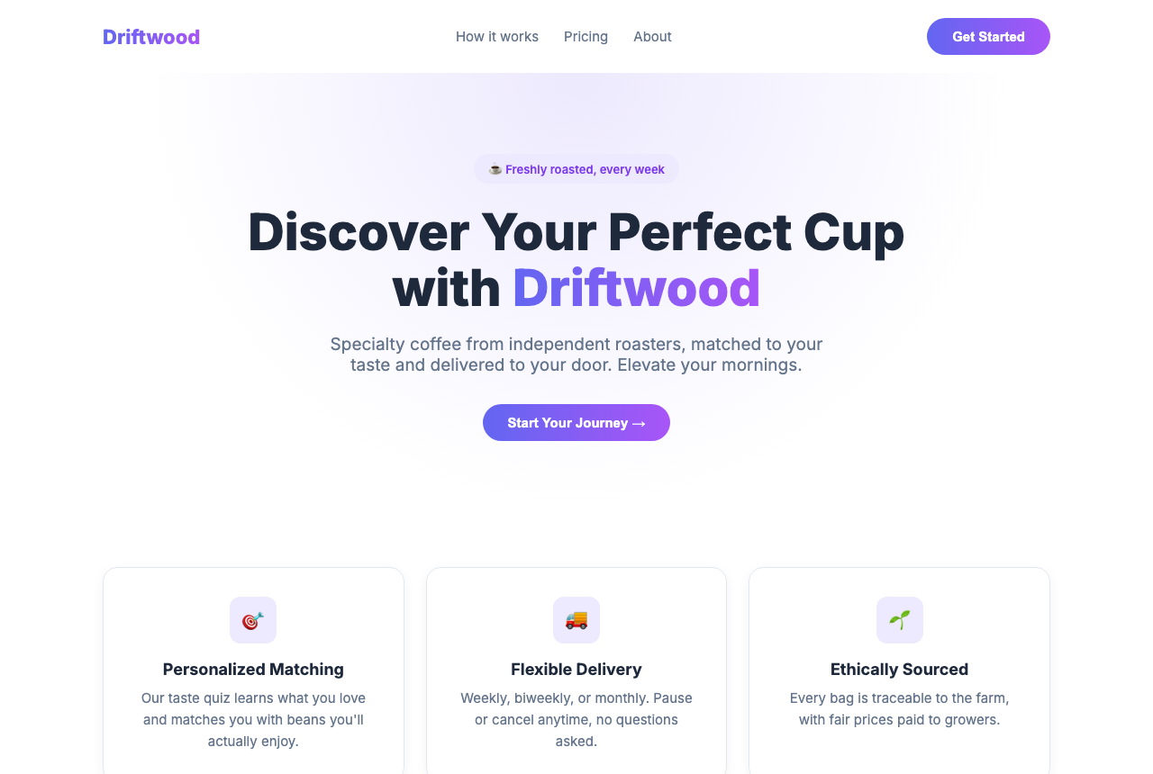
Nothing is broken. Everything is default. The gradient logo, the pill badge, the "Discover Your Perfect Cup", the emoji icon cards: each one is the highest-probability choice for an unconstrained prompt, which is exactly why every unconstrained site converges here. A visitor cannot tell this coffee company from an AI-tools startup.
Run B: the brief plus eight lines
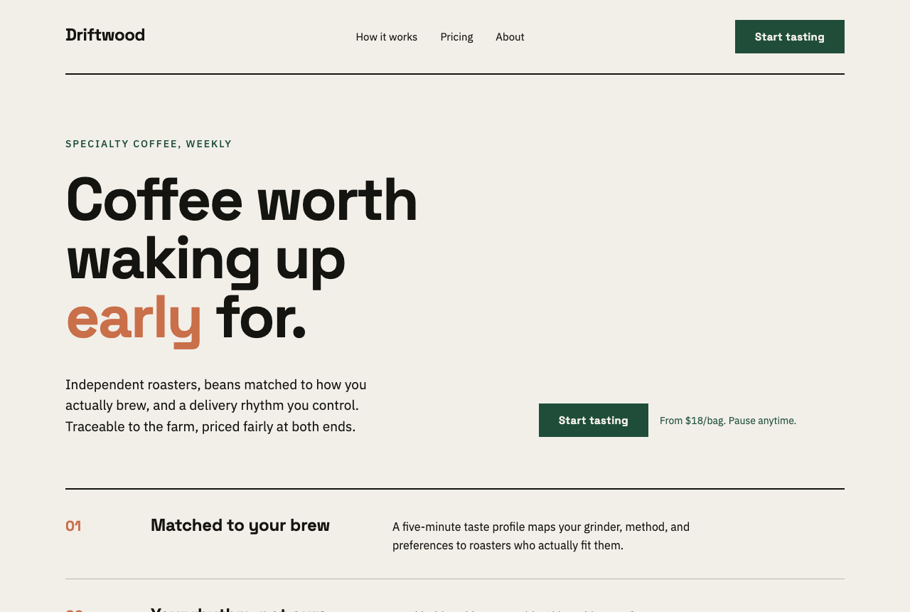
Same model, same brief, same sections. The difference is not "more effort by the AI"; it is that every decision the model would have made by default was made by the style guide instead. Color count dropped from six-ish to four. The hero stopped centering. The features became rows with numbers instead of interchangeable cards. It reads like a brand, because a brand is exactly what we pasted in.
Why such a small block works
Models fill unspecified decisions with the most common answer from their training data. Typography, alignment, color count, and component shape are the four decisions that most define "generic", so constraining those four buys most of the distance. The block above is deliberately structured as tokens and rules rather than adjectives: "flush-left, no gradients, four named hexes" is checkable, while "make it feel premium and modern" is a request for the model's average idea of premium, which is the gradient again.
Two details worth copying:
- Name the forbidden moves. "No icon cards, no centered hero, no gradients" removes the defaults explicitly. Models follow negative constraints on concrete patterns well.
- Ban the vocabulary, not just the visuals. One line about headline voice ("no elevate/discover") kills the copy equivalent of the violet gradient.
The reusable template
Paste this under any brief and fill the brackets:
STYLE GUIDE (follow strictly):
- palette: [3-4 named hex values]. No other colors.
  [Allow/forbid gradients.]
- type: [display font + weight + tracking],
  [body font + weight].
- layout: [flush-left/centered], [grid rule],
  [one thing to never do].
- headline voice: [tone rule + 2-3 banned words].
- components: [the shape you want] NOT [the default
  you are avoiding].
- accent: [which color, how sparingly].
If you have an existing brand, the fastest source of real values: your logo's exact hexes, the two fonts your site already loads, and whichever section of your current site you like most, described in one sentence.
If you do not have a brand yet, do not invent tokens ad hoc mid-prompt. Pick a coherent set from a style that fits the product: every prompt in our library ships as a complete token system for one specific style, and the Prompt Builder walks you through the same decisions interactively.
The one-variable rule
When an output looks wrong, resist rewriting the whole prompt. Change one line of the style guide and rerun: it keeps the experiment readable, and after three or four iterations you have something better than a good page. You have a style guide that reliably produces your look in any AI tool, which is worth more than any single generation.
Outputs in this post: Claude, September 2026, single generation each, no retries and no manual edits. Your exact pixels will vary run to run; the pattern will not.