Bento Grid Layout Prompt: Draw the Grid Before You Ask
"Use a bento grid" gets six icon cards in random sizes. Drawing the grid as grid-template-areas fixes it. Real outputs and a reusable spec inside.
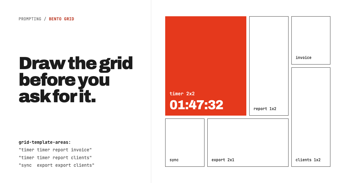
The prompt that produces a good bento grid is not a style description. It is a map. Write the grid as grid-template-areas rows, tie each cell's size to how much that feature matters, and ban the icon-plus-title-plus-sentence cell. Ask for "a bento grid" without those three lines and you get what we got below: six interchangeable cards whose sizes mean nothing.
Key takeaways
- "Bento grid" in a prompt only tells the model to vary card sizes. It does not tell it which card earns the big cell, so it picks at random.
- A six-line spec with an ASCII area map was followed exactly: every cell landed where the map put it.
- Banning icon cards matters as much as the map. A 2x2 cell holding one sentence is still an icon card, just a bigger one.
- The spec output still had one real bug at phone width. The fix is a seventh line, included in the template at the end.
What does a plain "bento grid" prompt produce?
It produces a card grid with spans, which is not the same thing. Here is the brief we used, exactly as sent:
Build a features page for Tally, a time-tracking app
for freelancers. A short intro heading, then the six
main features in a bento grid layout: live timer,
weekly reports, one-click invoices, client list,
calendar sync, CSV export.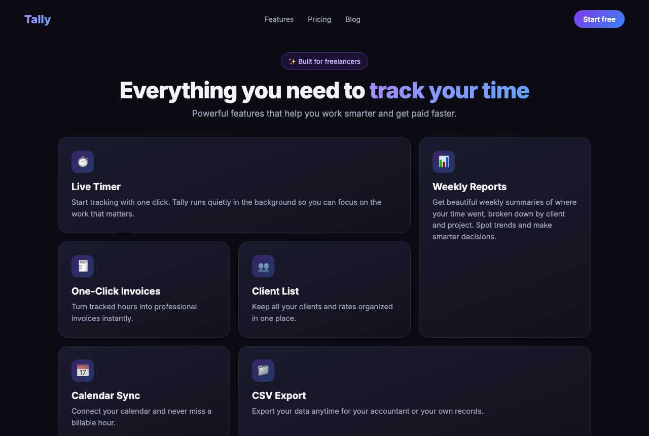
Look at what the sizes are doing. Live Timer got a double-wide cell and filled it with one sentence. Weekly Reports got the tall cell and left its bottom half empty. CSV Export, the least interesting feature on the list, got the second wide cell. The spans exist to make the grid look like a bento, not to rank anything. Around it sits the full generic kit: gradient text, a sparkle pill badge, centered everything, emoji in rounded squares.
What makes a bento grid prompt work?
Three decisions the model will not make on its own: where each cell goes, why it is that size, and what goes inside it. We added this block under the same brief, and changed nothing else:
BENTO SPEC (follow strictly):
- grid: 4 columns, 3 rows, rows fixed at 190px,
  gap 12px. Place cells with grid-template-areas:
  "timer  timer  report invoice"
  "timer  timer  report clients"
  "sync   export export clients"
- size = importance. The 2x2 cell sells the product;
  1x1 cells carry one fact each.
- no icon + title + paragraph cells. Every cell shows
  a real artifact: a running timer, a bar chart,
  a list, a single big number.
- short labels (max 6 words per cell caption).
- one cell filled with the accent color, the rest
  share one surface color. No gradients, no hover lift.
- mobile under 700px: one column, cells in
  importance order, drop fixed row heights.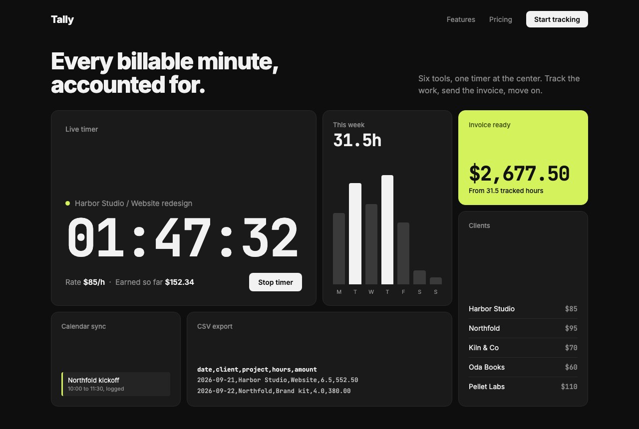
The grid matches the map cell for cell. The live timer, the feature that sells the app, owns the 2x2 slot and shows an actual running clock with the money it is earning. The report is a chart, the invoice is a number, the clients are a list, the export is literally CSV. Each cell has a different kind of content, which is what makes a bento read as a bento: in the original lunchbox the compartments hold different food, not the same food in different portions.
One thing changed that the spec never asked for: the intro heading went flush-left with a side note, and the pill badge disappeared. We read that as the model inferring a restrained register from "no gradients, no hover lift". Do not count on it. If the header matters, specify it.
The output is not perfect on desktop either. The timer and client cells have dead space at the top because fixed 190px rows stretch cells past their content. That is the cost of fixed rows, and usually the right trade: equal row heights are what keep the grid readable as a grid.
Does the prompt survive a phone screen?
Mostly. The mobile line was followed: one column, cells reordered by importance, fixed row heights dropped. But the big cell broke.
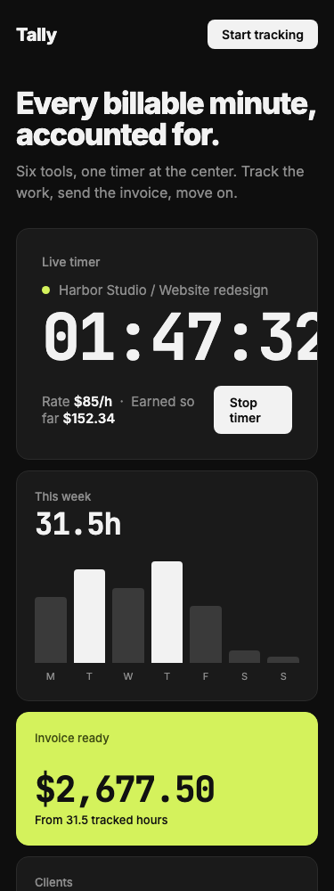
The timer digits are set at a fixed 72px on mobile, and eight monospace characters at that size are wider than a 375px phone column, so the cell clips them. This is the typical bento failure at small widths: the hero cell's content is sized for a 2x2 slot and nothing tells it to shrink. The fix is one more spec line (in the template below): type inside the large cell scales with clamp(), never a fixed pixel size. We have not re-run the prompt with that line yet, so treat it as the obvious patch rather than a tested one.
How do you write the area map?
Draw it in the prompt the way CSS reads it: one quoted string per row, one name per column, a name repeated wherever a cell spans. The model can copy it straight into grid-template-areas. Two rules from the CSS spec, as MDN documents them:
- Every named area must be a rectangle. An L-shaped cell makes the whole declaration invalid. If your map has one, the model will quietly change your layout to make it legal, and you will not get the grid you drew.
- A period is an empty cell. Use
.when you want deliberate negative space instead of filling every slot with a feature.
Then decide the sizes by ranking, not by taste. List your features in order of how much they sell the product. Rank 1 gets the 2x2. Ranks 2 and 3 get the tall or wide cells. Everything else is 1x1. If you cannot rank them, the page does not have a hero feature yet, and no layout will hide that.
The name "bento" comes from the segmented Japanese lunchbox, and Apple's product presentations are what made the pattern familiar on the web (freeCodeCamp's overview covers the lineage). Both origins point to the same rule the prompt encodes: compartments hold different things, and the biggest one holds the main course.
The reusable bento spec
Paste this under any brief and fill the brackets. Lines 1 to 6 are what we ran; line 7 is the mobile patch from above, not yet tested.
BENTO SPEC (follow strictly):
- grid: [N] columns, [N] rows, rows fixed at [px],
  gap [px]. Place cells with grid-template-areas:
  "[a]  [a]  [b]  [c]"
  "[a]  [a]  [b]  [d]"
  "[e]  [f]  [f]  [d]"
- size = importance. The largest cell sells the
  product; 1x1 cells carry one fact each.
- no icon + title + paragraph cells. Every cell shows
  a real artifact: [list the artifact per cell].
- short labels (max [N] words per cell caption).
- one cell filled with [accent], the rest share one
  surface color. No gradients, no hover lift.
- mobile under [px]: one column, cells in importance
  order, drop fixed row heights.
- type inside the largest cell scales with clamp(),
  never a fixed px size.
The spec controls structure, not look. Our Run B still came out in the model's own choice of dark theme and fonts because the prompt never mentioned them. Stack it with a style block (the approach from giving AI a brand style guide) when you want both. For a full-page starting point, the Bento Grid Portfolio prompt in our library ships a complete grid with tweakable gap and radius, and the Prompt Combiner lets you put a bento section under a hero from a different style.
Test notes: both runs generated with Claude Opus 5.5 in September 2026, one generation each, no retries. One manual edit to Run B before rendering: we corrected two dollar figures (earnings on the timer and the invoice total) where the arithmetic was off; the layout and markup were untouched. Desktop screenshots at 1280x860 in headless Chrome. The phone view was rendered in a 375px-wide frame, because headless Chrome will not lay out a window narrower than 500px. The clipped timer is exactly what the generated code does at that width.