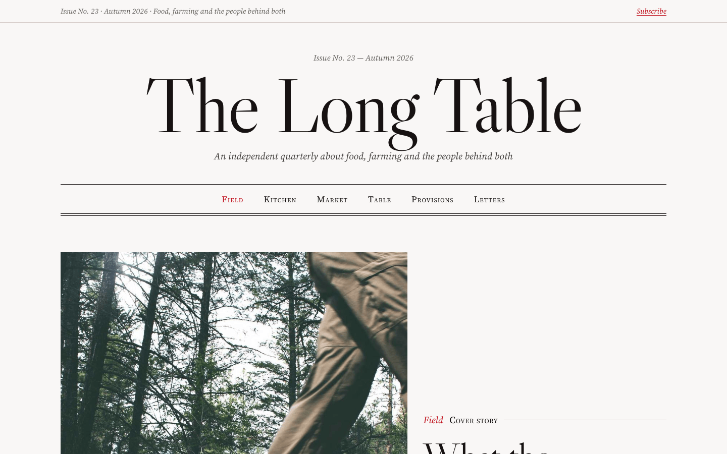
Create a magazine-style editorial site with typography-led design and a serious reading experience, in the tradition of The New Yorker, Monocle or The Gentlewoman.
Brief
Subject: The Long Table — an independent quarterly about food, farming and the people behind bothWrite real headlines, standfirsts, bylines and the full opening of at least one article (4–6 paragraphs). Editorial design only works with editorial writing: no lorem ipsumTwo views in one document: the issue's homepage, then the cover story as an article pageDesign Tokens
Use these exact values. Where the spec is silent, stay consistent with them.
colors:
  accent: "#c1121f"
  background: "color-mix(in srgb, #c1121f 1.5%, #fafaf9)"
  border: "color-mix(in srgb, #c1121f 5%, #d6d5d1)"
  inkSoft: "color-mix(in srgb, #c1121f 3%, #3a3a38)"
  muted: "color-mix(in srgb, #c1121f 3%, #66645f)"
  surface: "color-mix(in srgb, #c1121f 3%, #f1f1ef)"
  text: "color-mix(in srgb, #c1121f 3%, #121212)"
effects:
  doubleRule: "1px text-colour rules above and below the section nav, plus a third 4px below"
  frame: 1px text-colour border with a 1px outline offset 5px
  progress: "3px fixed bar at the top in the accent, scaleX from 0 with reading position, fading in over 250ms on the article"
fonts:
  body:
    fallback: "Georgia, 'Times New Roman', serif"
    family: Source Serif 4
    weights: [400, 600]
  display:
    fallback: "Georgia, 'Times New Roman', serif"
    family: Libre Caslon Display
    weights: [400]
layout:
  breakpoints:
    mobile: 760px
    pullQuote: 1040px
    tablet: 1000px
  container: 1280px including the gutters; article measure 680px
  gutter: "clamp(20px, 3vw, 40px); grid gap 32px"
motion:
  durations:
    colour: 150ms
    progressFade: 250ms
  easings:
    all: ease
radii:
  bylinePhoto: "50%"
  everything: 0
shadows:
  everywhere: none
spacing:
  block: "clamp(40px, 6vw, 72px) top and bottom; block heads 32px above content"
type:
  body:
    font: body
    lineHeight: 1.7
    size: 1.1875rem; article prose 1.25rem
    tracking: 0
    weight: 400
  caption:
    font: body
    lineHeight: 1.45
    size: "0.85rem, italic"
    tracking: 0
    weight: 400
  display:
    font: display
    lineHeight: 0.92
    size: "clamp(3.4rem, 12vw, 9.5rem)"
    tracking: -0.02em
    weight: 400
  headline:
    font: display
    lineHeight: 1
    size: "clamp(2.8rem, 5.2vw, 4.75rem)"
    tracking: -0.015em
    weight: 400
  title:
    font: display
    lineHeight: 1.1
    size: "clamp(1.5rem, 2vw, 1.85rem)"
    tracking: -0.005em
    weight: 400
Style Rules
Typography carries the design: a deliberate scale from the masthead down through cover, lead, side and brief headlines; all headings at weight 400 with balanced wrappingItalic and small caps mark the editorial voice: section names, bylines, captions, standfirsts, notes; never tracked-out uppercaseOne accent for section names, links, numerals, the drop cap, ornaments and the reading-progress bar; everything else is ink on paperStructure is rules: 1px muted rules between stories, 1px ink rules above blocks, a double rule under the section navThe homepage is an asymmetric 12-column grid sized by importance; the article is a narrow 680px measureLinks are inherited colour and turn accent on hover; prose links are accent with a 1px underline 3px belowPage Layout
container 1280px incl. gutters, 12 columns
Issue No. 23 · Autumn ······································· Subscribe      ← top bar
                     Issue No. 23 — Autumn 2026                                 ← masthead
                        THE LONG TABLE   (display)
                          italic tagline
═══════════════ field · kitchen · market · table · provisions · letters ═══════════
[ cover photo 4:5, cols 1–7 ]  │ Section — Cover story ────────                 ← featured
                               │ Headline / italic standfirst / By NAME
                               │ Read the cover story →
──── In This Issue ··························· italic note                      ← article grid
[ lead 3:2, cols 1–8, 2 rows ]       │ 1 side story + 4:3 photo
headline / standfirst / byline       │ 2 side story
──────────────────────────────────────────────────────────────
[portrait 3:4] │ ESSAY italic, drop cap excerpt │ In Brief: 4 ruled items
░ The Sections: i Field · ii Kitchen · iii Market / iv · v · vi (3 columns) ░   ← category
            ┌╔ The Sunday Letter / pitch / ____email____ Sign me up → ╗┐        ← newsletter
▓ THE LONG TABLE · Field · Issue 23 ······························ ← Back ▓     ← view bar
              Section / HEADLINE / italic standfirst / (○) NAME · date · 9 min    ← article header
[══════════════ feature image 16:8, full bleed ══════════════]  caption · credit
               D|rop cap paragraph … (680px measure)                           ← article body
               ❦ Subhead … ─── “ pull quote ” ─── ▌blockquote … ■
──── Further Reading: [3:2] [3:2] [3:2]                                         ← related
──── NAME · colophon │ links │ links                                            ← footer
Sections
Homepage
Masthead — Centred: issue line, the name in display size 10px below, the tagline 14px below, then the section nav 40px below, full container widthContent:Issue line: 'Issue No.' and number, season and year, in italicThe publication nameA one-line italic taglineSix section names from the subjectComponents:Top bar: under a 1px rule, 0.9rem: the issue and date in italic muted on the left, an italic accent 'Subscribe' with a 1px underline on the rightSection nav: a band between 1px ink rules with a second ink rule 4px below (a double rule); six section names in small caps (0.06em), centred with 40px gaps; the current one in the accentMobile: The name scales down with its clamp; the nav wraps to two centred lines; the top bar hides its taglineFeatured Article — 12 columns with a 32px gap, aligned to the bottom, 72px vertical padding and a 1px rule below: the 4:5 photo in columns 1–7, the text in columns 8–12 with 40px bottom padding (headline in headline size, standfirst 24px below at 1.15–1.35rem)Content:Headline of 4–8 wordsA two-sentence italic standfirstByline with writer and photographerComponents:Label row: the section name in italic accent, then 'Cover story' in small caps, then a 1px rule filling the rest of the lineByline: 'By' in italic and the name in small caps; 'Photographs by' and the photographer the same wayRead link: italic accent with a 1px underlineMobile: Under 760px photo above text in one columnArticle Grid — Row 1: the lead story in columns 1–8 spanning two rows (3:2 photo, headline at clamp(2.2rem, 3.6vw, 3.3rem)); two side stories in columns 9–12 with a 1px left rule and 32px padding, the second under a 1px rule. Row 2, 56px below under a 1px rule: a portrait story in columns 1–3, the essay in columns 4–8, In Brief in columns 9–12. Gaps 48px by 32pxContent:'In This Issue' with a note on the number of storiesSeven stories from the subject plus four briefs, each with a section, writer and standfirstComponents:Block head: a 1px ink rule with 18px above the title (1.6–2rem) and an italic muted note right-aligned on the same baselineStory: optional photo 18px above, the section name in italic accent, the headline, a standfirst 12px below, the byline 14px belowNumbered side story: a 3.2rem accent numeral above the headlineEssay: an italic headline at clamp(2.4rem, 3.6vw, 3.2rem) and a 3–4 sentence excerpt with a 3.6em drop cap in the text colour, between 1px rules left and rightIn Brief: a 1.6rem title over an ink rule and four ruled items, each a section name, a 1.2rem headline and one sentenceMobile: Under 1000px row 2 becomes portrait and essay side by side with briefs below; under 760px one column with 1px top rules between storiesCategory Section — Surface background, block padding: block head, then three columns with 40px gaps; each item under a 1px rule (ink for the first row), 22px top and 30px bottom paddingContent:'The Sections' with a noteSix departments, each with a one-line description and its latest piece with a dateComponents:Index item: a 2.6rem roman numeral in the accent beside a 1.7rem section title, its italic muted description, a 'Latest · date' caption and the latest headline in the heading font at 1.25rem with an accent underline on hoverMobile: Two columns under 1000px, one under 760pxNewsletter — Centred text inside the frame, 56px padding; the name in headline size; the pitch max 52chContent:The newsletter's name and dayA two-sentence pitchA reader count in an italic note; on submit the note turns accent and confirmsComponents:Frame: max 720px, centred, a 1px ink border plus a 1px ink outline 5px outside itSignup: max 500px, an underline-only row (1px ink bottom border): a borderless input with an italic muted placeholder and an italic accent 'Sign me up →' buttonMobile: Padding 32px 20pxArticle Page
Article Header — Centred, max 880px, 88px top padding: the section name in italic accent, the headline at clamp(2.8rem, 7vw, 5.6rem) line-height 0.98, the italic standfirst (max 680px) 26px below, the byline row 32px belowContent:The cover story's section, headline and standfirstWriter, date and reading timeComponents:View bar before it: a full-width ink band with paper-coloured text: the publication name in the heading font at 1.4rem, the section and issue, and an italic '← Back to the issue' linkByline row: under a 1px rule, a 56px photo, the name in small caps, and the date and reading time in 0.88rem mutedMobile: Padding 48px topFeature Image — Full bleed, 64px below the header, 16:8 and at most 82vh; the caption aligned to the prose measure 12px belowContent:One italic caption sentence and a small-caps creditMobile: 4:3Article Body — A 680px measure centred, 72px below the image, at 1.25rem with the line-height variable and 1.15em paragraph spacingContent:4–6 paragraphs of the cover story, two subheads, one pull quote, one quoted sourceComponents:Drop cap: the first letter of the first paragraph in the heading font, 5.4em, line-height 0.8, floated, in the accent; the first line in small capsSubheads: the heading font at clamp(1.7rem, 2.6vw, 2.1rem), a ❦ in the accent above with 0.4em trackingPull quote: between 1px ink rules, centred, the heading font at clamp(1.7rem, 3vw, 2.3rem), an accent opening quote mark above, an italic muted attributionBlockquote: 2px accent left border, italic, 1.1rem, with a small-caps sourceEnd mark: a 0.55em accent square after the last word; then an italic muted note on the writer under a 1px ruleMobile: 1.1875rem; the drop cap shrinks to 4.6em; the pull quote stays inside the measureRelated Articles — 112px below the article under a 1px ink rule: block head, then three equal columns with 40px gapsContent:'Further Reading' with a note on which sectionsThree related stories with a 3:2 photo, section, headline, standfirst and bylineMobile: One column under 760pxImagery & Icons
Photos from picsum.photos with a seed per story; natural colour, no filters: cover 4:5, lead story 3:2, side story 4:3, portrait story 3:4, article feature 16:8 (max 82vh, 4:3 on mobile), related stories 3:2The article byline photo is a 56px circle in grayscale with contrast 1.05Ornaments: a ❦ fleuron in the accent above article subheads; roman numerals for the section indexImplementation Notes
Both views live in one document: the homepage, then the view bar, then the article (id 'article'); the cover story's links jump to itThe site footer closes both: the publication name at 2rem, an italic colophon, two link columns with italic accent headings, under a 1px ink ruleDon'ts
No Fraunces, no sans-serif and no second display faceNo tracked all-caps labels: small caps and italics do that workNo warm cream, sand or beige paper: the background is a near-neutral off-whiteNo cards, rounded corners, shadows or gradients: structure is rules and whitespaceNo accent on headlines, backgrounds or buttonsNo fonts, colours, radii or shadows outside the design tokens and rules aboveNo sections, features or effects that this spec doesn't listNo placeholder copy (lorem ipsum, "Elevate your workflow"): every word comes from the subjectNo pill-shaped eyebrow labels above headings and no gradient text, unless this spec asks for themNo grid of identical icon cards: vary size and emphasis by importanceQuality Floor
Mobile-first and responsive from 360px to 1440px and wider, with no horizontal scrollingText contrast meets WCAG 2.1 AA: 4.5:1 for body text, 3:1 for large textSemantic landmarks (header, nav, main, section, footer), one h1, descriptive alt textEvery interactive element has hover, visible focus and active states and works from the keyboardHonour prefers-reduced-motion: keep opacity fades, drop movementTech Stack
Framework: HTML/CSS/JS — Deliver one self-contained index.html: styles in a <style> block, scripts in a <script type="module"> block, no build step.Styling: Vanilla CSS — Plain CSS. Declare every design token as a custom property on :root (--color-accent, --font-display, --radius-card…) and use only those properties for colours, fonts, radii, shadows and timing.Language: JavaScript — JavaScript as ES modules; no TypeScript.UI library: None — No component library: build every component from the design tokens.Motion: CSS only — CSS transitions and keyframes only, with durations and easings from the design tokens.Icons: Inline SVG — Inline SVG icons drawn for this style, with one stroke width and corner treatment across the page.Acceptance Checklist
Every heading uses the heading font at weight 400; everything else is the body font; there is no sans-serif anywhereBylines, captions, standfirsts and section names are italic or small caps; nothing is tracked-out uppercaseThe accent appears only on section names, links, numerals, the drop cap, ornaments, the pull-quote mark, the end mark and the progress barThe homepage grid follows the column spans in the wireframe, with 1px rules between storiesArticle prose sits in a 680px measure at 1.25rem with the line-height variableThe first paragraph has an accent drop cap and a small-caps first lineThe pull quote breaks out 90px beyond the measure on each side from 1040px, between two ink rulesEvery photo has an italic caption or a small-caps creditA 3px accent reading-progress bar tracks the article view onlyUnder 760px every grid is one column and the rules between stories become horizontal